ECON 0150 | Economic Data Analysis
The economist’s data analysis skillset.
Part 2.3 | Numerical by Numerical by Category
Economic Realignment
Has American politics become more geographically divided along economic lines?
- Do wealthy and poor counties vote differently now than twenty years ago?
- This is the kind of question you might explore in a final project.
- This question requires combining data from multiple sources.
Question: Has the relationship between income and voting changed?
The Data
Two datasets, each answering different questions
Dataset 1: Income by County
- Median household income for each U.S. county
- From the Census
Dataset 2: Elections by County
- Democratic vote share for each county
- Multiple years: 2000, 2004, …, 2024
- Includes total votes cast (proxy for county size)
Question 1: Do Counties Vote Differently Today?
Compare county distributions between 2000 and 2024.
This is a Part 2.2 (or 1.4) question: a numerical variable across categories.
Democratic Vote Share by Year
Counties shifted Republican on average
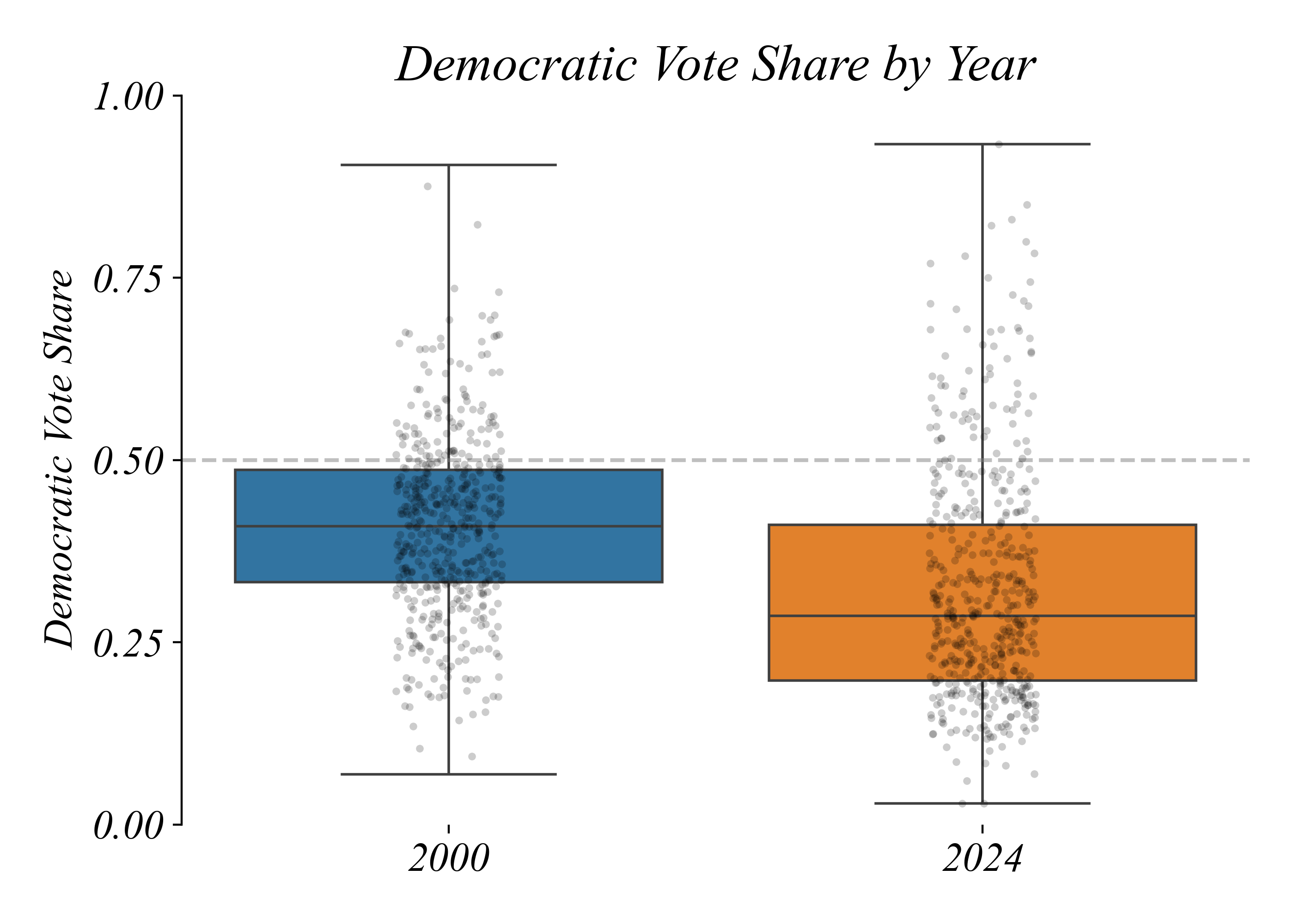
> median dropped from 41% to 29% — but why were elections still close?
Question 2: Do Large Counties Vote Differently?
Lets try to explaining the paradox.
- Counties aren’t equal in population.
- Small rural counties outnumber large urban ones.
Question: Do larger counties lean Democratic?
This is a Part 2.1 question — a relationship between two numerical variables.
Do Large Counties Vote Differently?
Large counties vote more Democratic
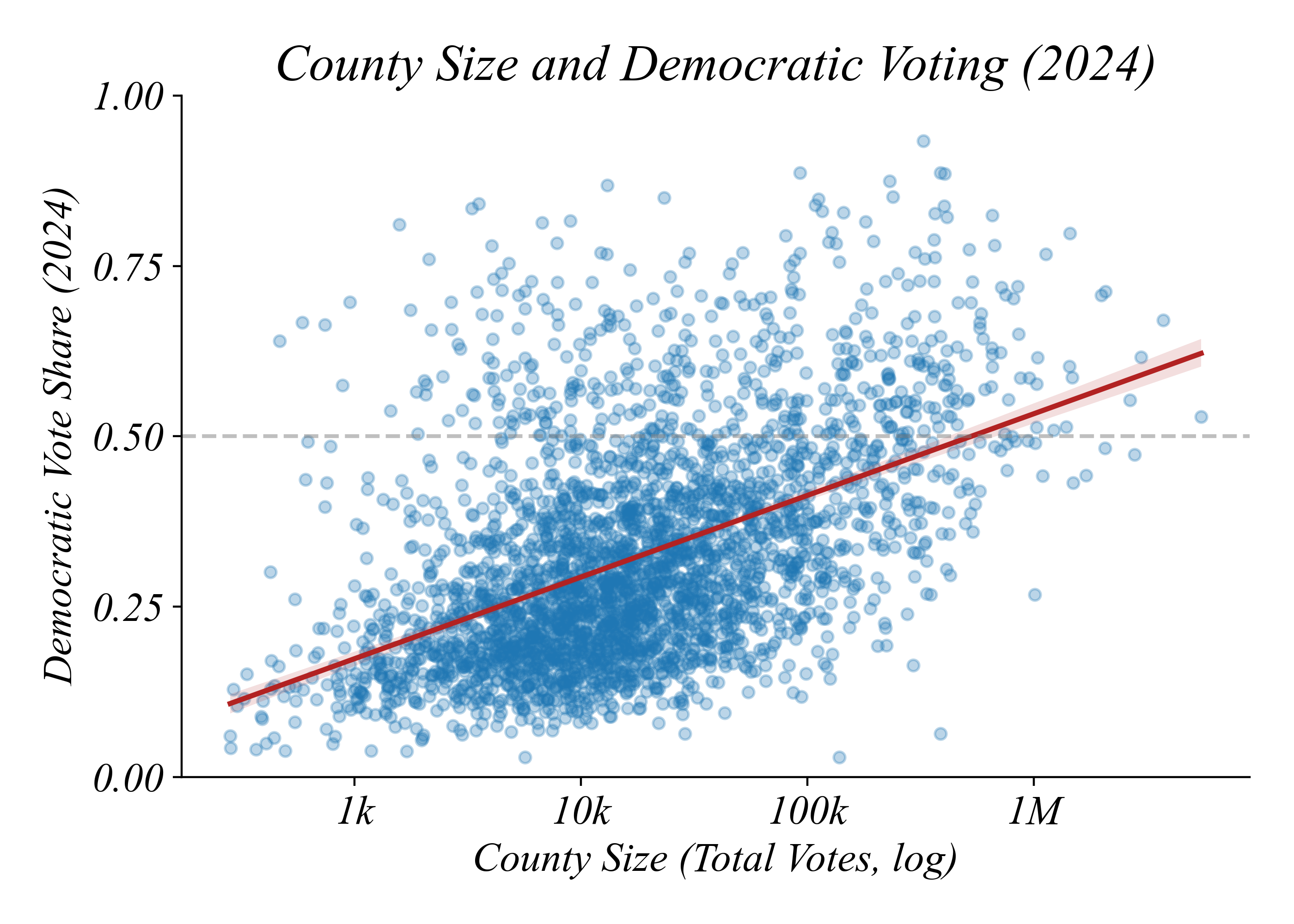
> Democratic-leaning counties are larger (correlation: 0.49)
Question 3: Is This Related to Income?
Large counties tend to be richer. Is income related to voting?
Question: Is the Democratic lean related to income?
Income and Democratic Voting (2024)
Richer counties vote more Democratic
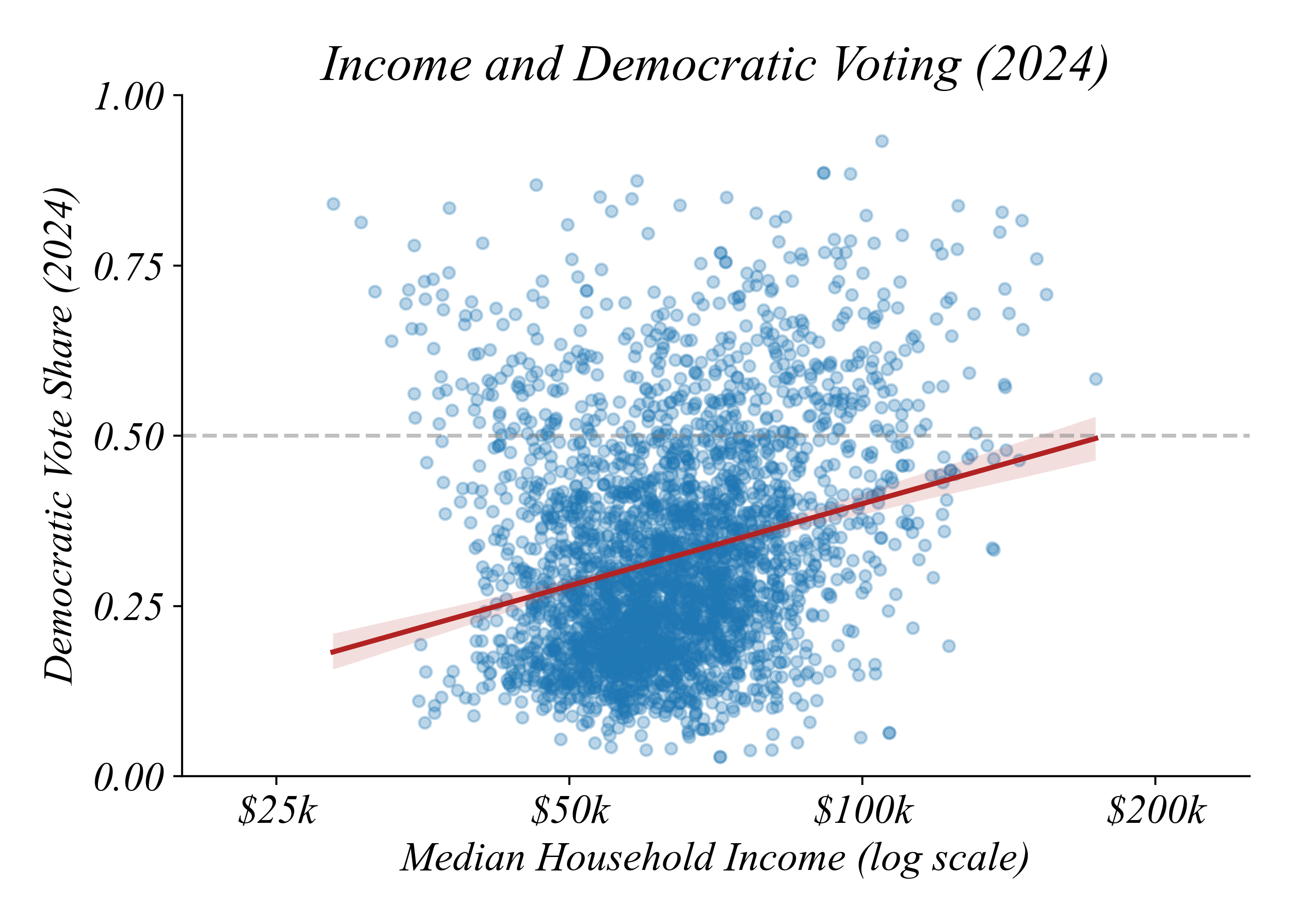
> correlation: 0.25 — but was it always this way?
Question 4: Has the Relationship Changed?
Have higher income counties always leaned Democratic?
Prior tools fall short:
- Part 2.1 (scatter): Shows one year at a time
- Part 2.2 (boxplot): Ignores the income relationship entirely
> neither tool shows how the relationship between two numerical variables varies by category
New Tool: Scatter by Category
Color points by year to see how the relationship differs
We need a scatter plot that shows bivariate relationships separately by category.
Income and Democratic Voting: 2000 vs 2024
The relationship has flipped
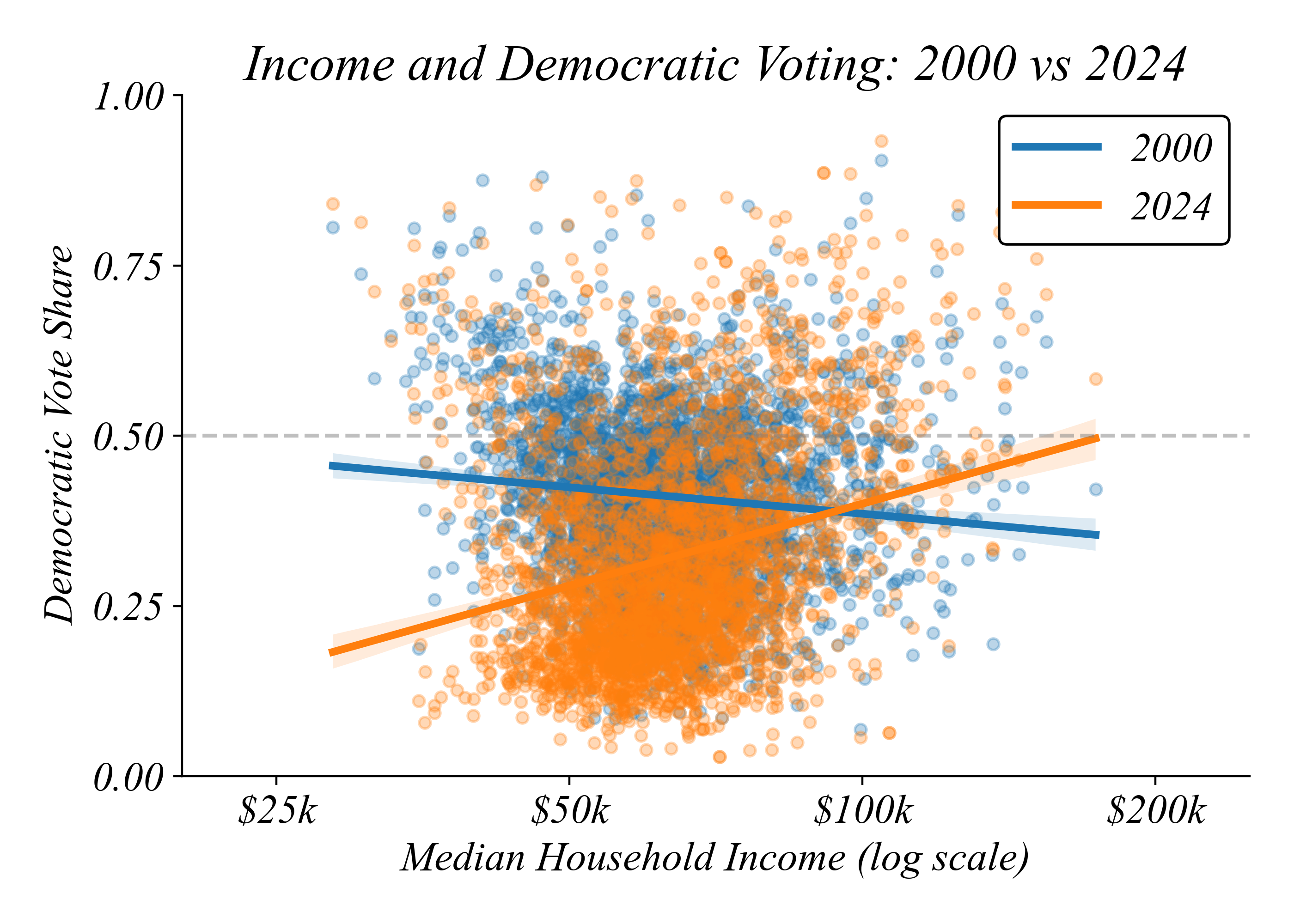
> in 2000, richer counties leaned Republican; by 2024, they lean Democratic
The Insight
Each question built on the previous
- Q1: Counties shifted Republican on average
- Q2: But large counties vote Democratic (explains why elections are close)
- Q3: Richer counties vote Democratic
- Q4: This relationship completely flipped since 2000
Merging Datasets
Combining income and election data
To answer Q2-Q4, we needed data from multiple sources.
> the merge matches 3,106 of ~3,200 counties — 97% success
The Workflow
A template for final projects
- Q1 (Part 2.2): Boxplot by year — counties shifted Republican
- Q2 (Part 2.1): Scatter of size vs. voting — large counties vote Democratic
- Q3 (Part 2.1): Scatter of income vs. voting — richer counties vote Democratic
- Q4 (Part 2.3): Scatter by category — the relationship flipped
Part 2.3 | Summary
- Part 2.1 tools (scatter) show relationships between two numerical variables
- Part 2.2 tools (boxplot) show how a numerical variable differs by category
- Part 2.3 tools (scatter by category) show how a relationship differs by category
- Merging combines datasets when your question requires variables from both
Building Blocks
What this unit adds to your toolkit
| Block | Part 2.3 |
|---|---|
| Variables | Numerical + Categorical |
| Structures | Cross-section, Panel |
| Operations | Merge, Reshape (melt), Add hue |
| Visualizations | Scatter by category (lmplot with hue) |