ECON 0150 | Economic Data Analysis

The economist’s data analysis skillset.


Part 2.2 | Numerical Variables by Category

Behavioral Response to Incentives

How do buyers respond to different discount structures?


  • Starbucks sent different promotional offers to different buyers
  • Each offer has a different structure (BOGO, $2 off $10, $5 off $20, etc.)


Question: Which incentive structure affects buying behavior the most?

The Data

Let’s load the data and take a look

Event Revenue Offer ID
0 transaction 34.56 2off10
1 transaction 18.97 2off10
2 transaction 33.90 Bogo 5
3 transaction 18.01 Bogo 10
4 transaction 19.11 Bogo 10


> which would we expect customers to respond most to: Bogo 5 or Bogo 10?

Exercise 2.2 | Revenue by Offer Type

Visualize the data to answer whether Bogo 5 or Bogo 10 has higher average spending.


Use a boxplot to show the distribution of numerical variables by category.

# Boxplot
sns.boxplot(data, x='Offer ID', y='Revenue', whis=(0,100))

Revenue by Offer Type: Boxplot

The distribution of revenue by offer type.

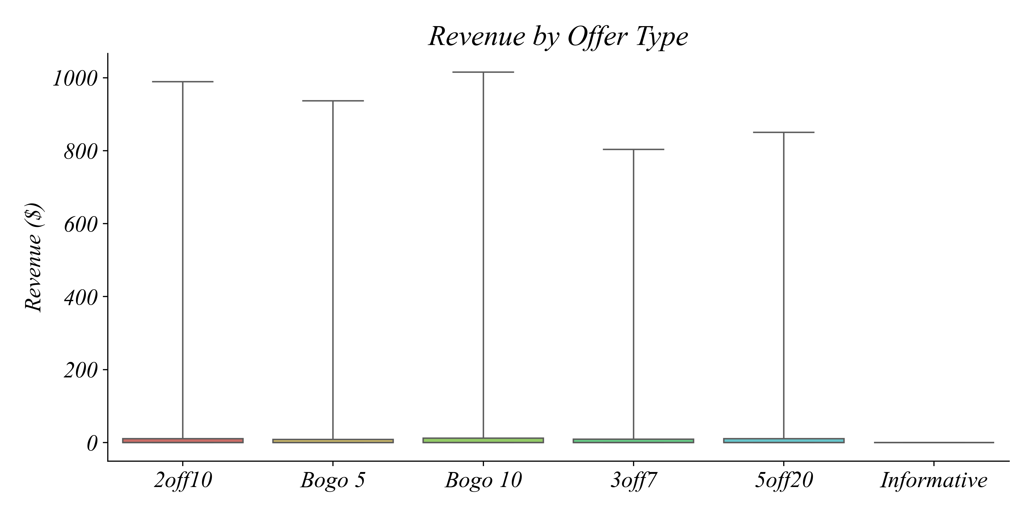
> hard to see — why are so many values compressed at zero?

Log Transformation: Skewed Data

Each unit = a doubling of spending

Revenue log2_Revenue
0 34.56 5.152183
1 18.97 4.319762
2 33.90 5.125155
3 18.01 4.248687
4 19.11 4.329841

> log2(1+$7) = 3, log2(1+$15) = 4, log2(1+$31) = 5

Log Transformation: Visualized

The transformation spreads out skewed data

> x-axis is compressed at low values; y-axis spreads them out evenly

Exercise 2.2 | Log Revenue by Offer Type

Create a boxplot with the log-transformed variable to better see the distribution.


Log transform Revenue.

data['log2_Revenue'] = np.log2(1 + data['Revenue'])

Create a boxplot of log revenue log2_Revenue.

sns.boxplot(data, x='Offer ID', y='log2_Revenue', whis=(0,100))

Add a stripplot.

sns.stripplot(data, x='Offer ID', y='log2_Revenue', alpha=0.3, color='black')

Log Revenue by Offer Type: Boxplot

Now we can see the data better.

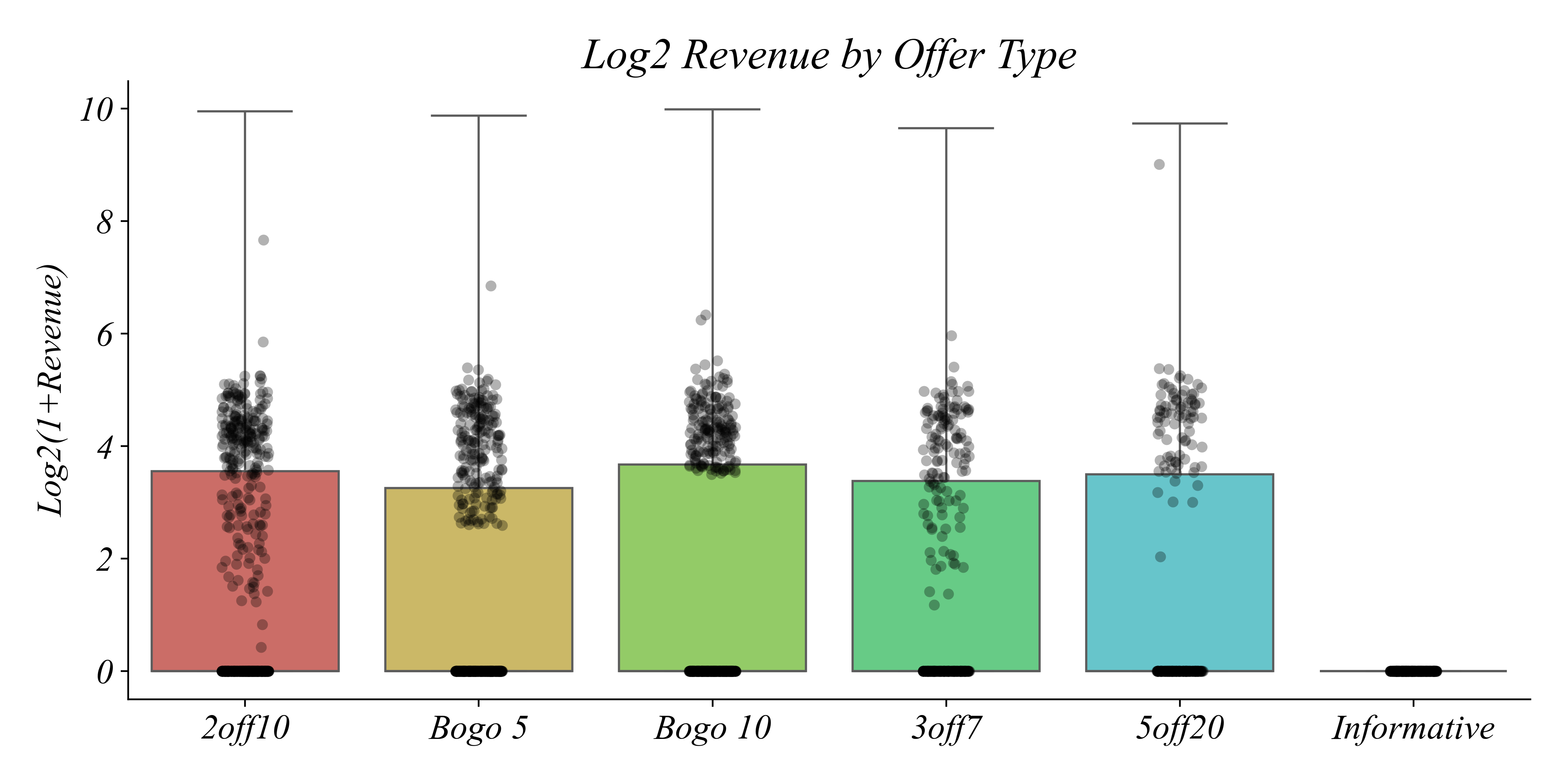
> why are there so many zeros?

Exercise 2.2 | Investigate the Data

What’s in the Event column?


Count the unique values in Event.

data['Event'].value_counts()

Summarize counts using a countplot.

sns.countplot(data, x='Event')

Three Event Types

Not all rows are purchases

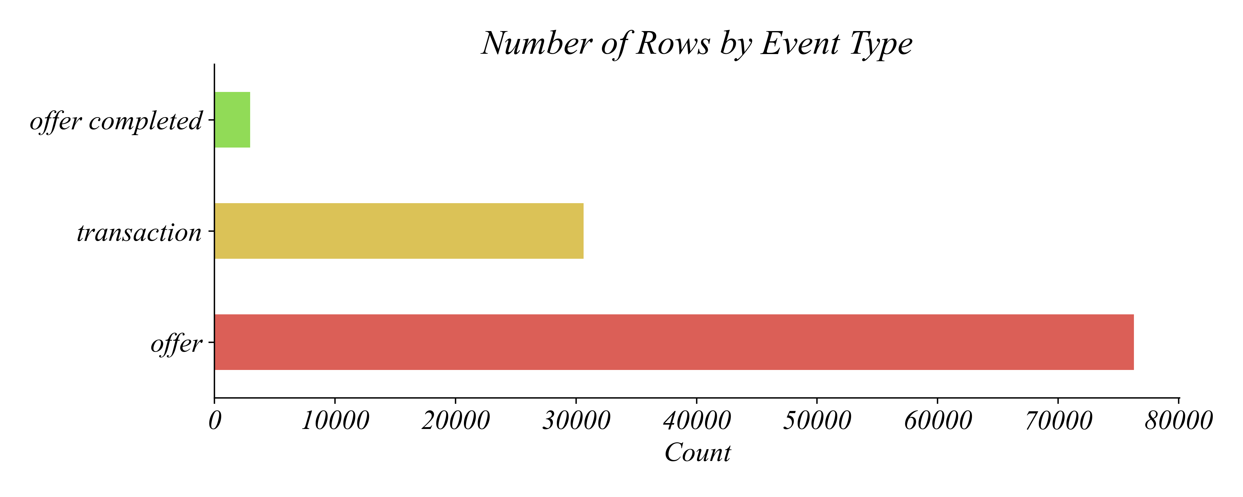
> most rows are offers, not transactions

Exercise 2.2 | Revenue by Event

Where is revenue coming from?


Create a boxplot of Revenue by Event.

sns.boxplot(data, x='Event', y='Revenue', whis=(0,100))

Revenue by Event Type

Only transactions have revenue

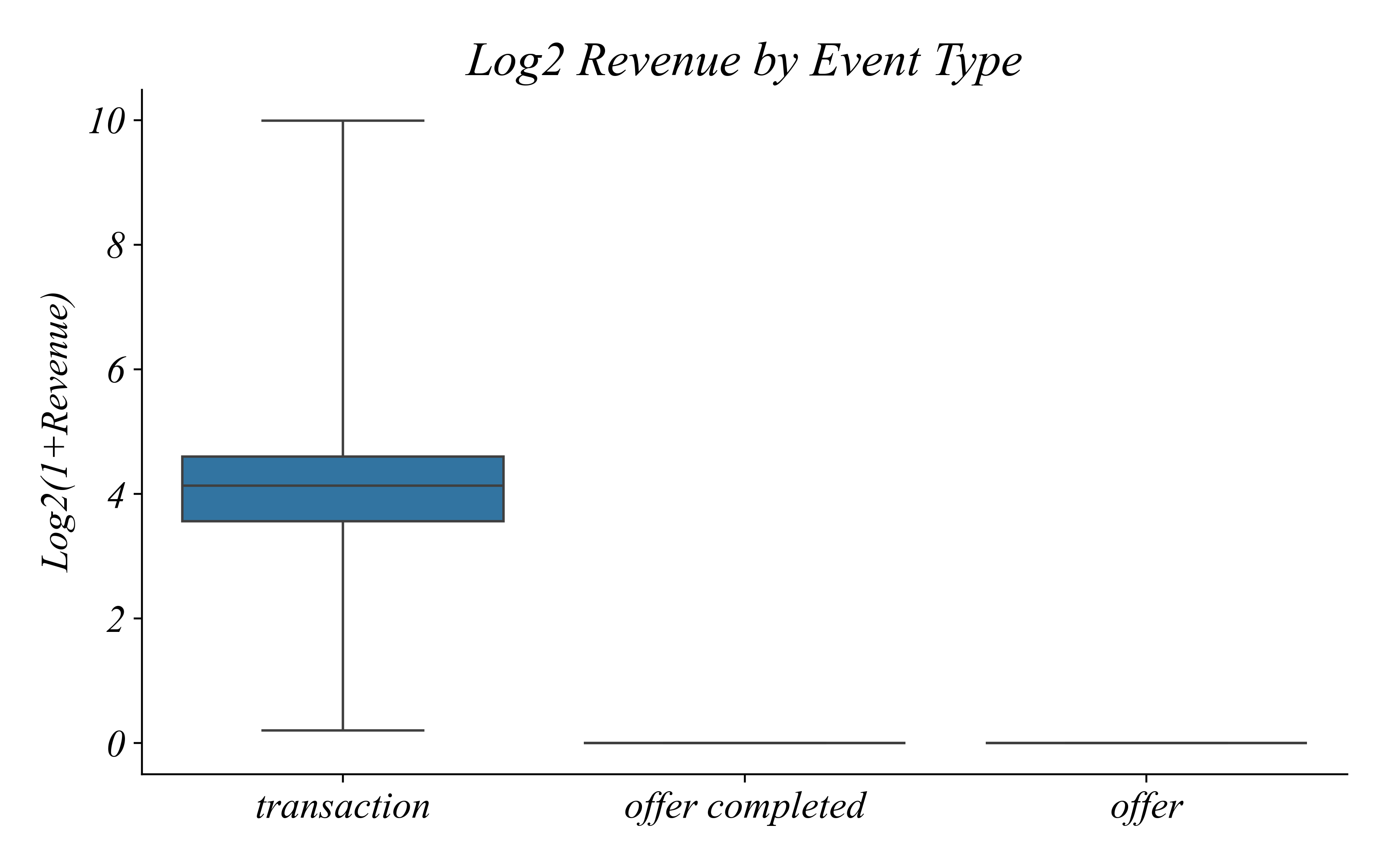
> offers and completions have zero revenue — that’s why we see so many zeros

Exercise 2.2 | Summarize Transactions


  1. Keep only rows where Event equals transaction.
transactions = data[data['Event'] == 'transaction']


  1. Create a boxplot of log revenue by offer type using only transactions.
sns.boxplot(transactions, x='Offer ID', y='log2_Revenue', whis=(0,100))
sns.stripplot(transactions, x='Offer ID', y='log2_Revenue')

Summarize Transactions

Every row is a real purchase.

> which offer type has higher spending?

Exercise 2.2 | Grouped Statistics

Calculate the mean, standard deviation, and count of log revenue by offer type.

transactions.groupby('Offer ID')['log2_Revenue'].agg(['mean', 'std', 'count'])

Grouped Statistics

Average log spending by offer type

mean std count
Offer ID
2off10 3.89 1.03 8569
3off7 3.75 1.06 4698
5off20 4.31 0.89 3239
Bogo 10 4.33 0.65 6308
Bogo 5 3.95 0.81 7803

> 5off20 has the highest mean

> Bogo 10 has a higher mean than Bogo 5

> but is this the whole story?

The Workflow

Filter → Transform → Group → Visualize


  1. Filter — keep only relevant rows
  2. Transform — log scale for skewed data
  3. Group — organize by a categorical variable
  4. Summarize — compare distributions across groups


> you can also see this doesn’t always progress in a straight line!

Distributions by Offer Type

Each point is one transaction

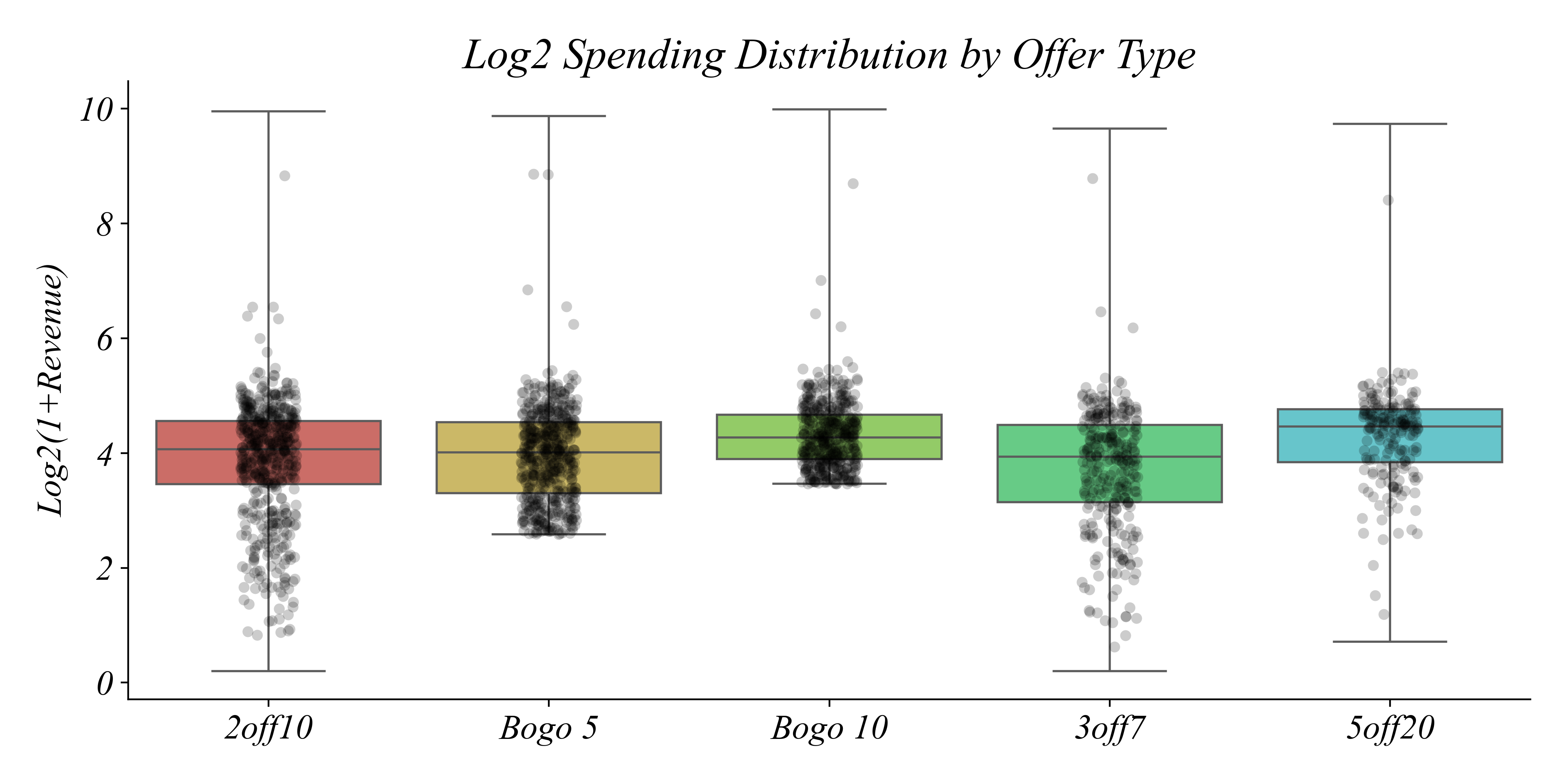
> substantial variation within each offer type

> why are there small purchases in 5off20?

Exercise 2.2 | Compare Two Offers

Filter for just Bogo 5 and Bogo 10, then create a boxplot to compare them.

two_offers = transactions[transactions['Offer ID'].isin(['Bogo 5', 'Bogo 10'])]
sns.boxplot(two_offers, x='Offer ID', y='log2_Revenue', whis=(0,100))

Comparing Two Offers

BOGO 5 vs BOGO 10: Do buyers respond differently?

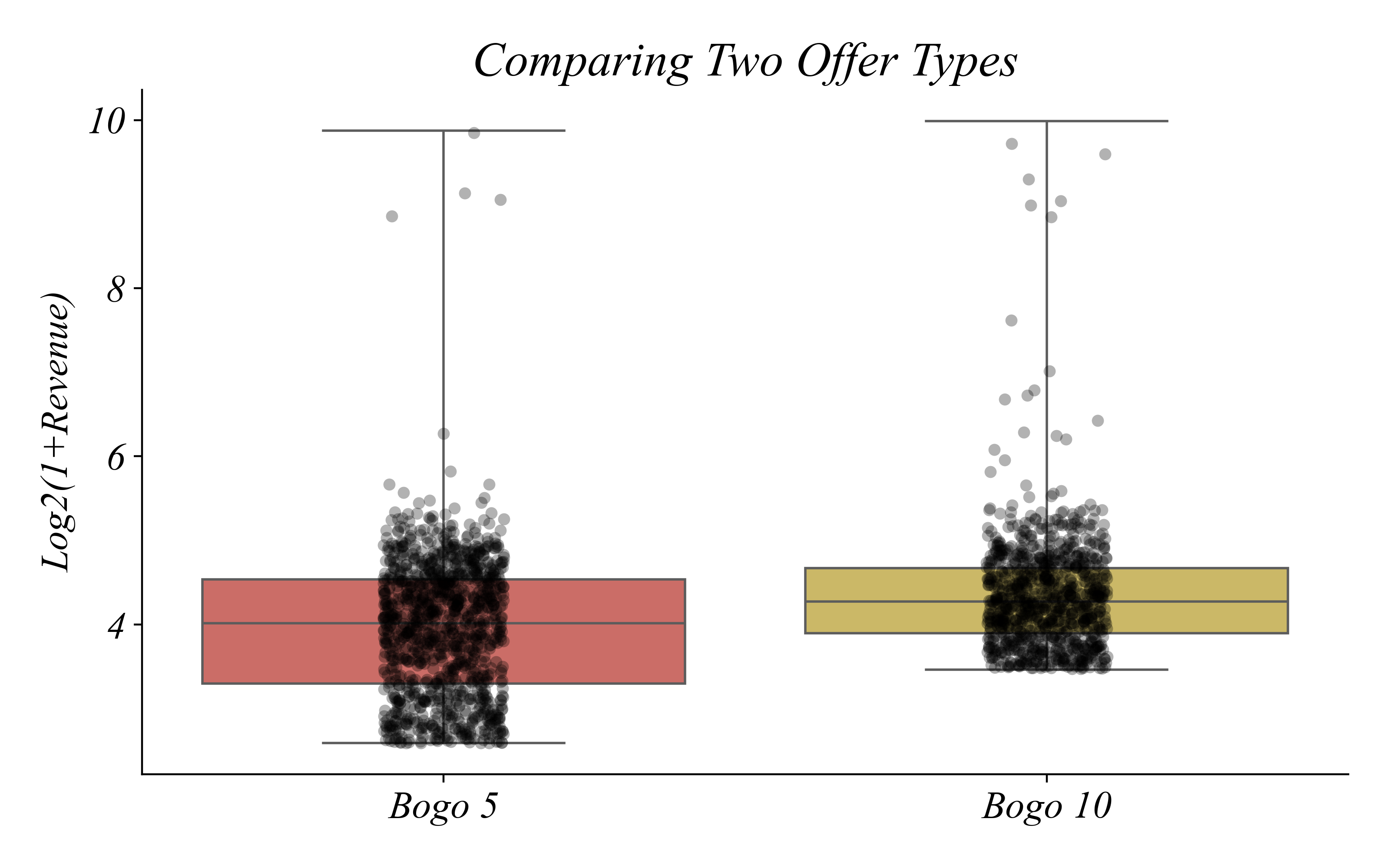
> BOGO 10 has higher average spending — but look at the overlap

The Overlap Problem

Many BOGO 5 buyers spent more than BOGO 10 buyers

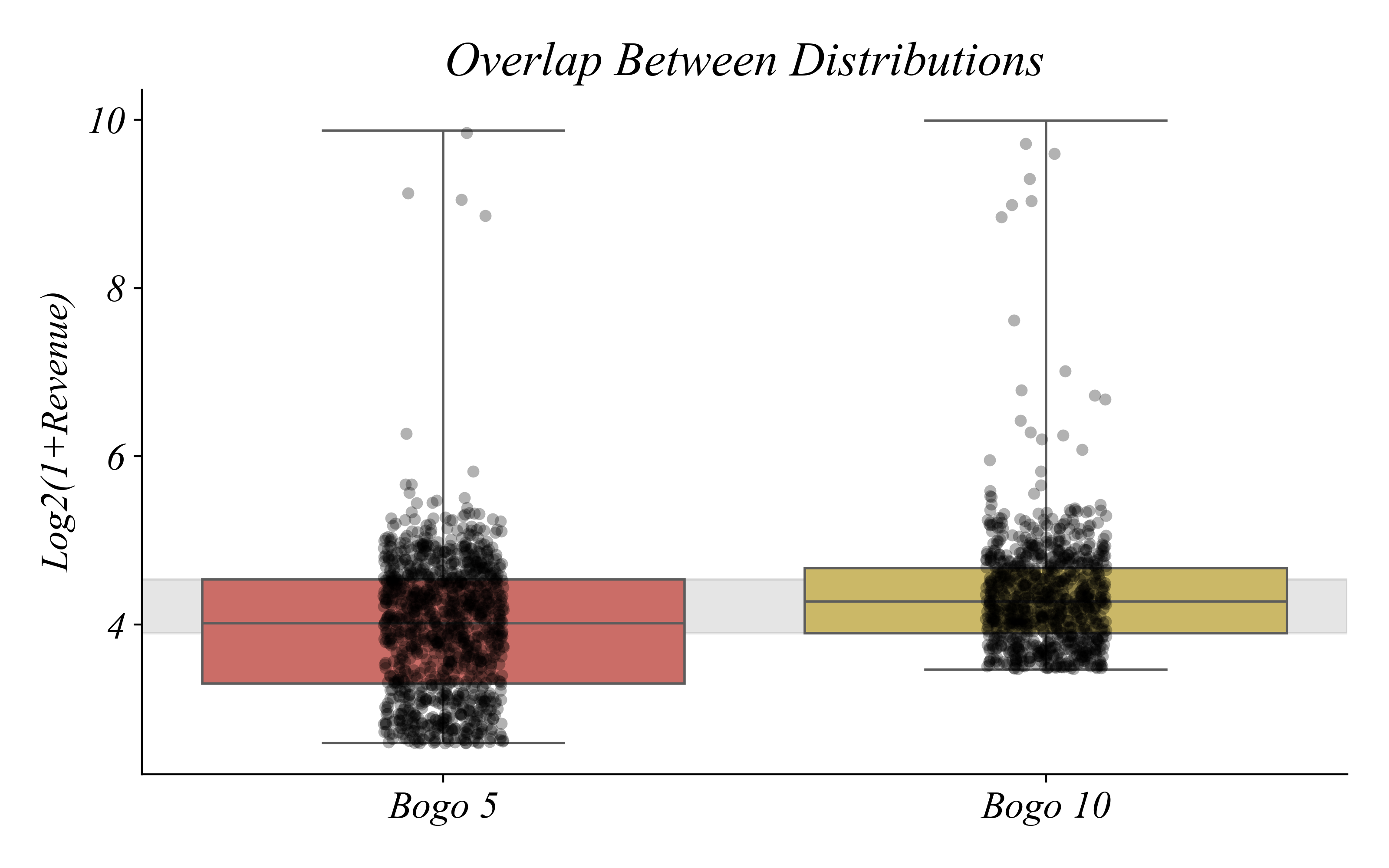
> when distributions overlap this much, is the difference meaningful?

The Key Question

Is the difference real or just noise?


  • Average spending differs across offer types
  • But there’s substantial variation within each group
  • Some “lower” offer buyers outspent “higher” offer buyers


Question: Is this difference we observe actually meaningful?

Part 2.2 | Summary


  • Summary statistics can hide problems — always visualize
  • Filter your data — make sure you’re analyzing what you think
  • Log transformation helps with skewed data
  • Boxplots by category show distributions, not just means
  • Overlapping distributions raise inference questions

Building Blocks

What this unit adds to your toolkit

Block Part 2.2
Variables Numerical + Categorical
Structures Cross-section
Operations Filter, Log transform, Groupby
Visualizations Bar chart, Boxplot, Stripplot by category