Bivariate Relationships
Let’s summarize what we know about four datasets.
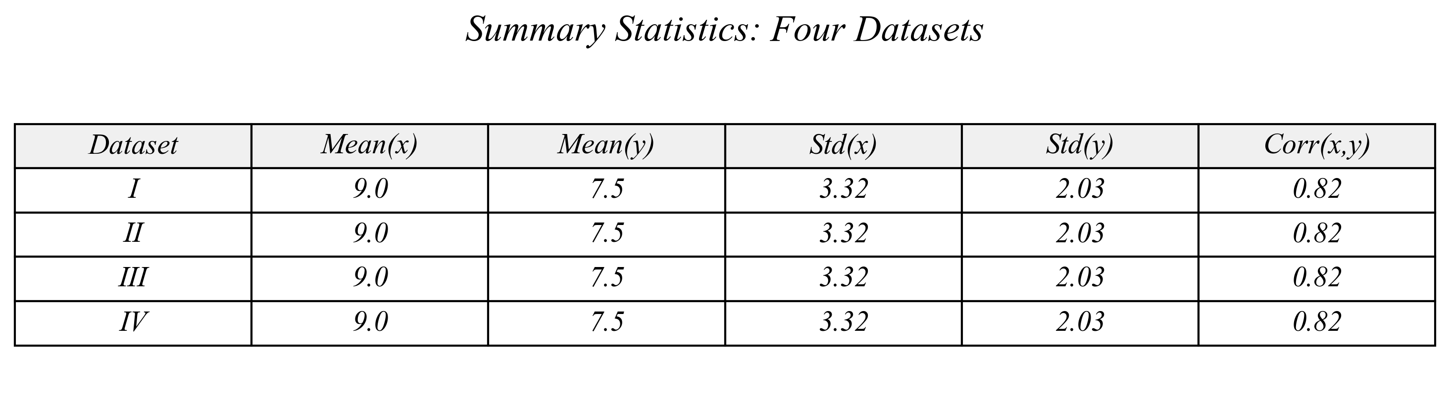
> same means, same standard deviations, same correlation between x and y…
> are these datasets the same?
Bivariate Relationships
Are these the same datasets?
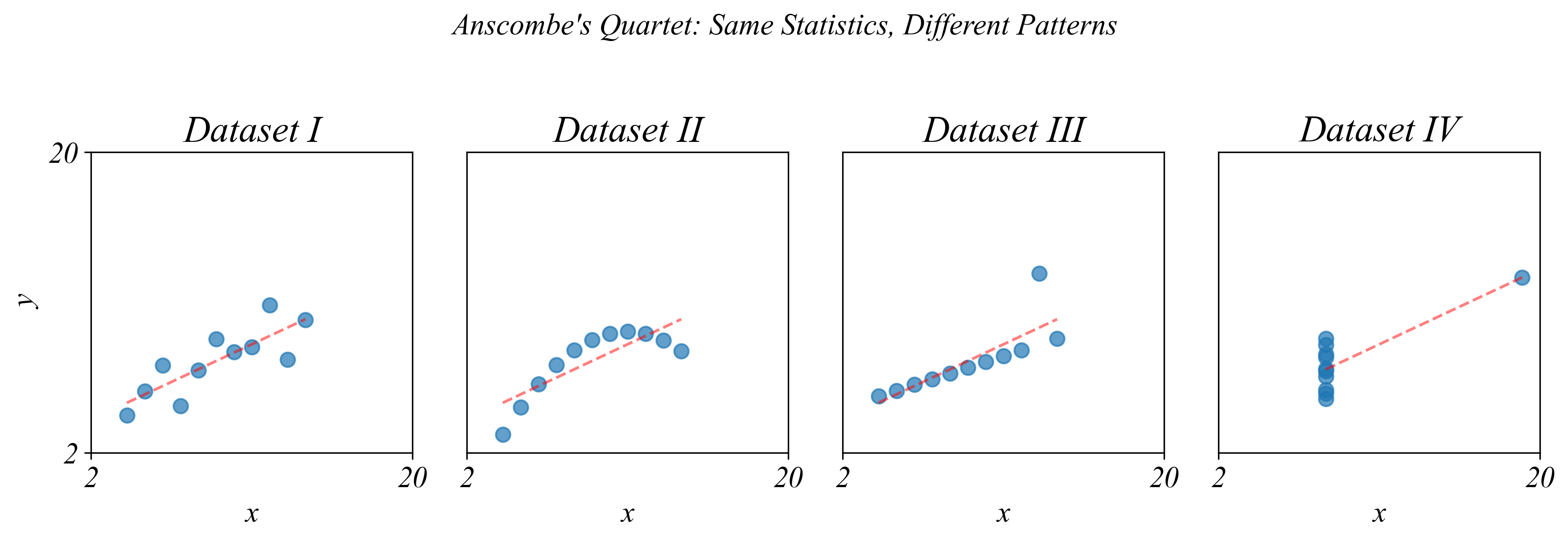
> very different! summarizing variables isn’t enough
Bivariate Relationships in Cross-Section
Q. Is there a relationship between GDP and coffee production?
> maybe, but it’s hard to see
> lets use a two dimensional graph
Bivariate Relationships in Cross-Section
Q. Is there a relationship between GDP and coffee production?

> two dimensions is nice, but the points have no meaningful relationships
Bivariate Relationships in Cross-Section
Q. Is there a relationship between GDP and coffee production?
> a scatterplot effectively visualizes scross sectional data with two dimensions
Bivariate Relationships in Cross-Section
Which countries have a GDP above $2 trillion?
> look at the horizontal axis and select all that are greater than 2
Bivariate Relationships in Cross-Section
Which countries have a GDP above $2 trillion?

> look at the horizontal axis and select all that are greater than 2
Bivariate Relationships in Cross-Section
Which countries have a production above ½ billion kg?
> and we can use either axis
Bivariate Relationships in Cross-Section
Which countries have a production above ½ billion kg?

> and we can use either axis
Bivariate Relationships in Cross-Section
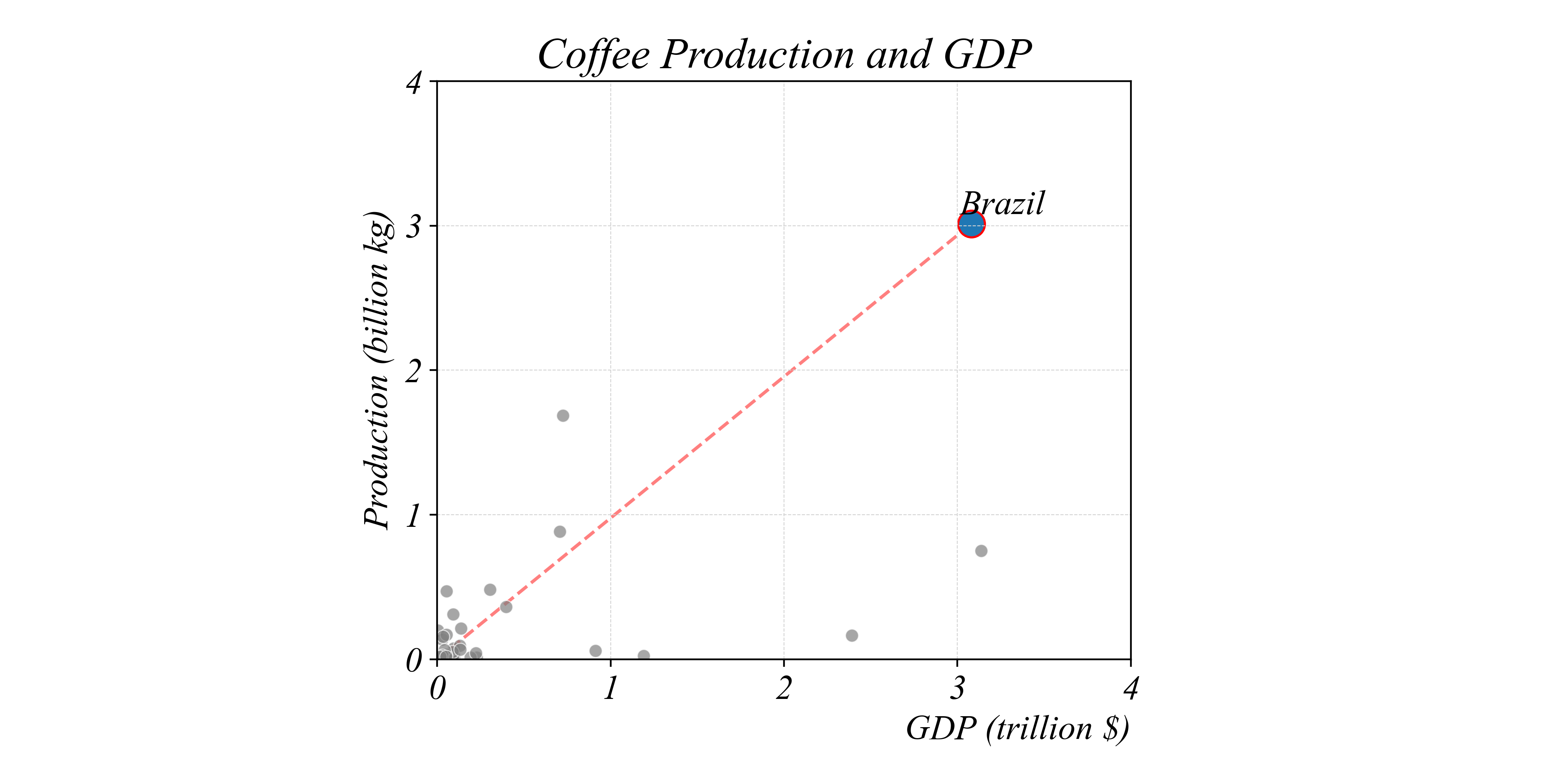
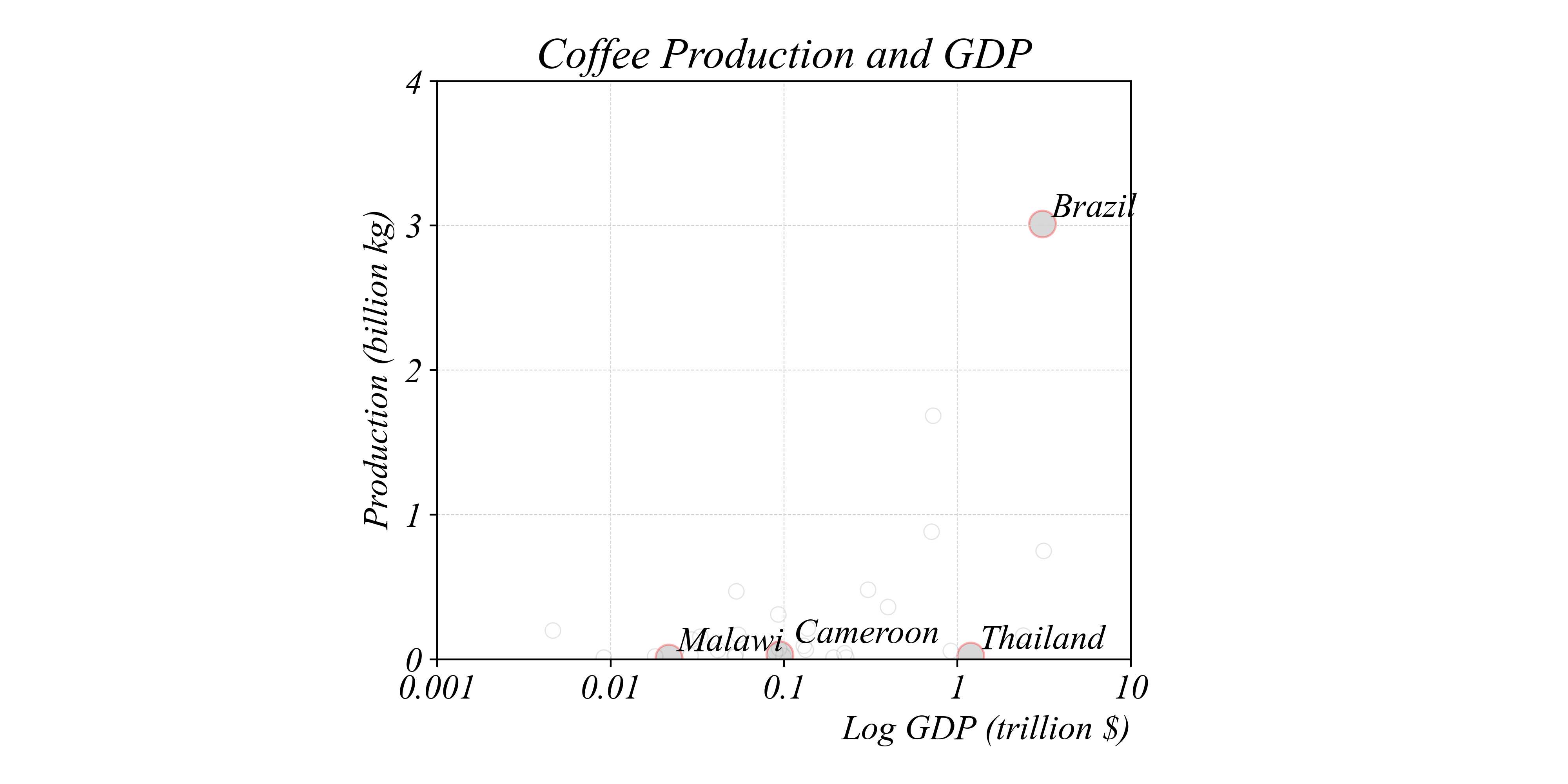
Which countries produce less coffee per dollar than Brazil?
> we can also compare BETWEEN data points
Bivariate Relationships in Cross-Section
Which countries produce less coffee per dollar than Brazil?

> we can also compare BETWEEN data points
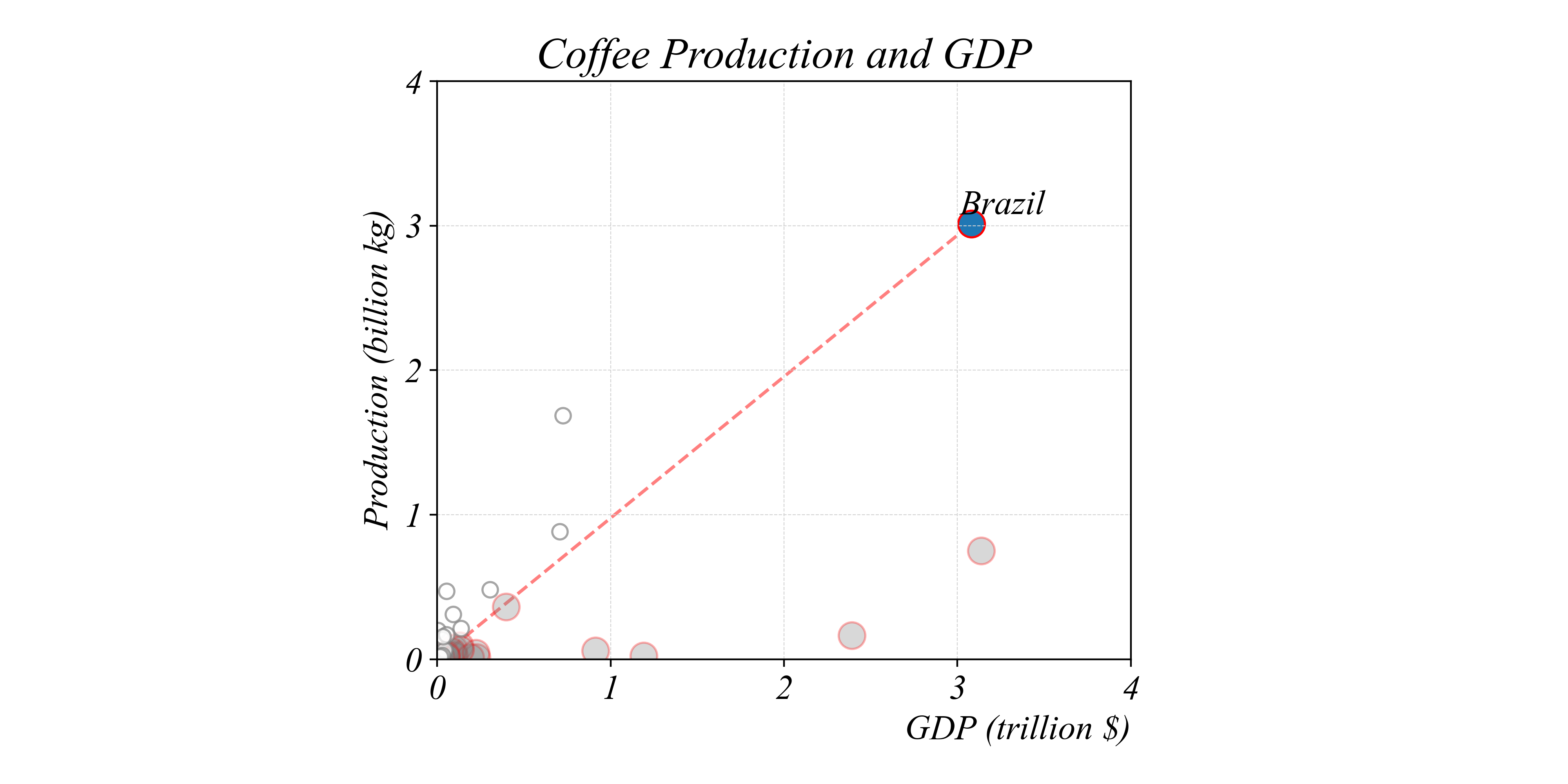
Bivariate Relationships in Cross-Section
Which countries produce less coffee per dollar than Brazil?
> separating lines can help make comparisons between ratios
Bivariate Relationships in Cross-Section
Which countries produce less coffee per dollar than Brazil?
> separating lines can help make comparisons between ratios
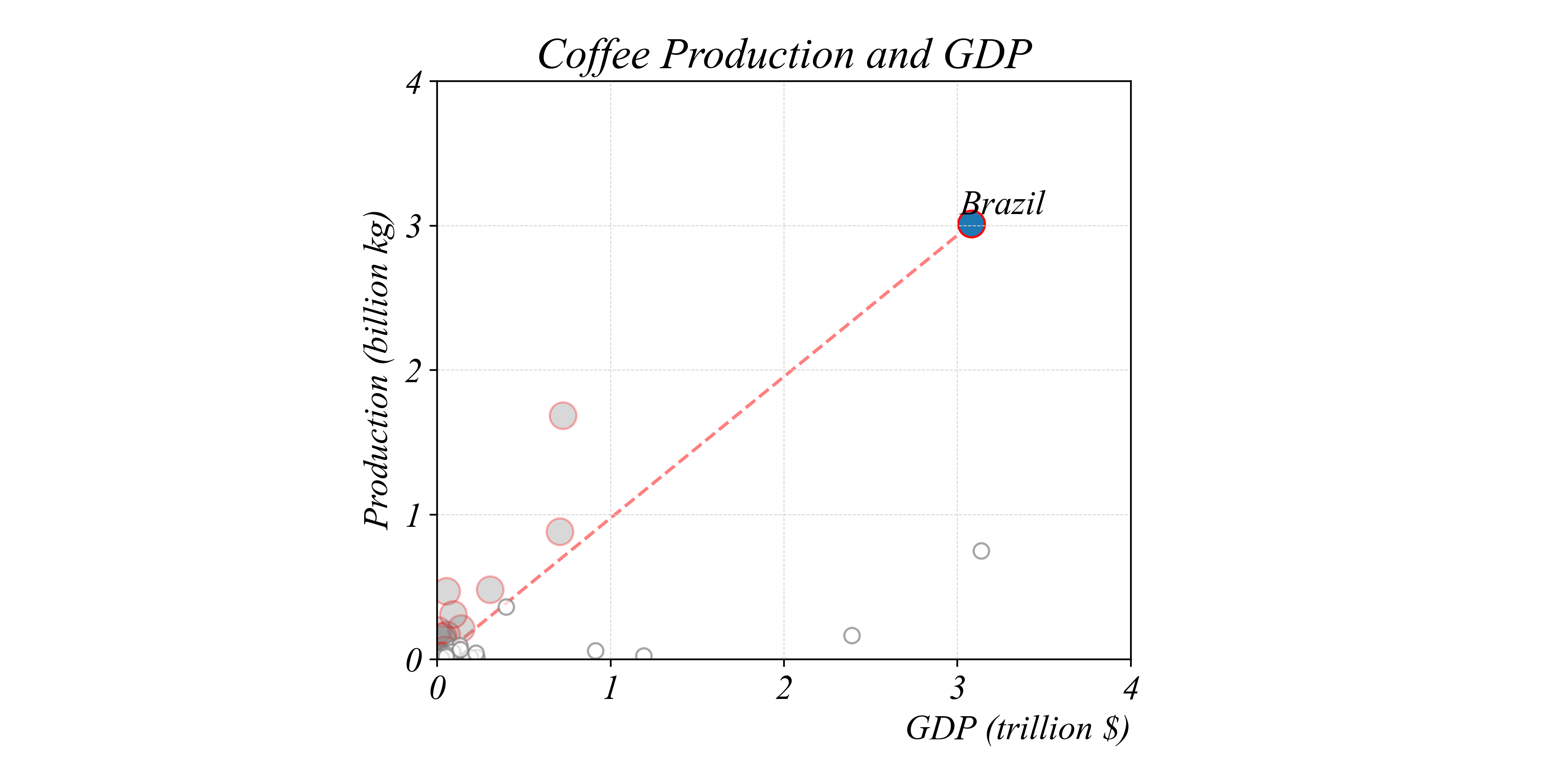
Bivariate Relationships in Cross-Section
Which countries produce more coffee per dollar than Brazil?
> separating lines can help make comparisons between ratios
Bivariate Relationships in Cross-Section
Which countries produce more coffee per dollar than Brazil?
> separating lines can help make comparisons between ratios
Bivariate Relationships in Cross-Section
Do the GDPs of the upper or lower pair differ by a larger amount?
> use the differences on the horizontal axis to measure differences
Bivariate Relationships in Cross-Section
Which is larger: the ratio of GDPs of the upper or lower pair?
> this question is difficult to answer with this scale
Bivariate Relationships in Cross-Section
Which is larger: the ratio of GDPs of the upper or lower pair?
> a log scale makes RATIOS easier to visualize: each tick is 10x larger
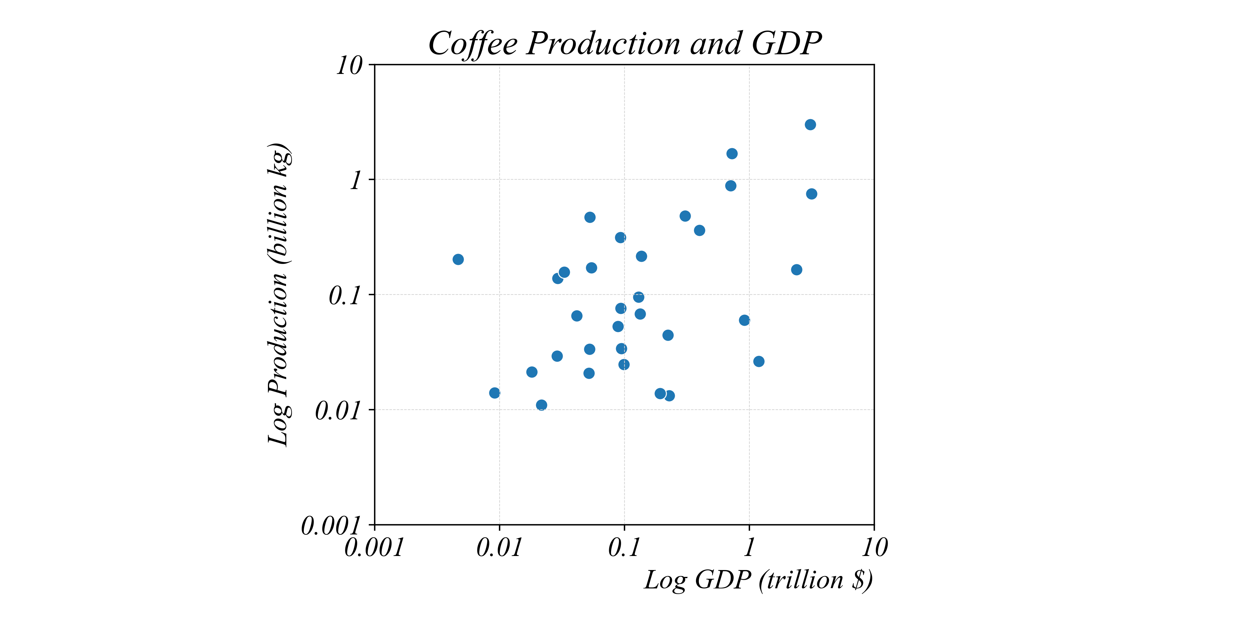
Bivariate Relationships in Cross-Section
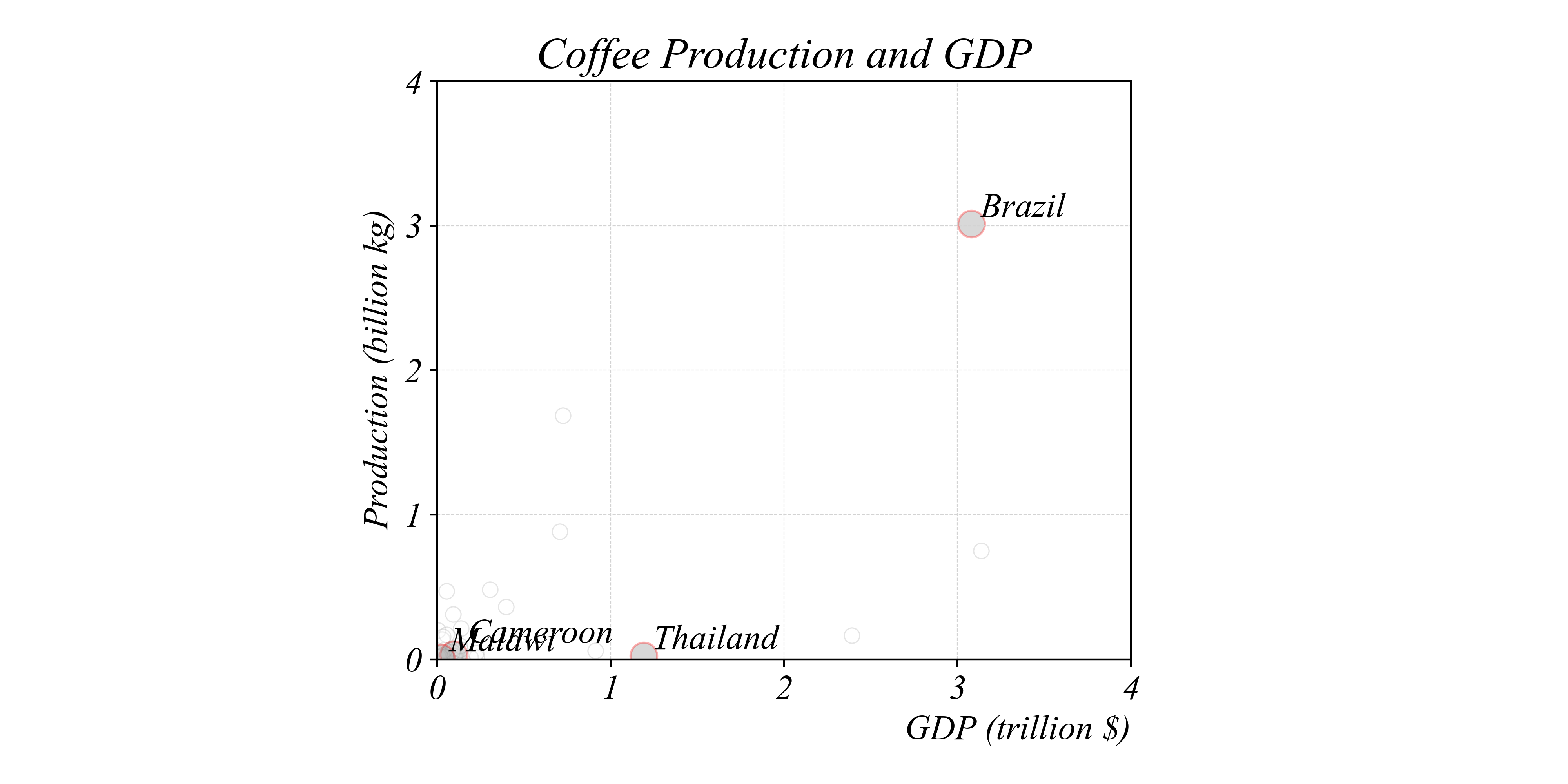
Which country produces the second highest output of coffee?
> a log scale also makes it easier to see SCALING
Bivariate Relationships in Cross-Section
Which country produces the second highest output of coffee?
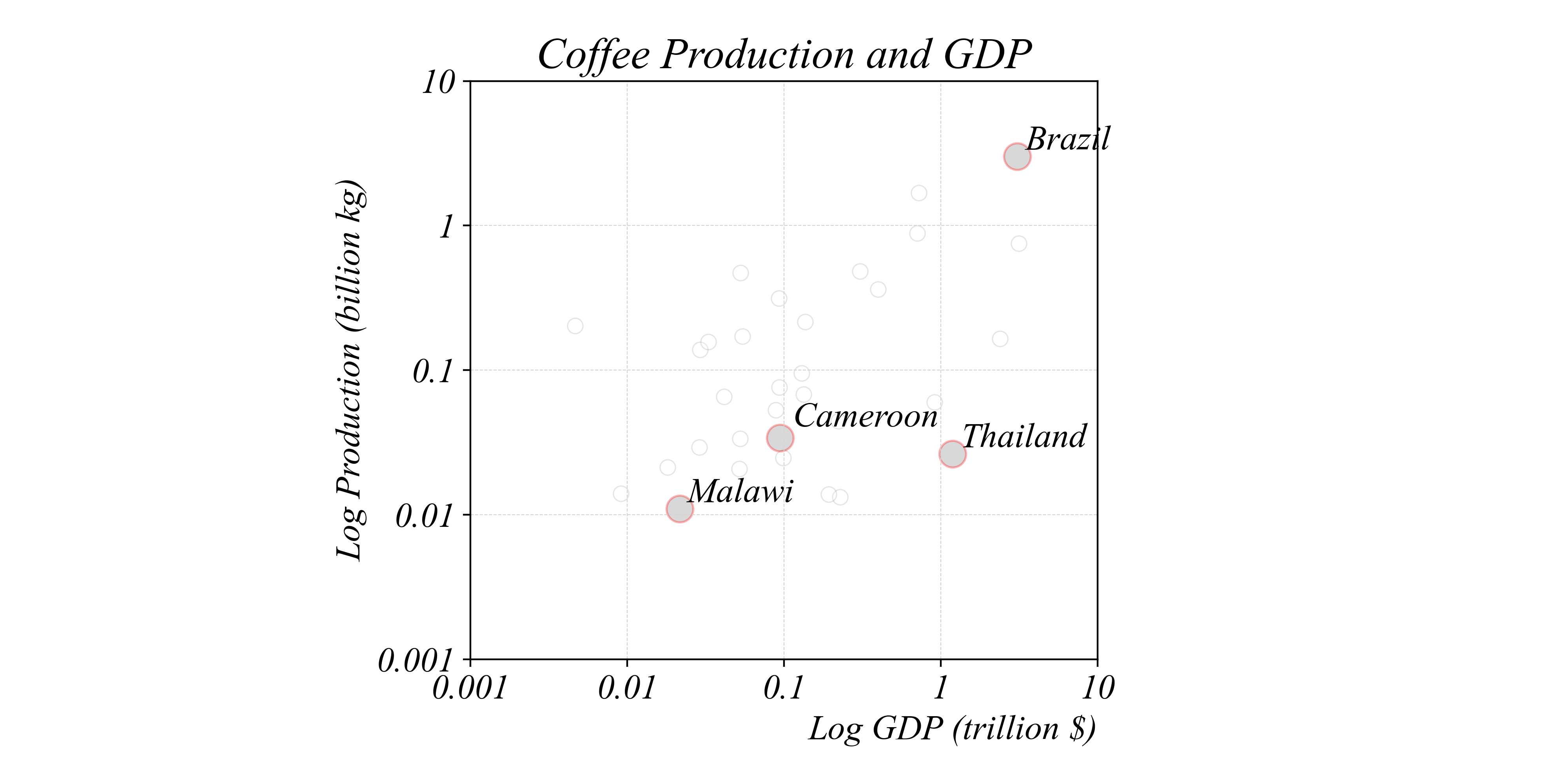
> scaling the vertical axis in logs clarifies both small and large variation
Bivariate Relationships in Cross-Section
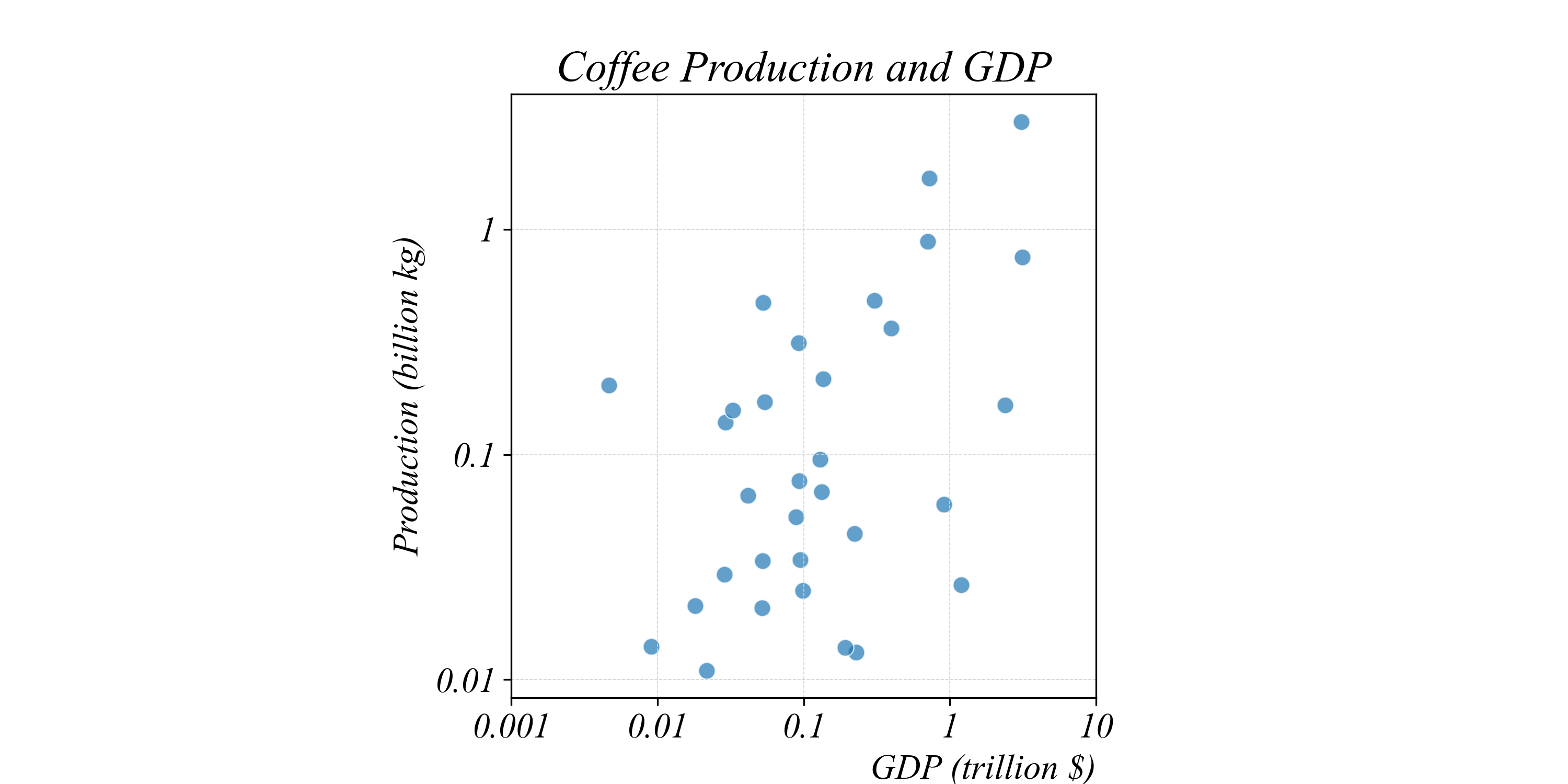
Linear vs Log Scale: Same data, different views
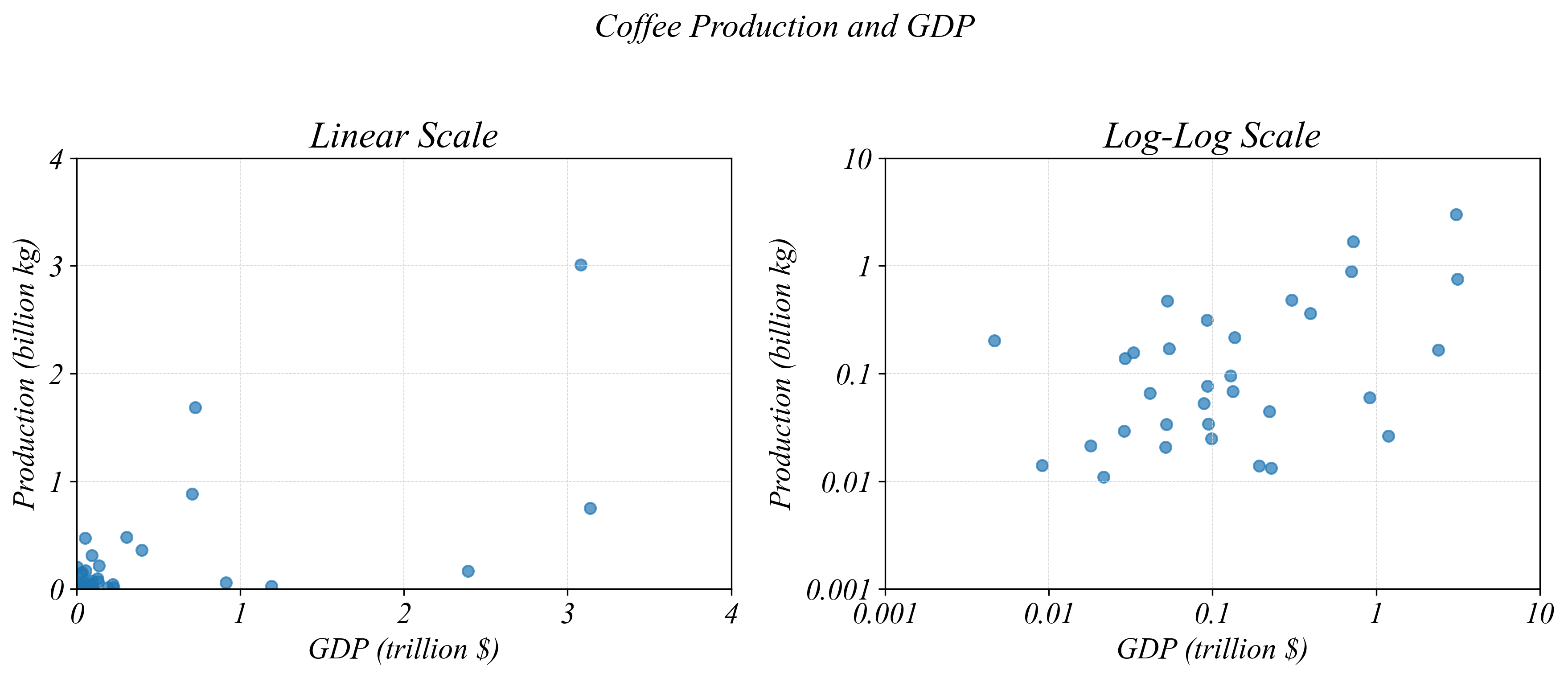
> log scales reveal patterns hidden by outliers in linear scale
Trivariate Relationships: Size
We can use SIZE to encode a third numerical variable
> our standard scatterplot with position encoding
Trivariate Relationships: Size
Each point’s SIZE now represents population
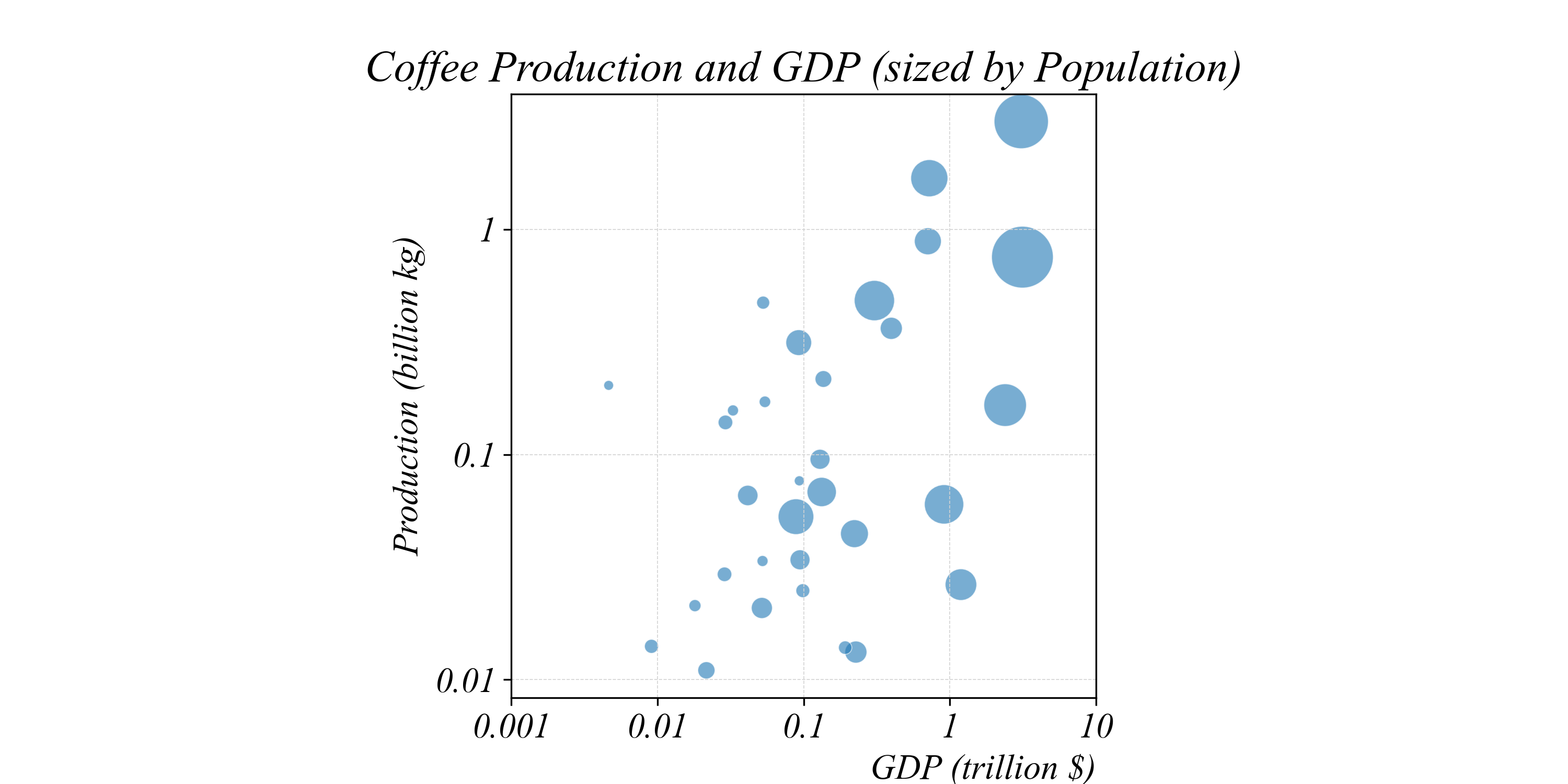
> larger bubbles = larger population
Trivariate Relationships: Size
Indonesia and Brazil stand out — large countries with high production

> we can now see three variables at once: GDP, production, AND population
Trivariate Relationships: Color
Each point’s COLOR now represents population
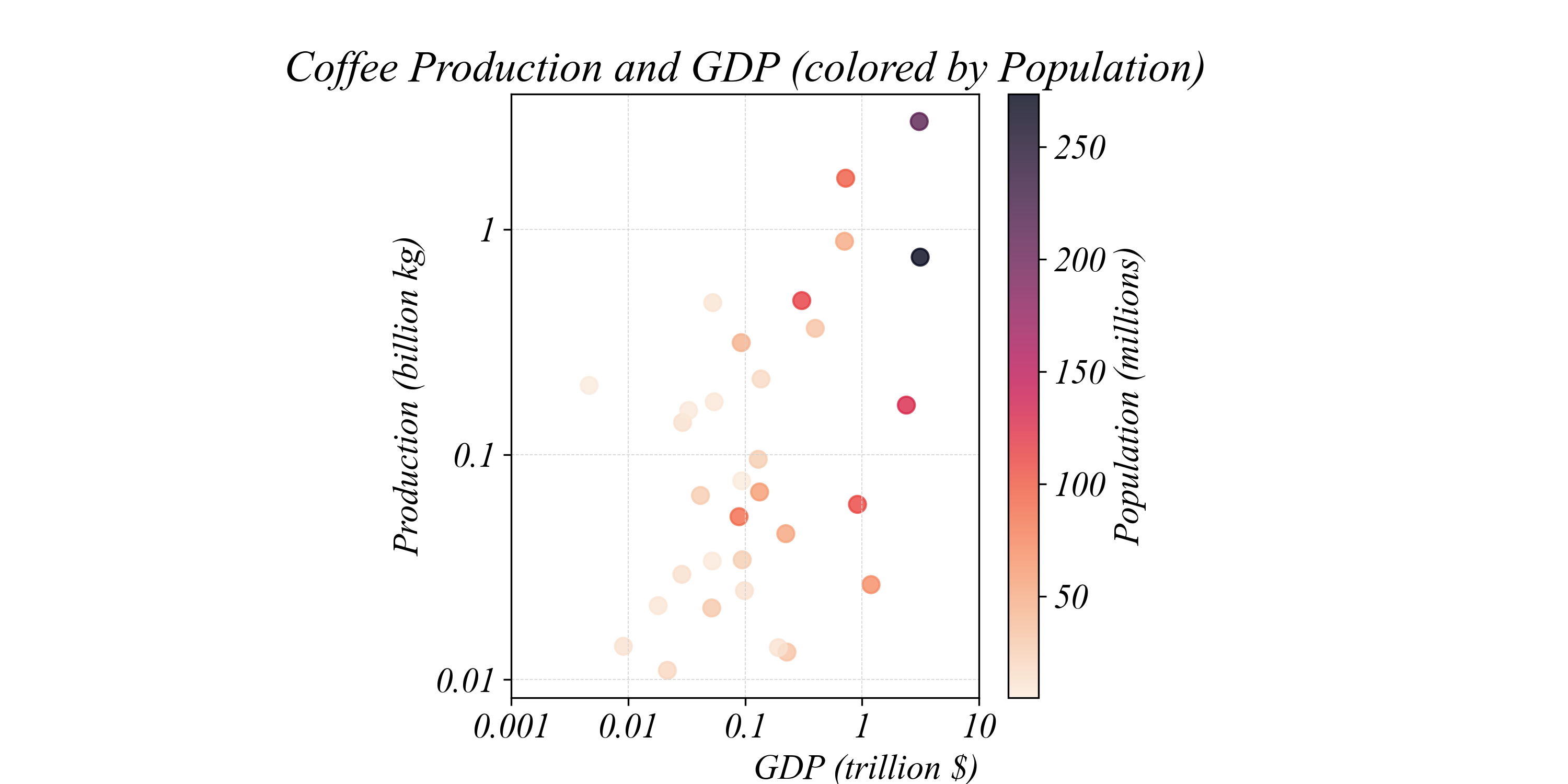
> darker points = larger population
Trivariate Relationships: Color
Color makes it easy to spot high-population countries

> Brazil, Indonesia, and Ethiopia stand out as darker points
Exercise 2.1 | Cross-Sectional Scatterplots
Visualizing GDP and Coffee Production Relationships
Was the relationship between coffee production and GDP different in 1980?
- Data:
Beans_GDP_1980.csv
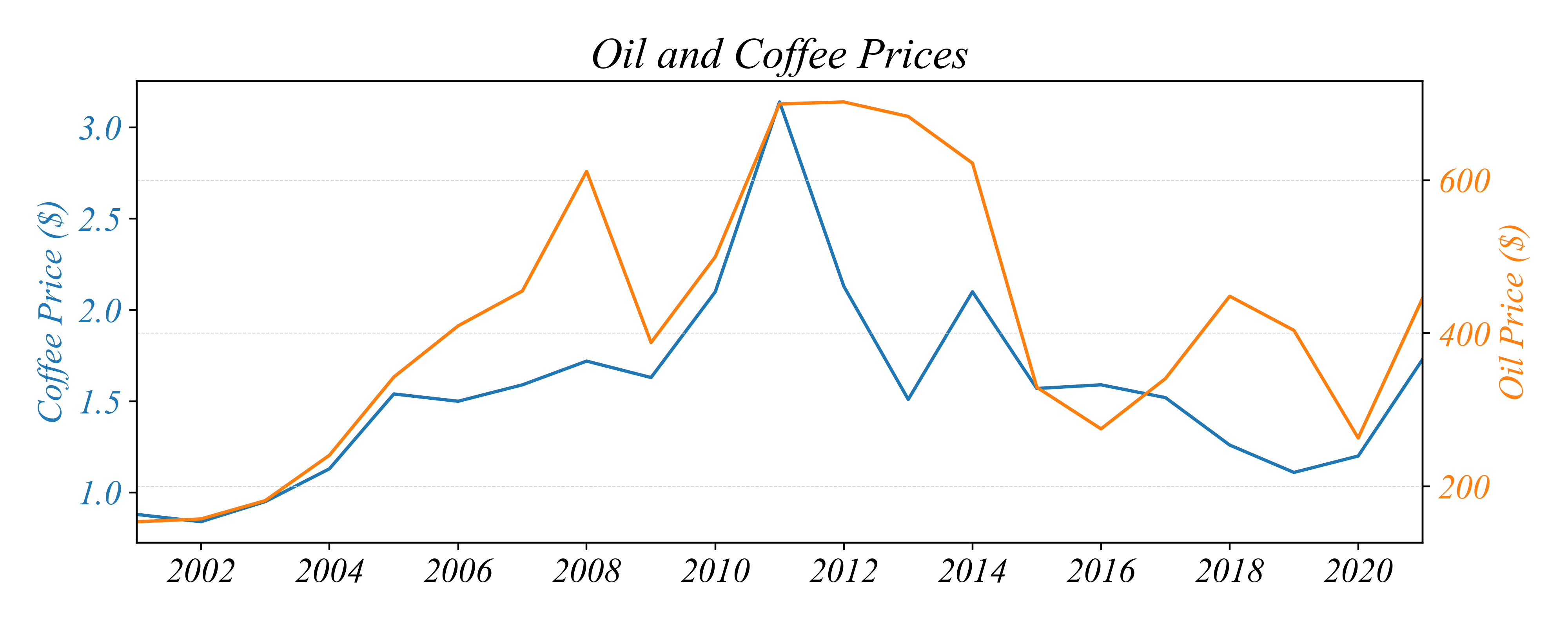
Bivariate Relationships: Timeseries
How do the two commodity prices relate to each other?
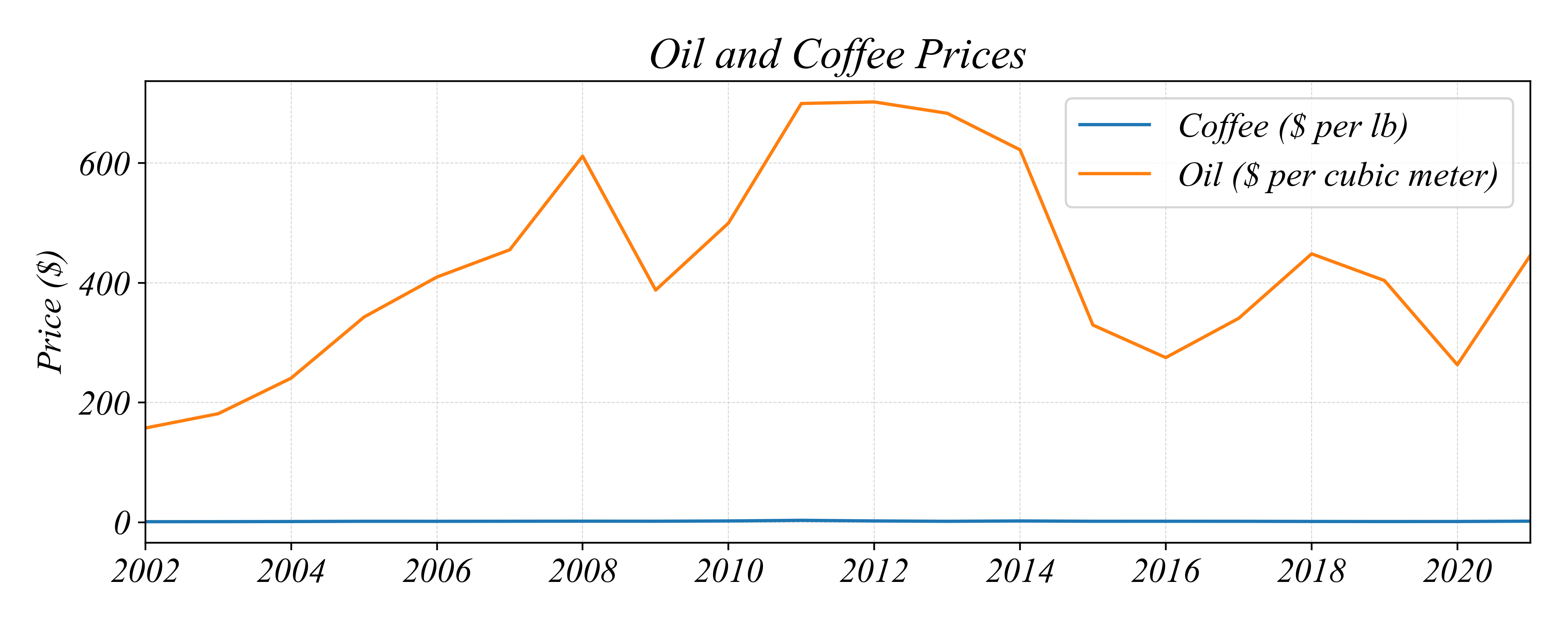
> difficult to tell because of the axis scale
Bivariate Relationships: Timeseries
How do the two commodity prices relate to each other?
Bivariate Relationships: Timeseries
In which years did oil and coffee prices move in opposite directions?
Bivariate Relationships: Timeseries
In which years did oil and coffee prices move in opposite directions?
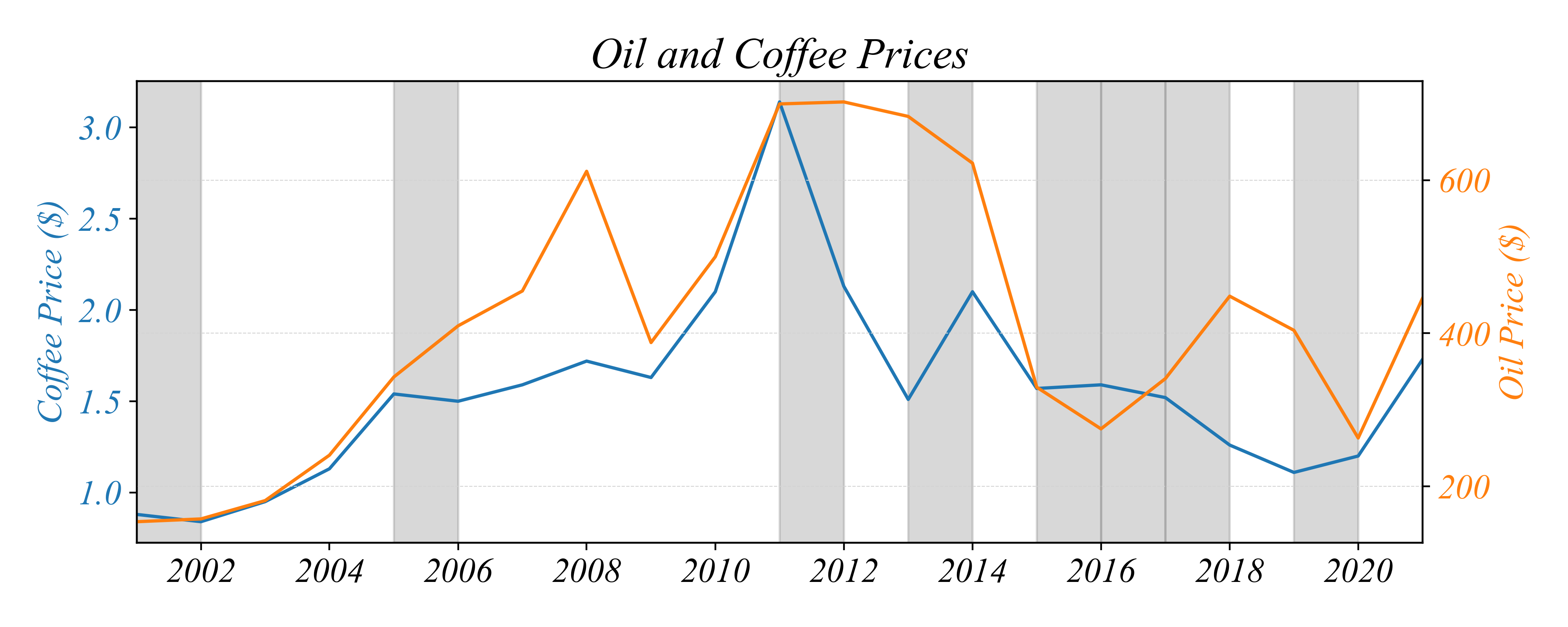
Bivariate Relationships: Timeseries
But are the two prices positively or negatively related to each other?
> this is difficult to see with just a Multi-Lineplot…
Bivariate Relationships: Timeseries
But are the two prices positively or negatively related to each other?
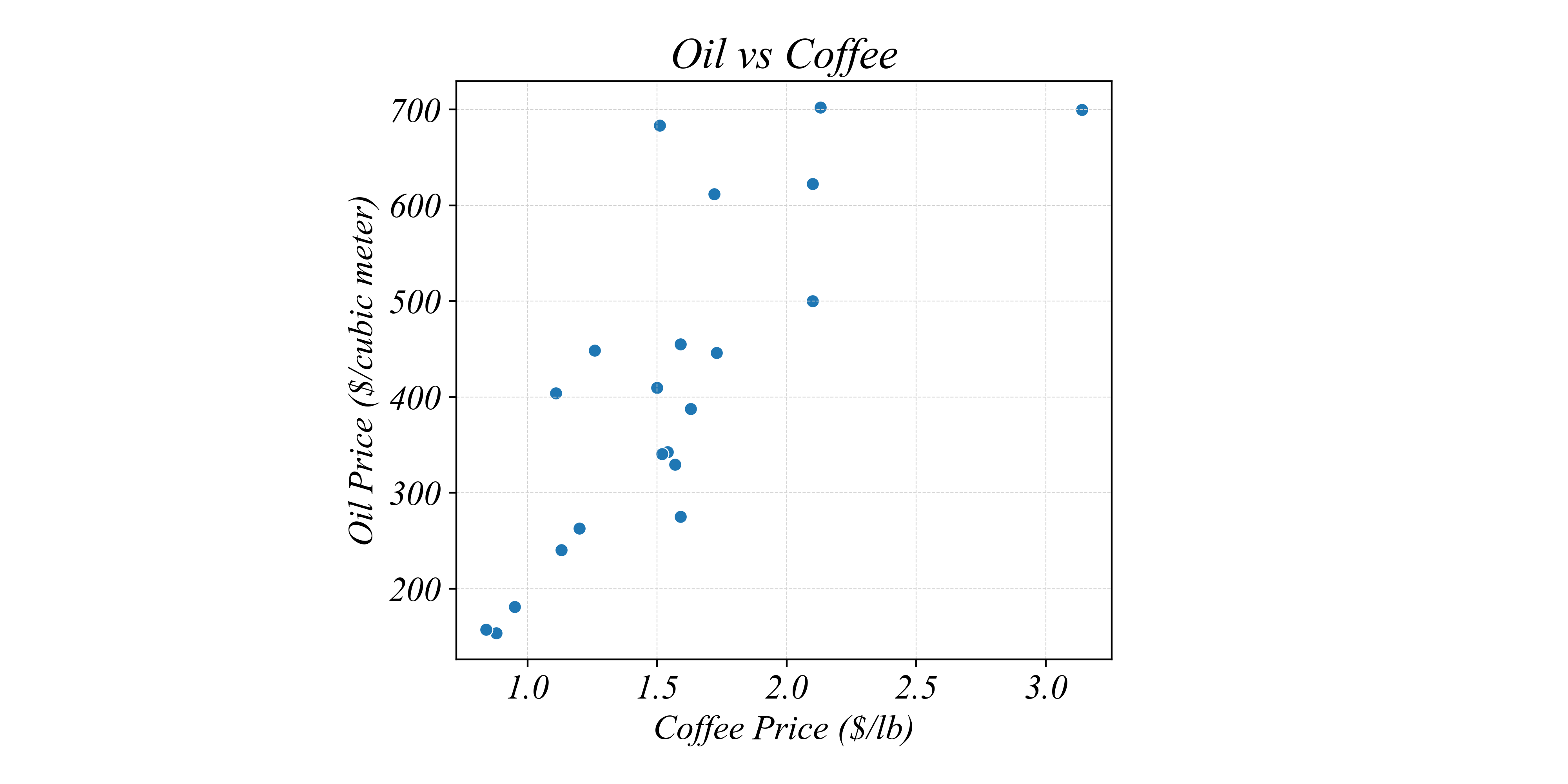
> a Scatterplot can show the relationship between two variables through time
Bivariate Relationships: Timeseries
Does the price of oil determine the price of coffee?
> a Scatterplot can only show associations not causation :(