| id | status |
|---|---|
| 1 | Employed |
| 2 | Unemployed |
| 3 | Employed |
| 4 | Employed |
| 5 | Unemployed |
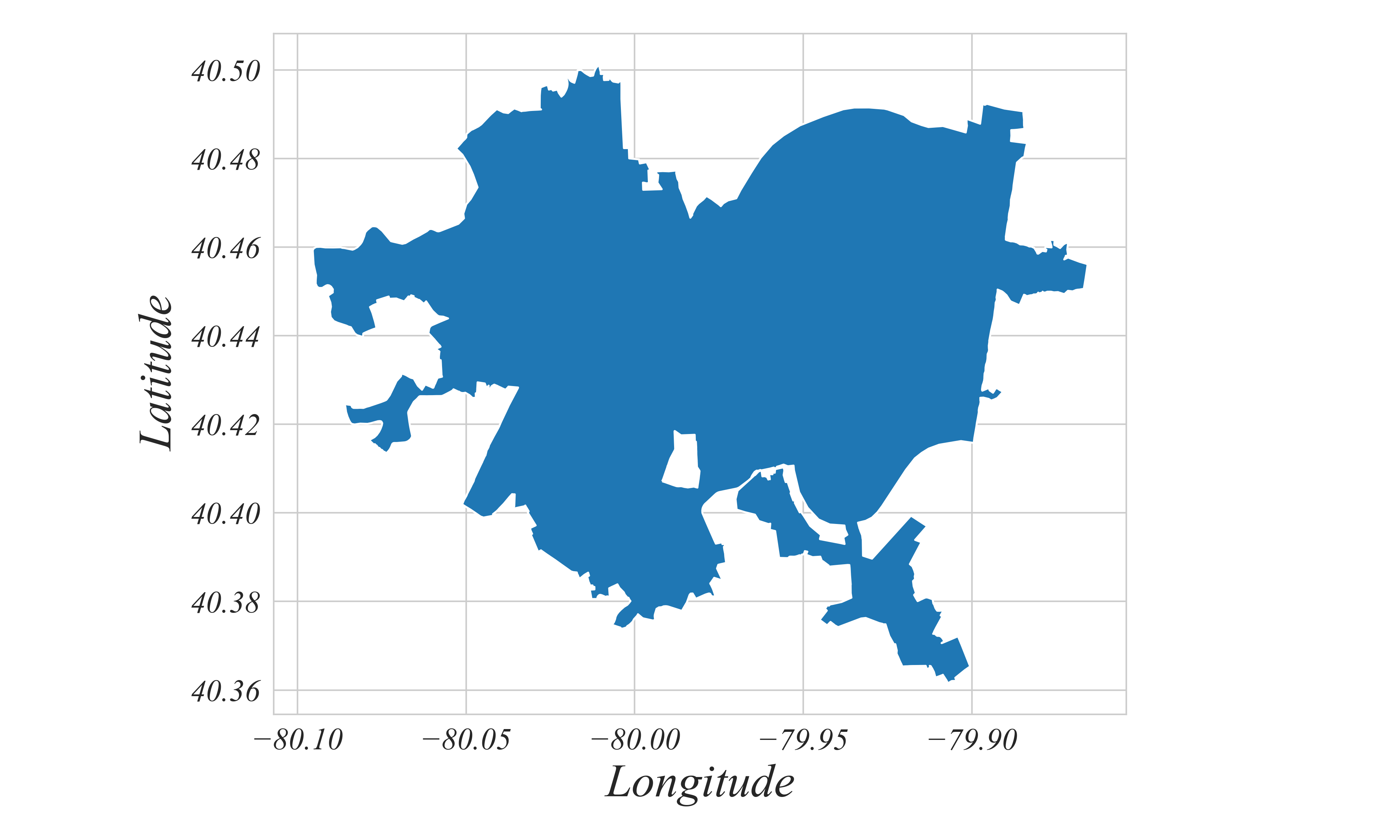
Geographic Data
Maps are (typically) plots on two axis
> a basic map of Pittsburgh
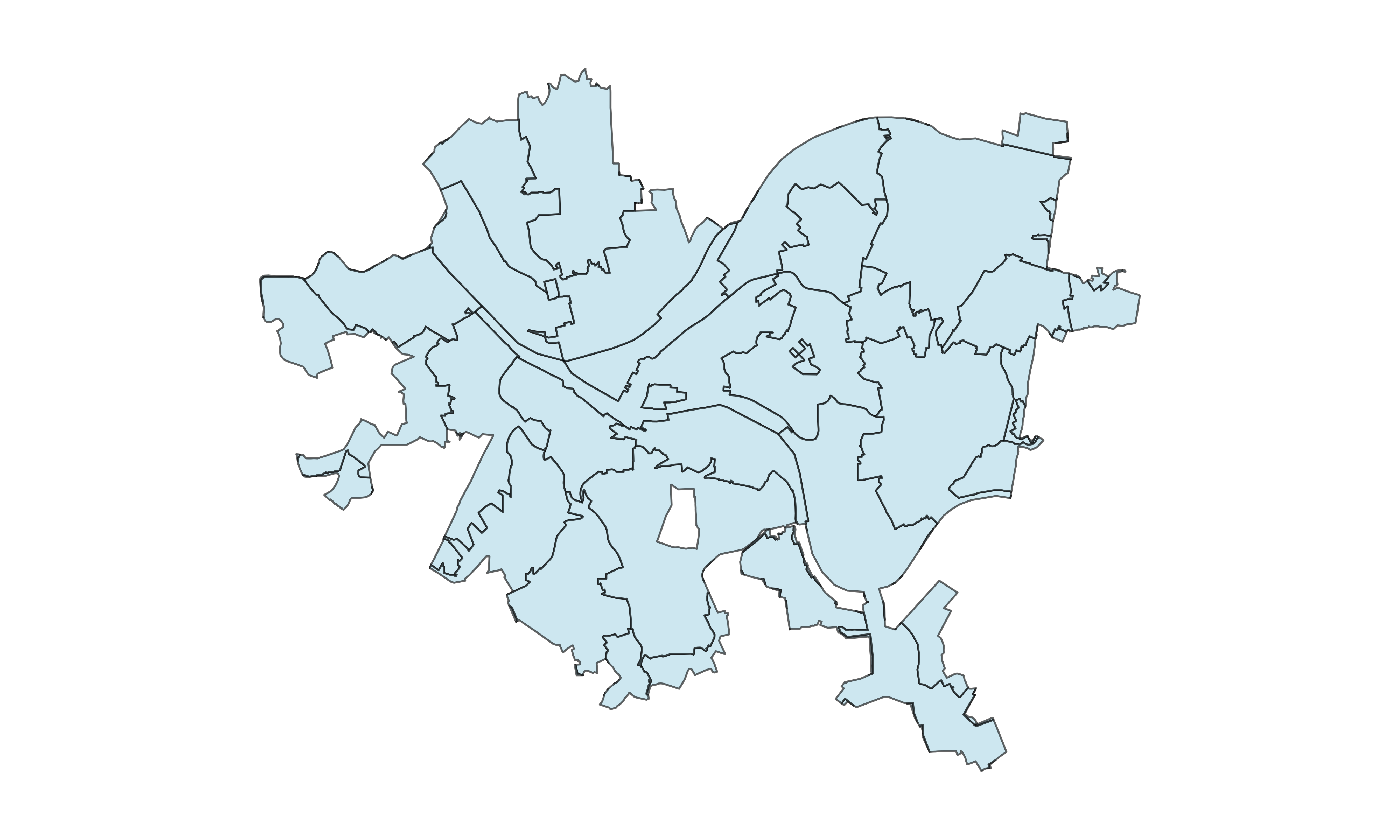
Geographic Data
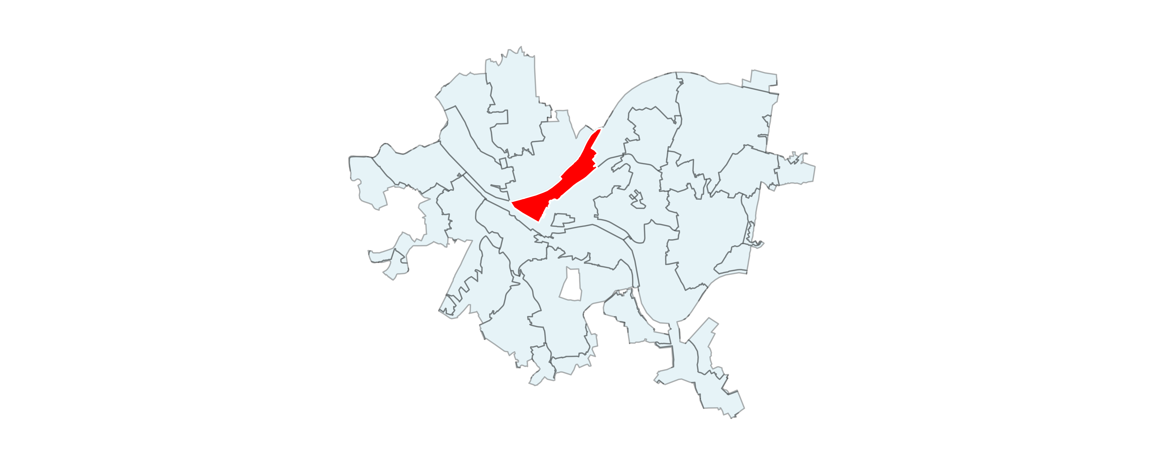
Maps can show any level of detail available in the data
> a map of Pittsburgh Zipcodes
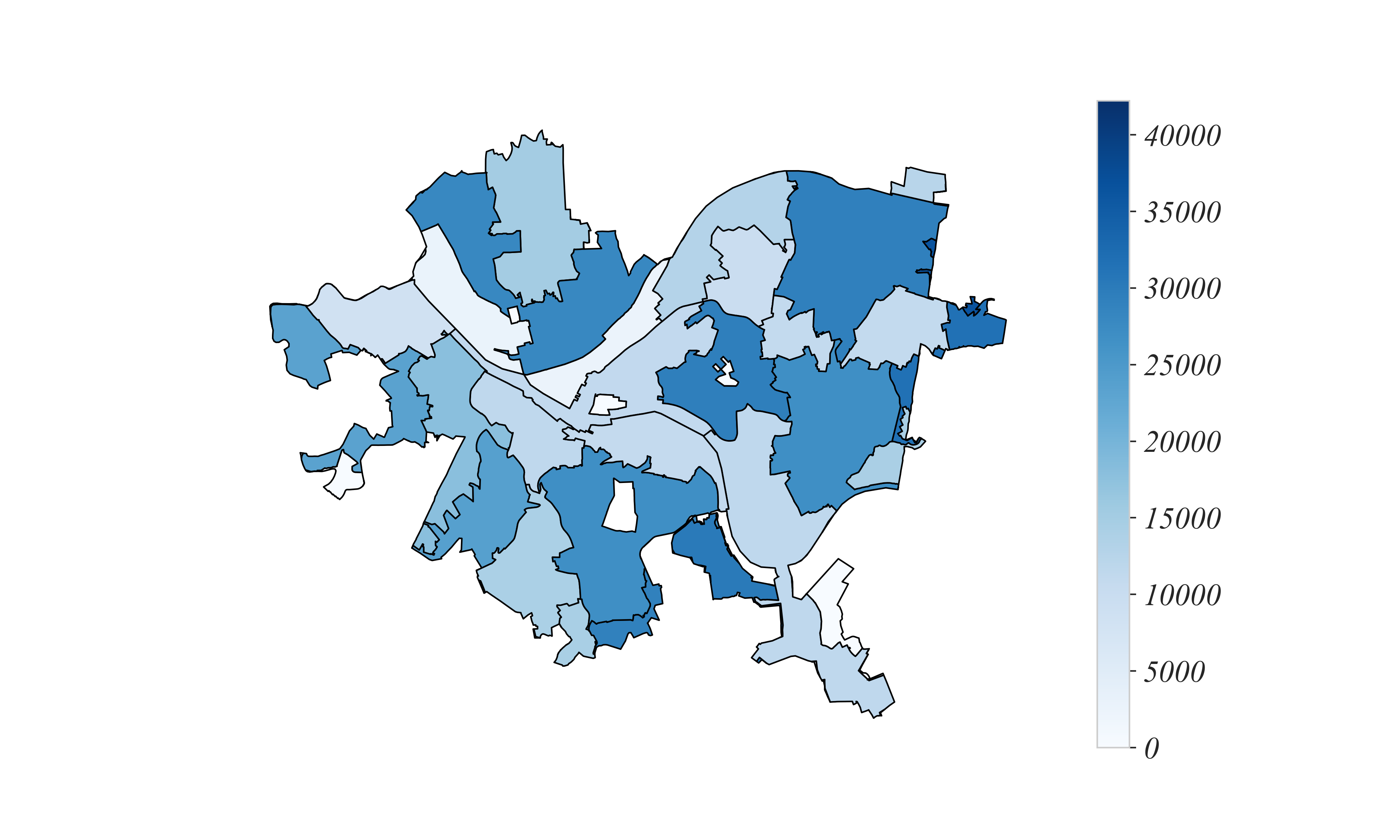
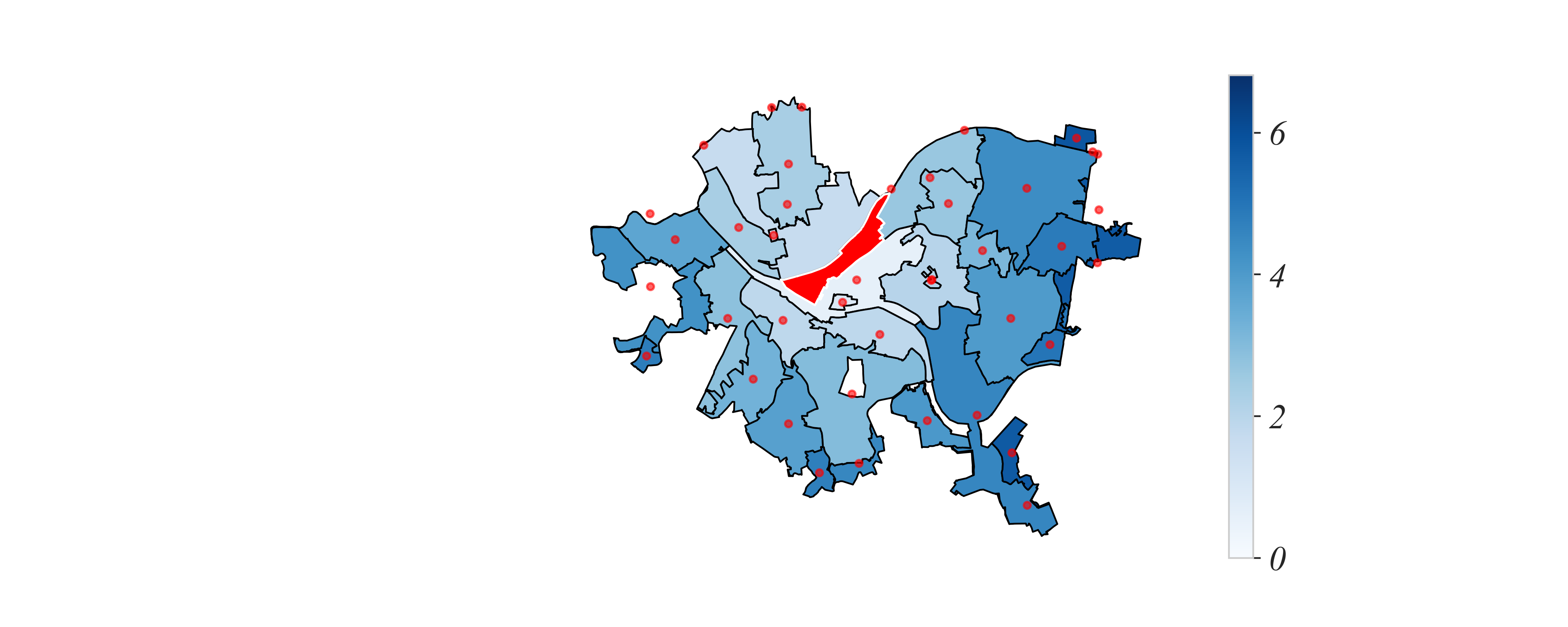
Geographic Data
We can add information: colors
> a map of Pittsburgh Zipcode populations
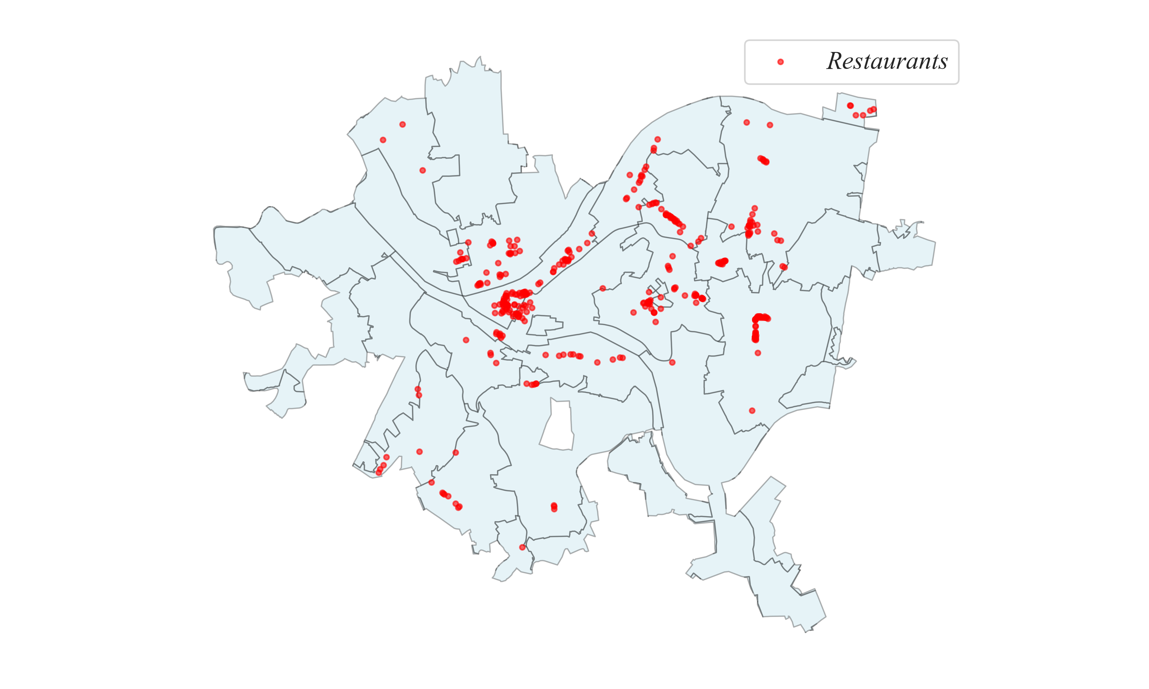
Geographic Data
Maps can also show points
> some restaurants in Pittsburgh!
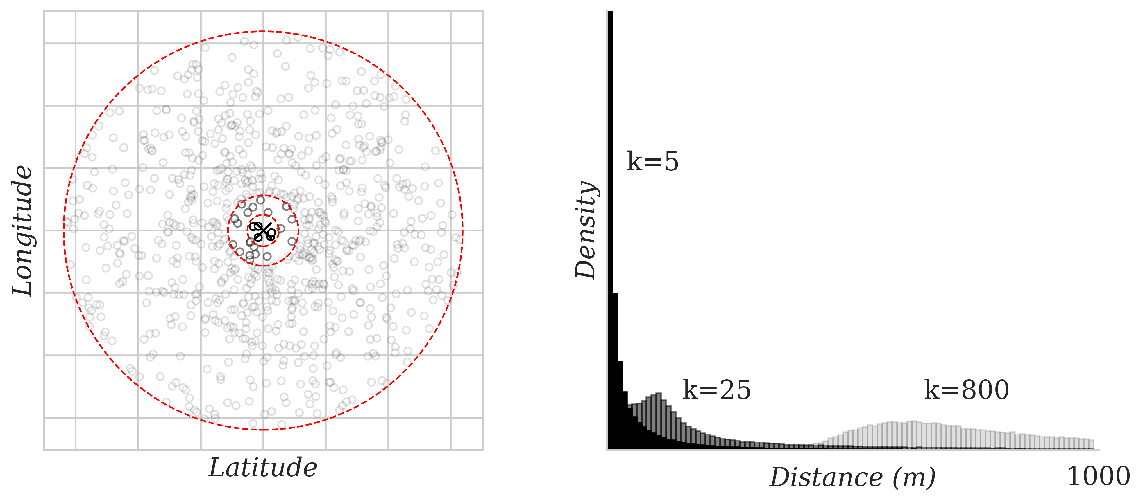
Geographic Data Example: Weidman (2024)
My dissertation involved measuring distances between voters
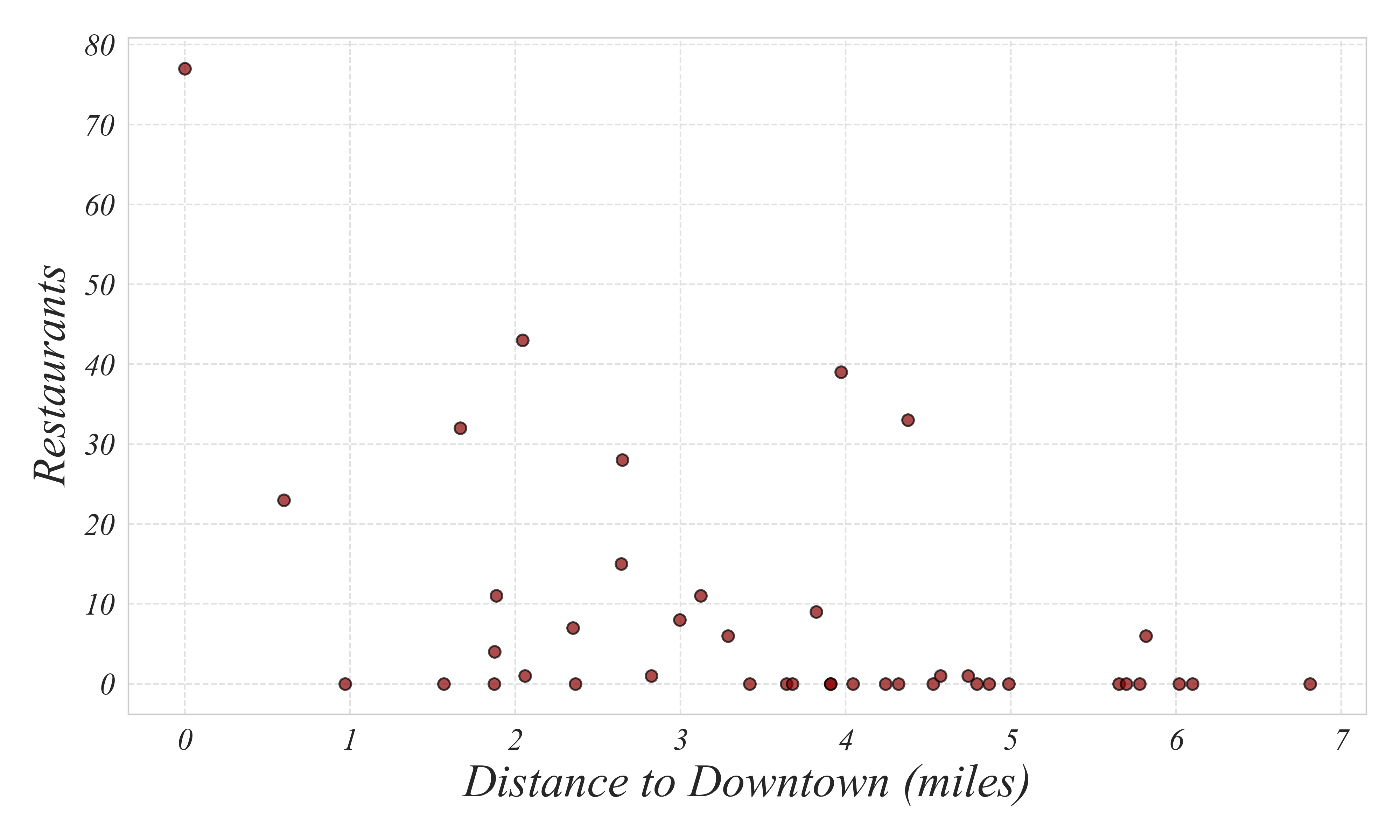
Geographic Data
Are there fewer restaurants further from downtown Pittsburgh?
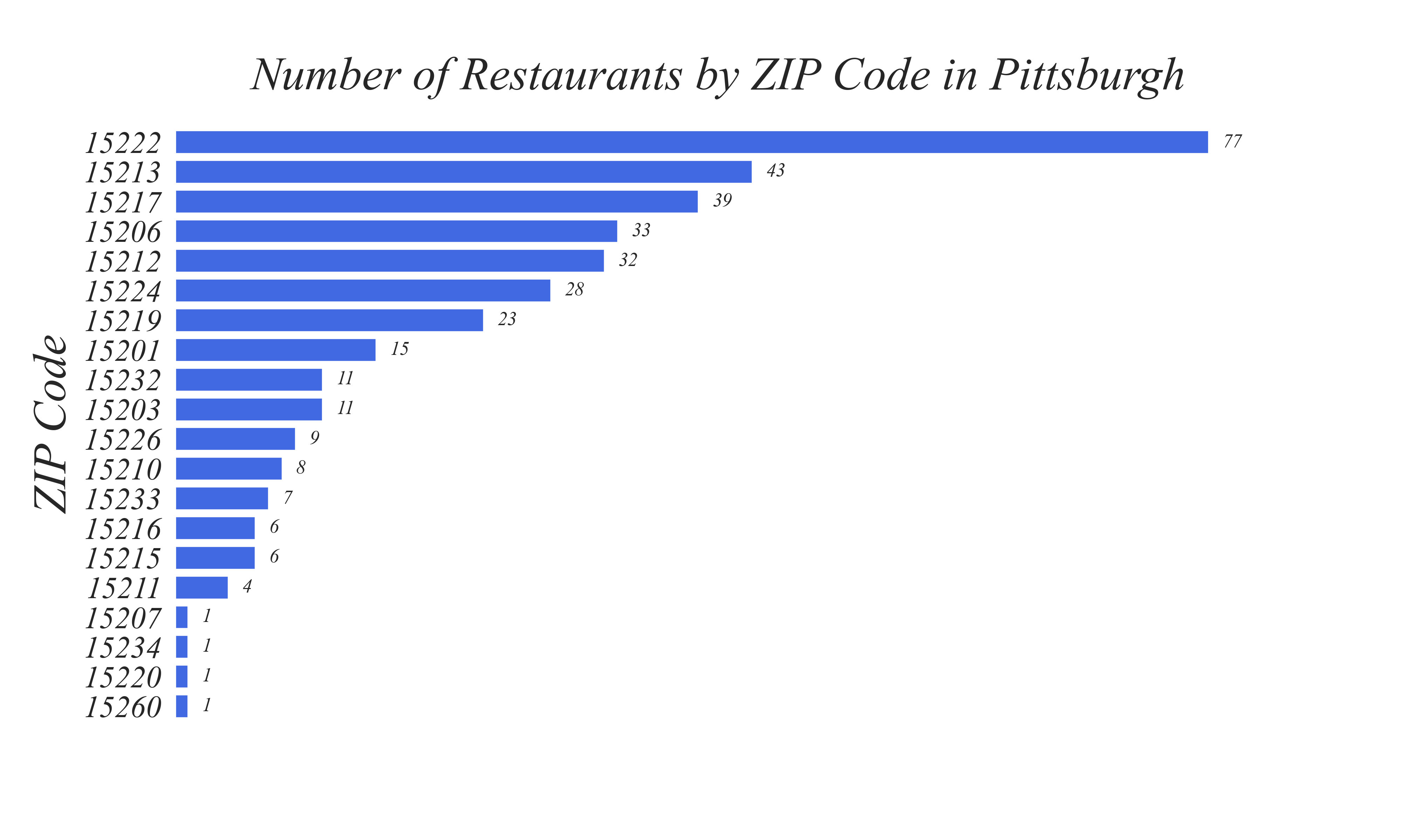
Geographic Data
Subquestion 1: how many restaurants are in each Pittsburgh zipcode?
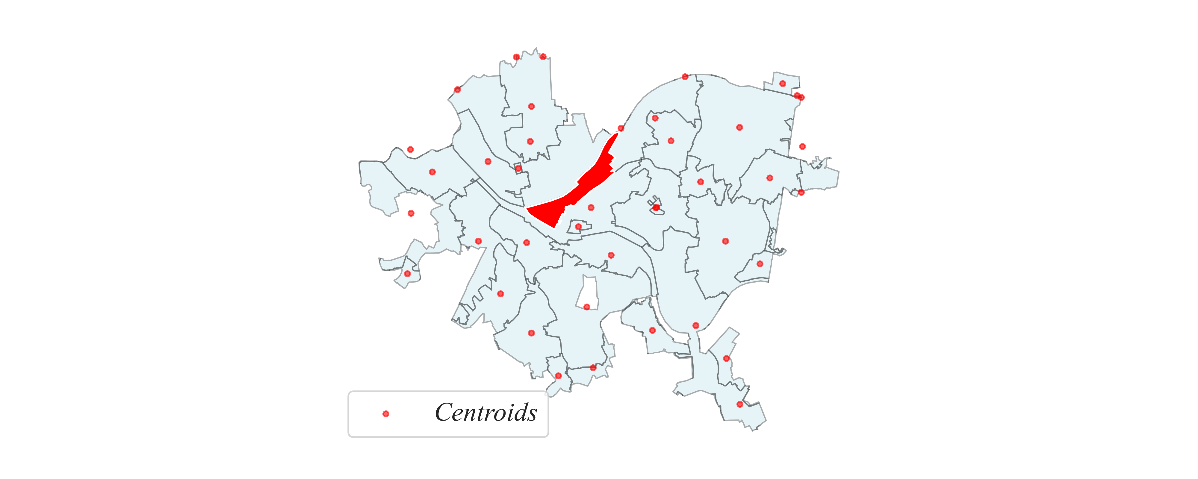
Geographic Data
Subquestion 2: how far is each zipcode from downtown?
> measure from the center (centroid) of the zipcode
Geographic Data
Subquestion 2: how far is each zipcode from downtown?
> measure from the center (centroid) of the zipcode
Geographic Data
Subquestion 2: how far is each zipcode from downtown?
> what’s the distribution?
Geographic Data
Subquestion 2: how far is each zipcode from downtown?
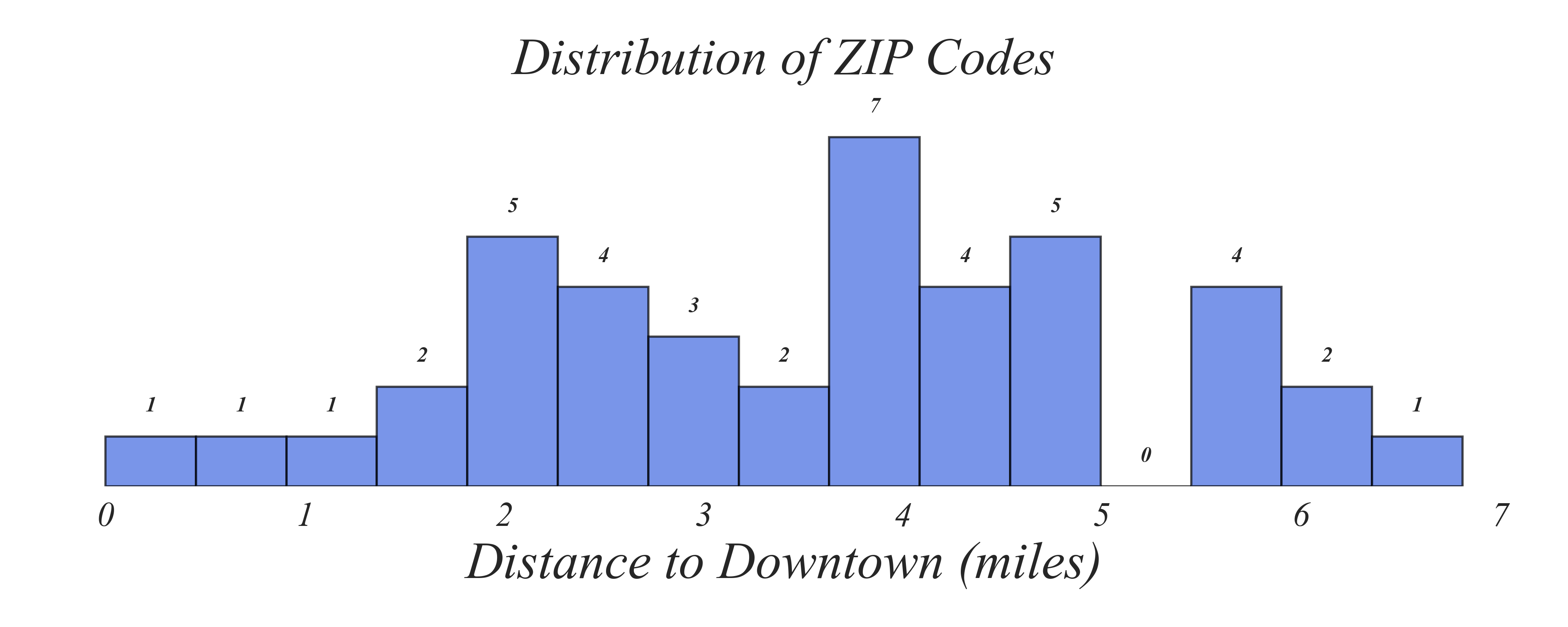
> we now have enough to answer our main question!
Geographic Data
Are there fewer restaurants in areas further from downtown Pittsburgh?
Exercise 1: Employment Status
What 1) are the dimensions of this dataset, and 2) an effecitve visualization?
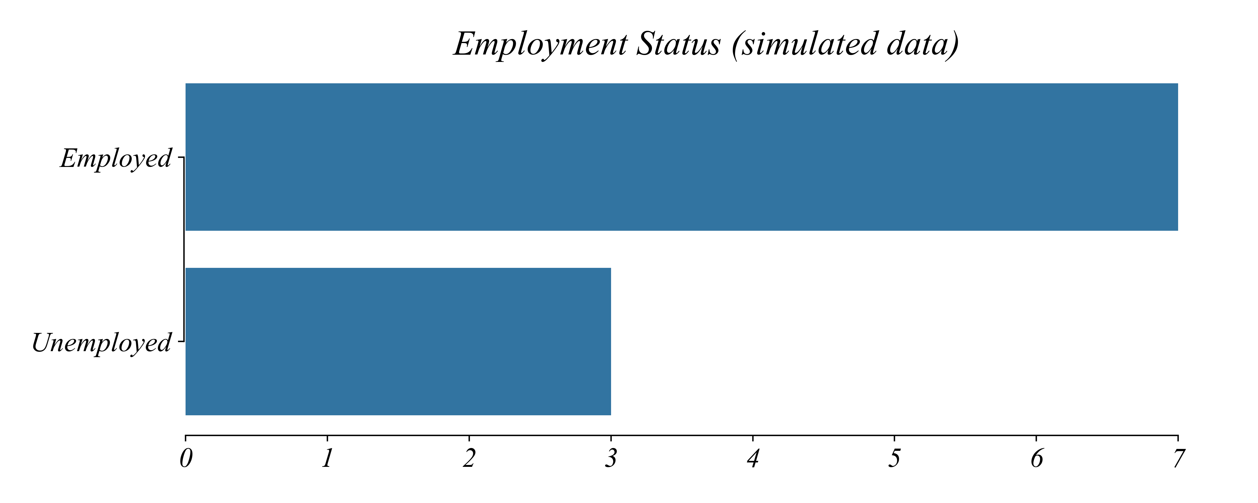
A Barplot effectively visualizes
- Cross-Sectional
- Binary Categorical
- Univeriate
Exercise 2: Employment Industry
What 1) are the dimensions of this dataset, and 2) an effecitve visualization?
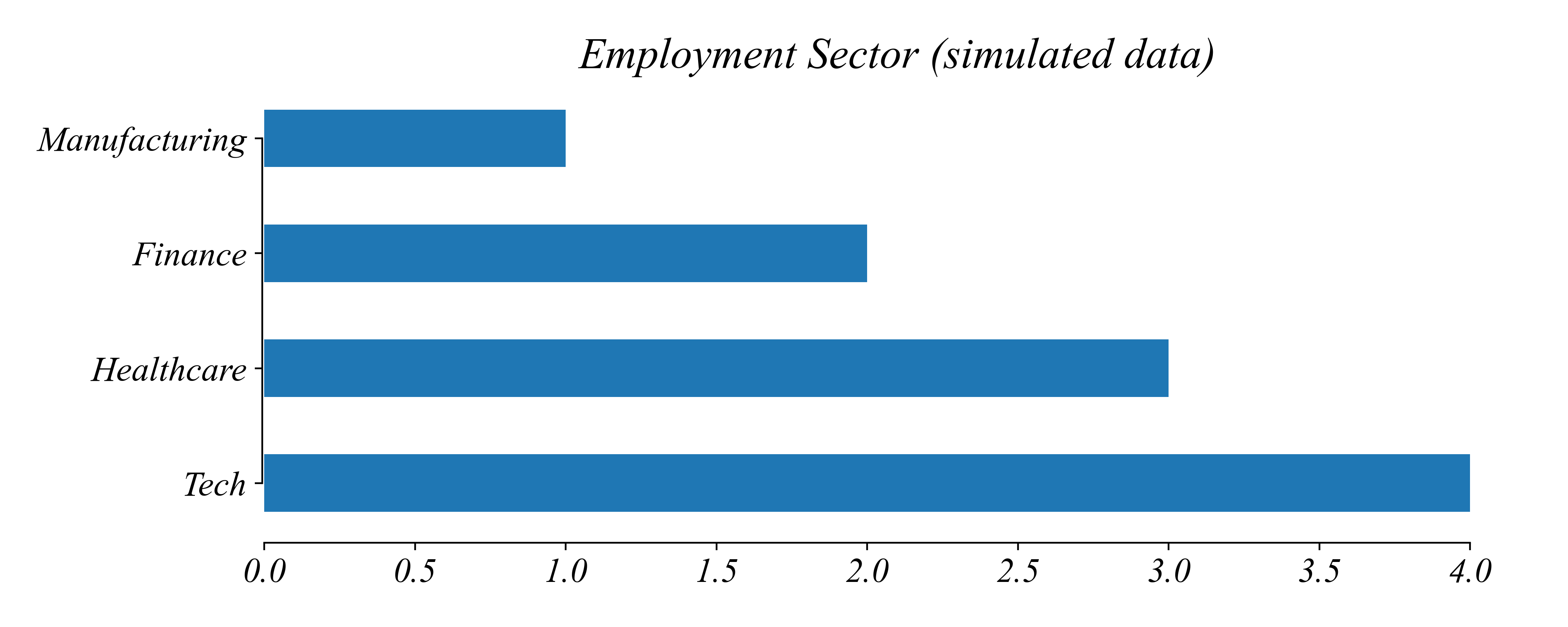
A Barplot effectively visualizes
- Cross-Sectional
- Nominal Categorical
- Univeriate
Exercise 3: Educational Attainment
What 1) are the dimensions of this dataset, and 2) an effecitve visualization?
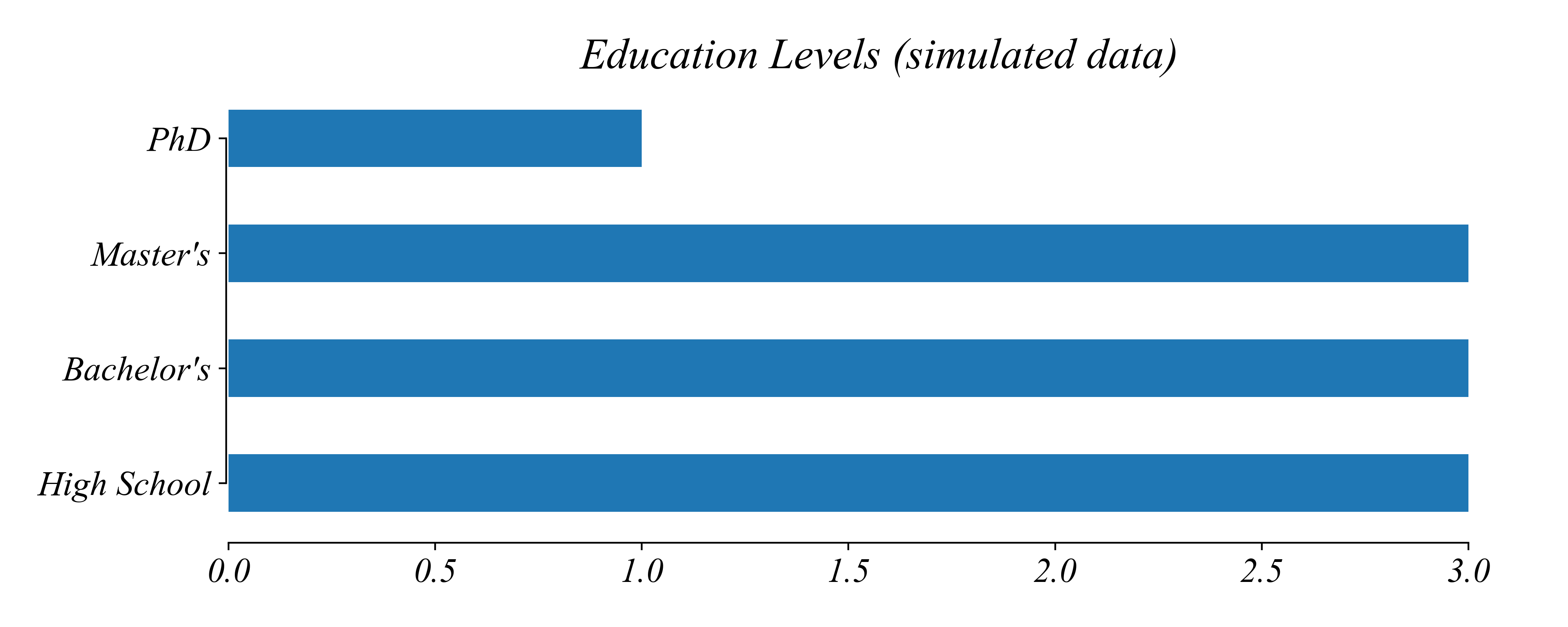
A Barplot (or histogram) effectively visualizes
- Cross-Sectional
- Ordinal Categorical
- Univeriate
Exercise 4: Annual Income
What 1) are the dimensions of this dataset, and 2) an effecitve visualization?
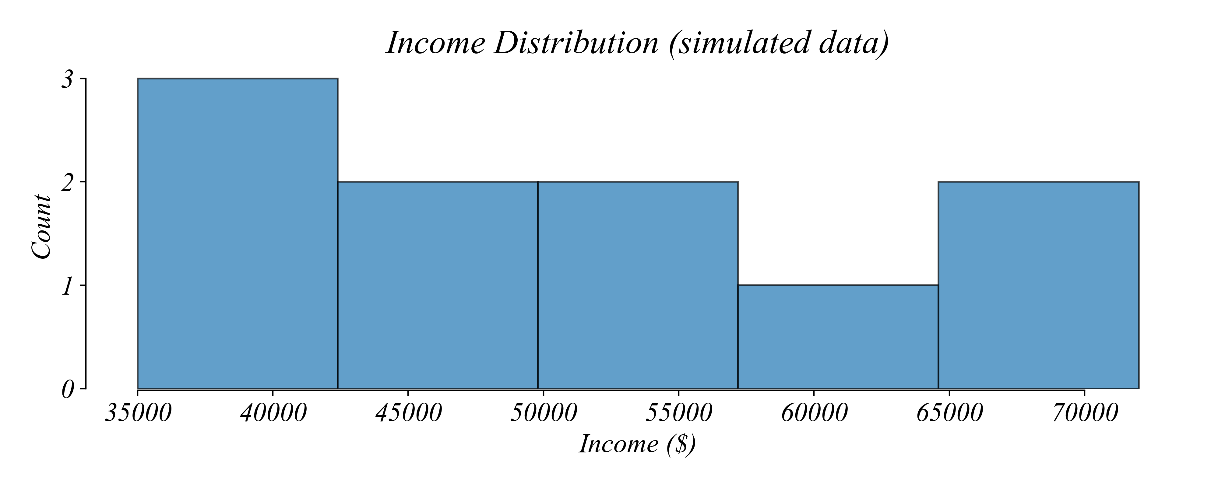
A Histogram (or boxplot) effectively visualizes
- Cross-Sectional
- Numerical
- Univeriate
Exercise 6: Income by Education
What 1) are the dimensions of this dataset, and 2) an effecitve visualization?
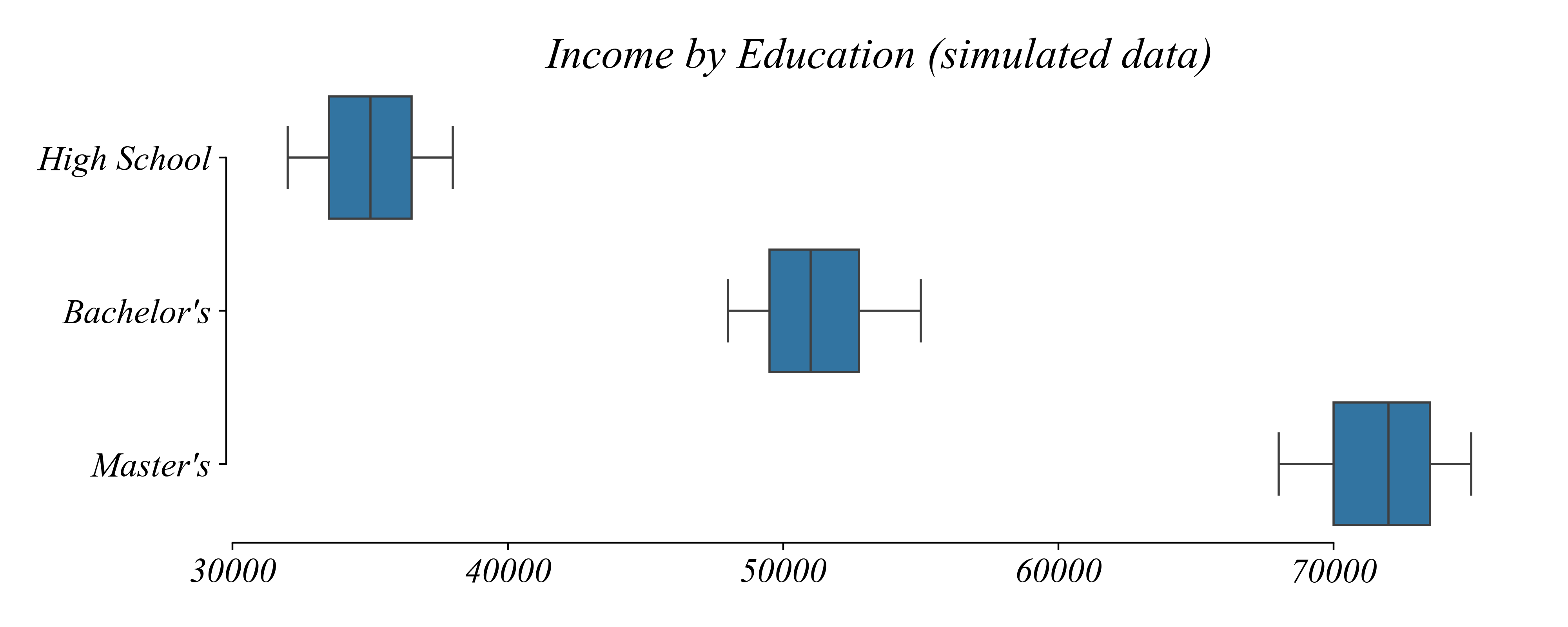
A Multi-Boxplot (or multi-linegraph-histogram) effectively visualizes
- Cross-Sectional
- Numerical by Categorical
- Biveriate
Exercise 7: Income by Age
What 1) are the dimensions of this dataset, and 2) an effecitve visualization?
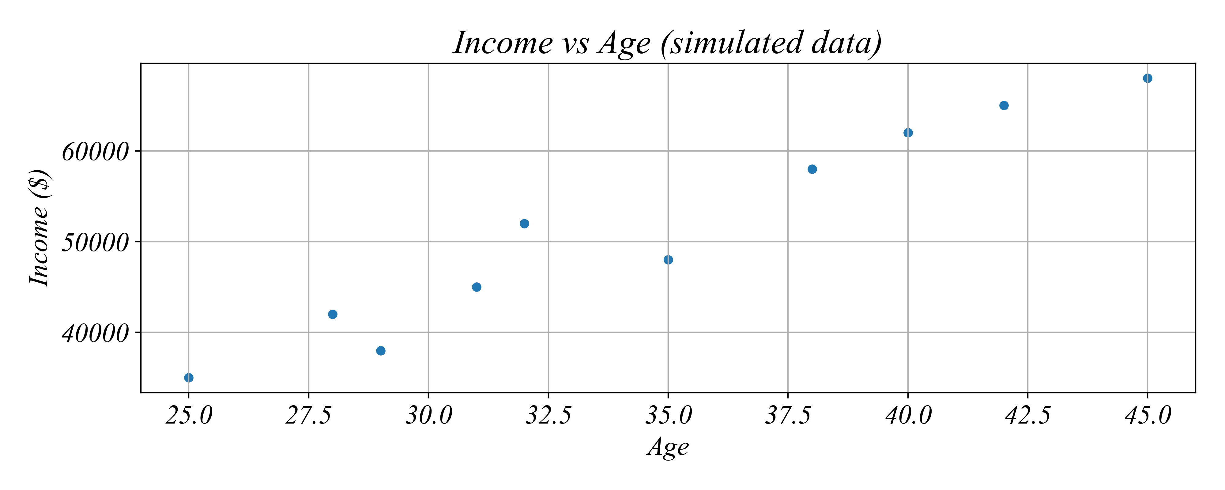
A Scatterplot effectively visualizes
- Cross-Sectional
- Numerical
- Biveriate
Exercise 8: GDP After 2015
What 1) are the dimensions of this dataset, and 2) an effecitve visualization?
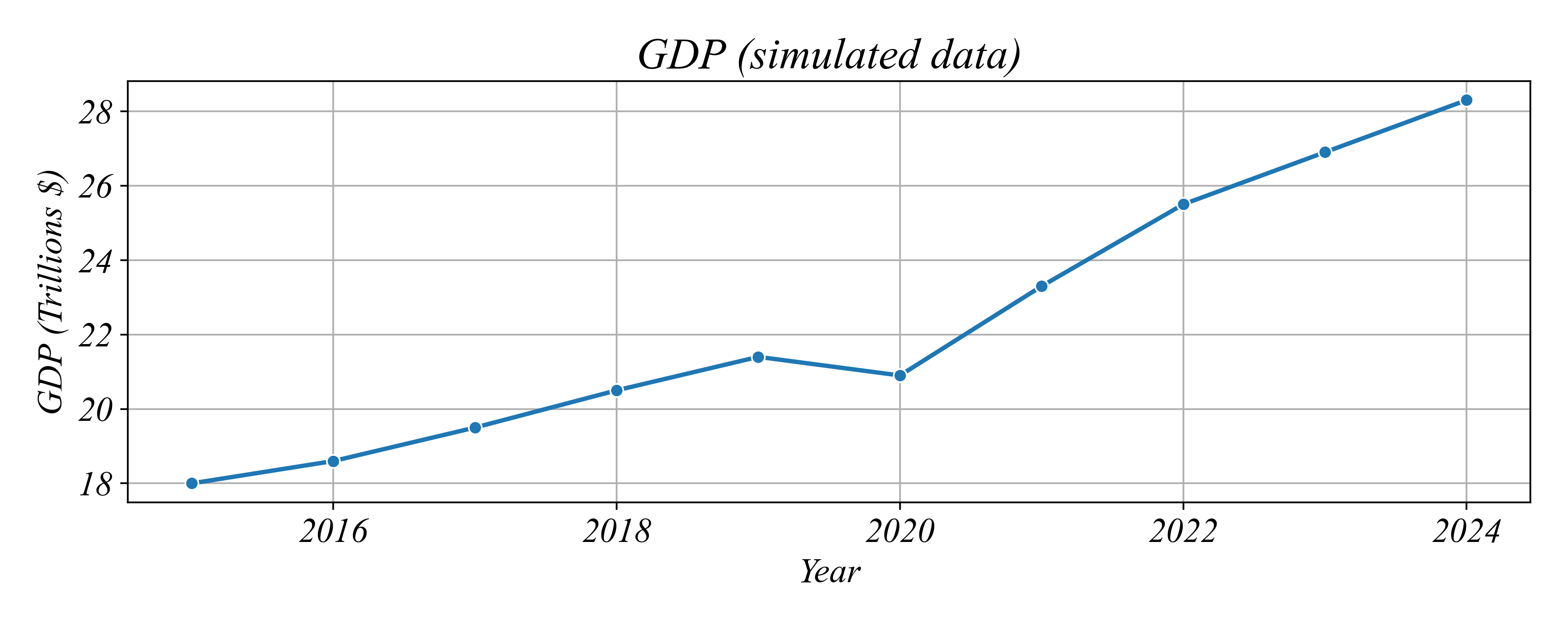
A Linegraph effectively visualizes
- Timeseries
- Numerical
- Univariate
Exercise 9: Inflation and Unemployment
What 1) are the dimensions of this dataset, and 2) an effecitve visualization?
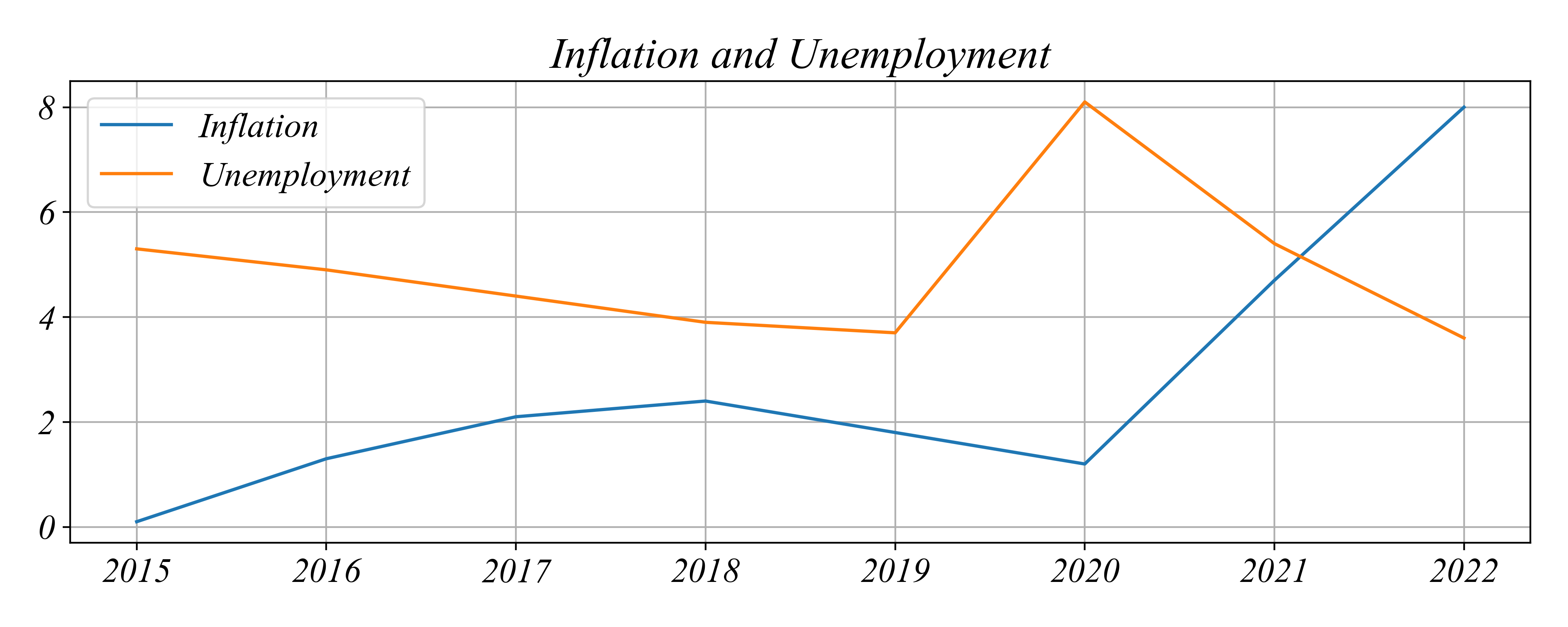
A Scatterplot (or sometimes a multilinegraph) effectively visualizes
- Timeseries
- Numerical
- Bivariate
Exercise 9: Inflation and Unemployment
What 1) are the dimensions of this dataset, and 2) an effecitve visualization?
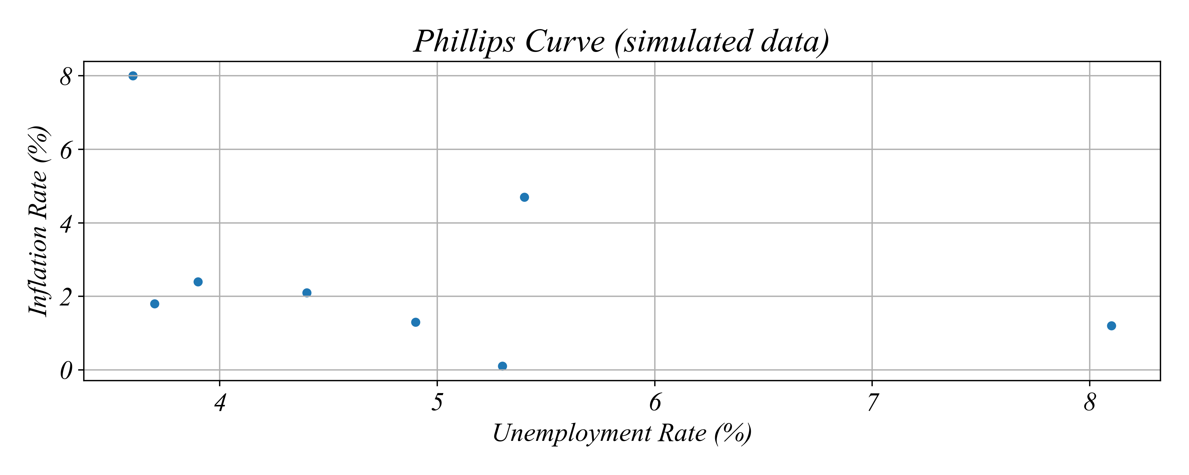
A Scatterplot (or sometimes a multilinegraph) effectively visualizes
- Timeseries
- Numerical
- Bivariate
Exercise 10: GDP Growth by Country
What 1) are the dimensions of this dataset, and 2) an effecitve visualization?
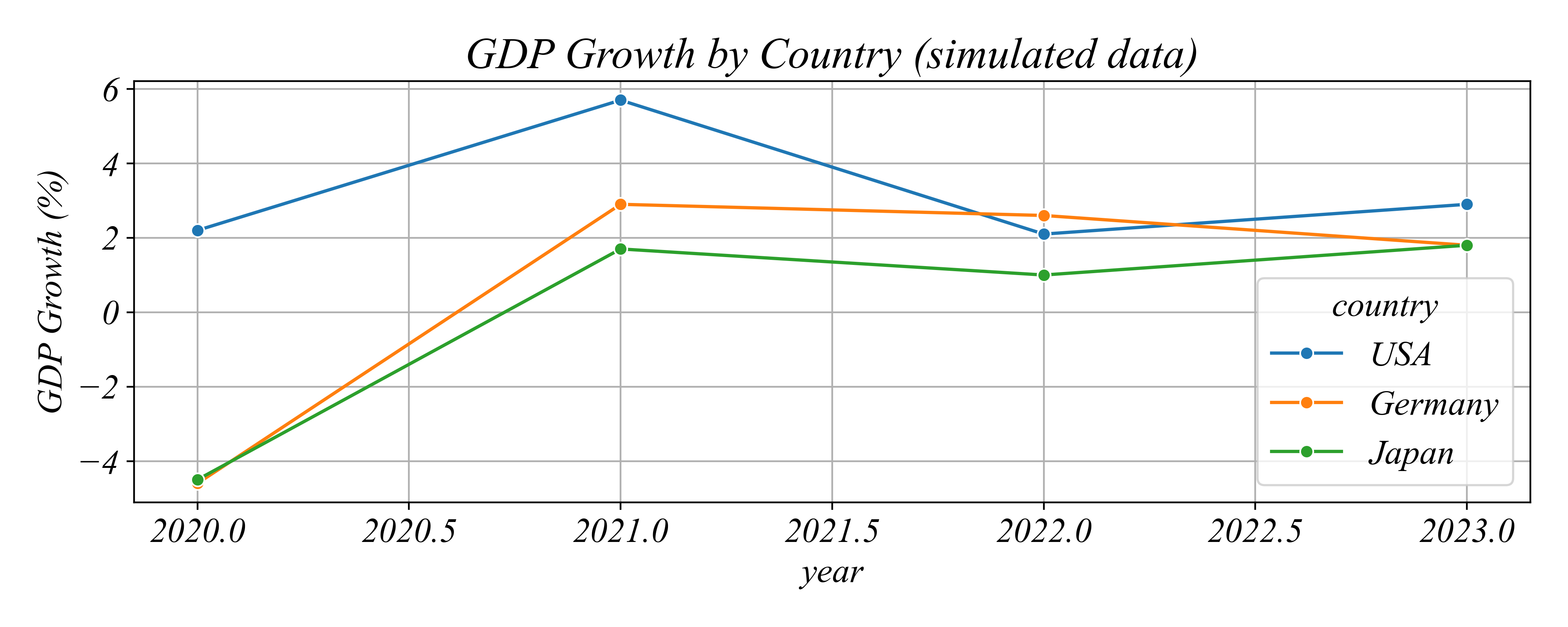
A Multi-Linegraph (or sometimes a scatterplot) effectively visualizes
- Panel
- Numerical
- Univariate