Panel Data: All-Country Line Plot
Are countries drinking more coffee?
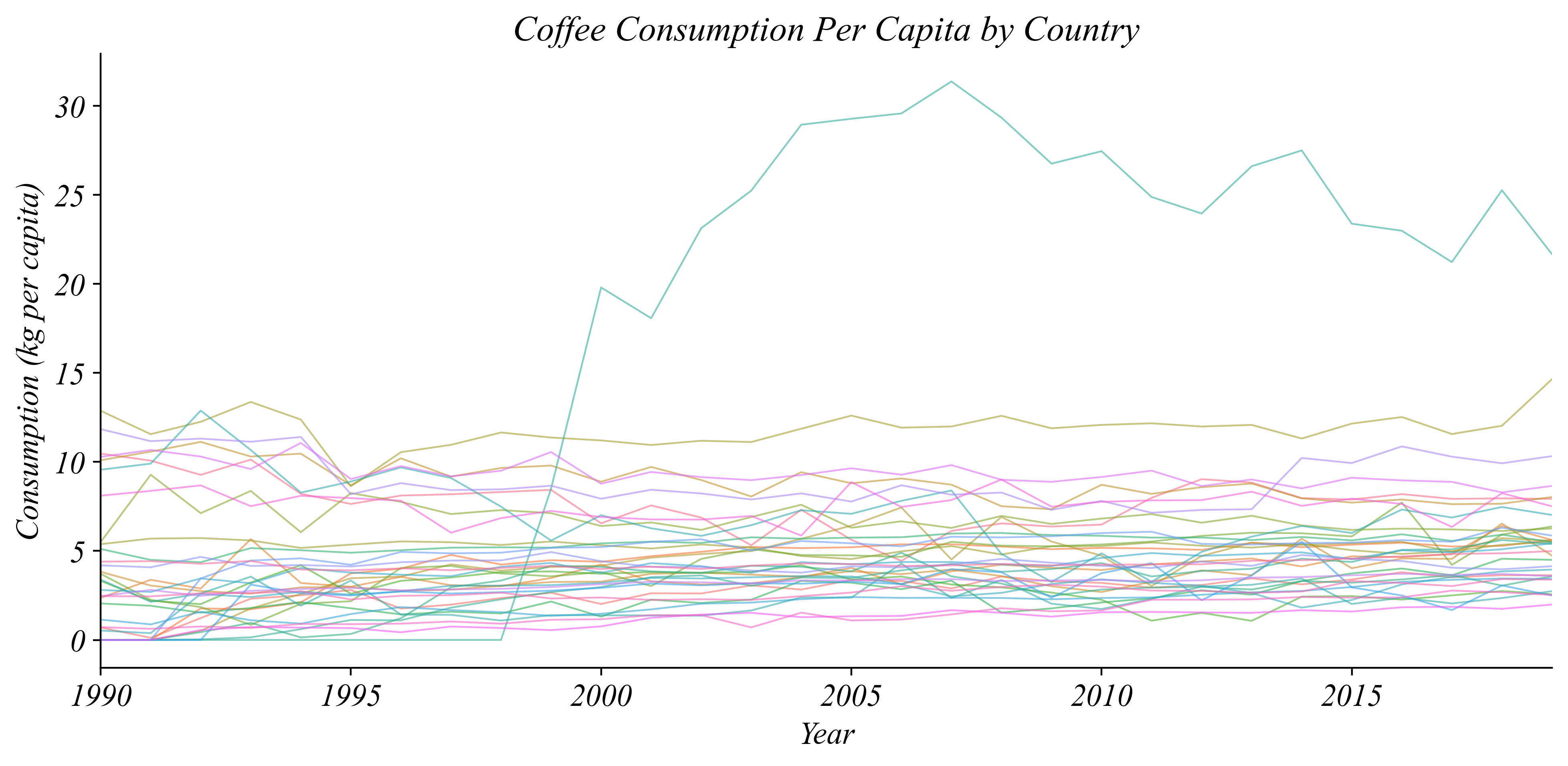
> readable, but not great for answering our question
Panel Data: Coffee Consumption Per Capita
Is the world drinking more coffee?
> compared to what…?
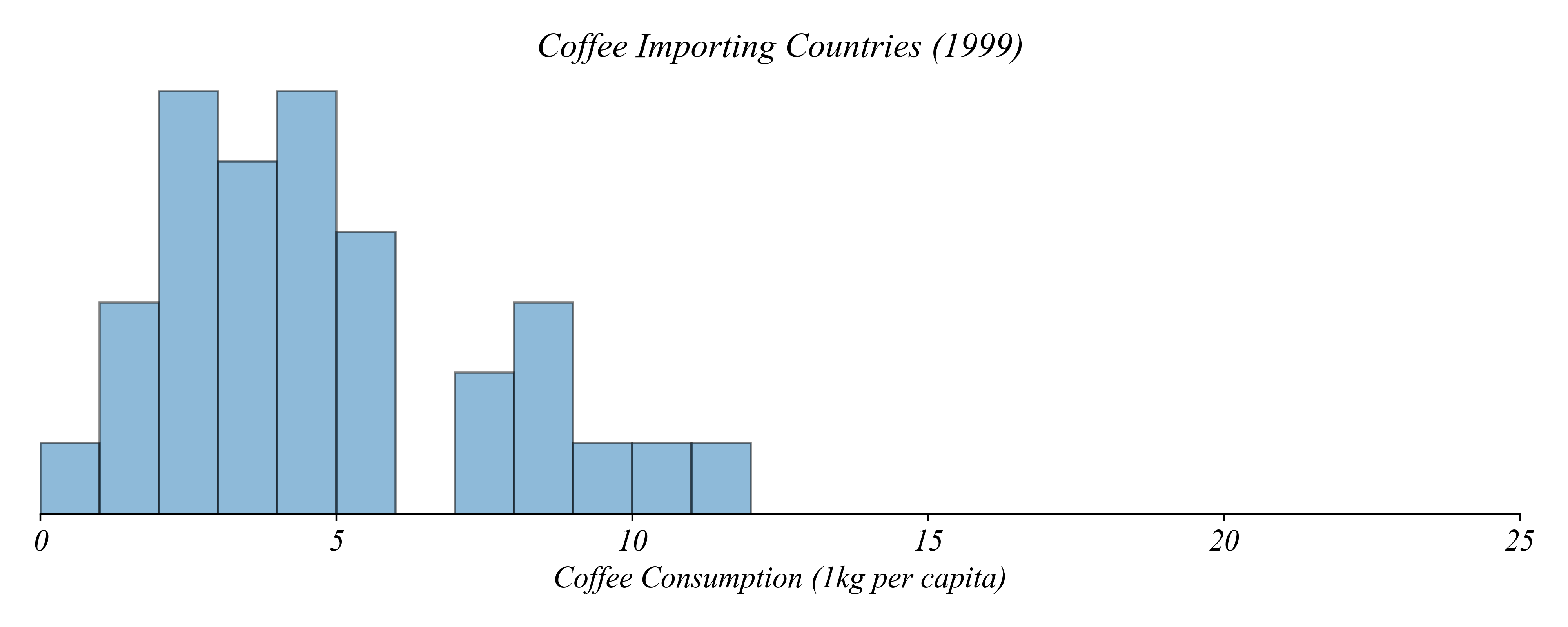
Panel Data: Coffee Consumption Per Capita
Is the world drinking more coffee?
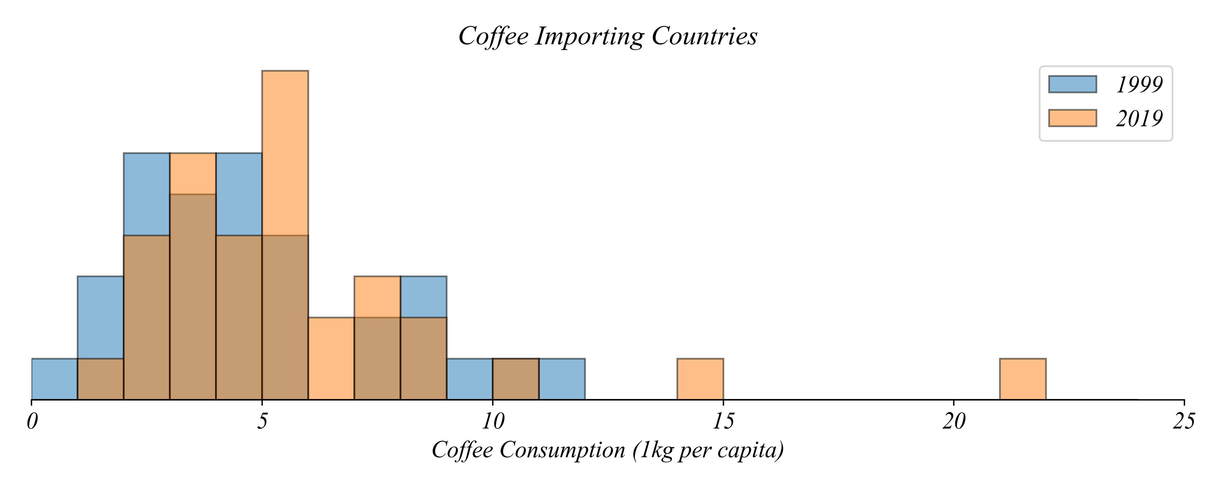
> this is still pretty unclear: histograms aren’t great for comparison
> lets use a multi-boxplot
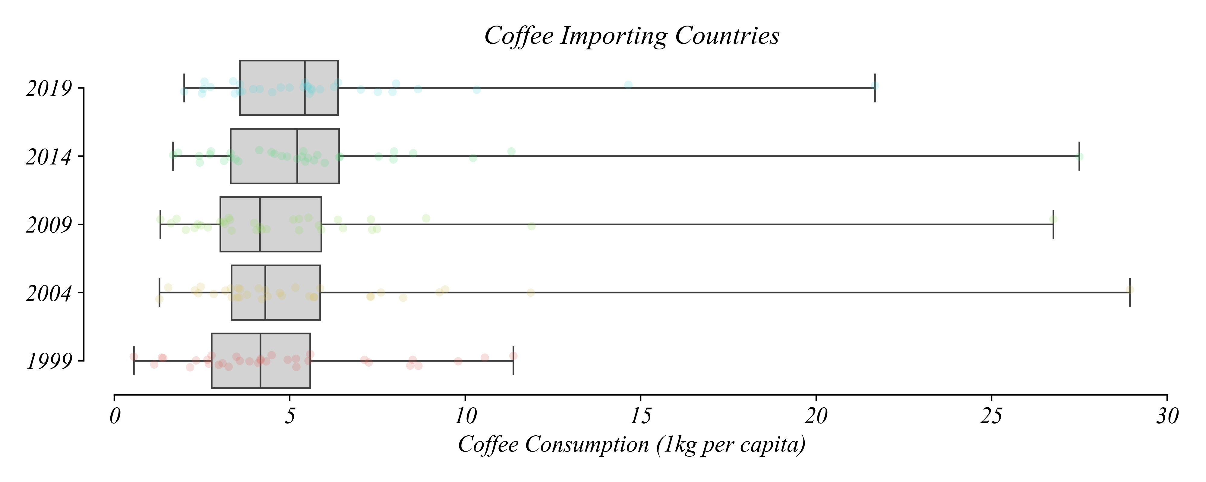
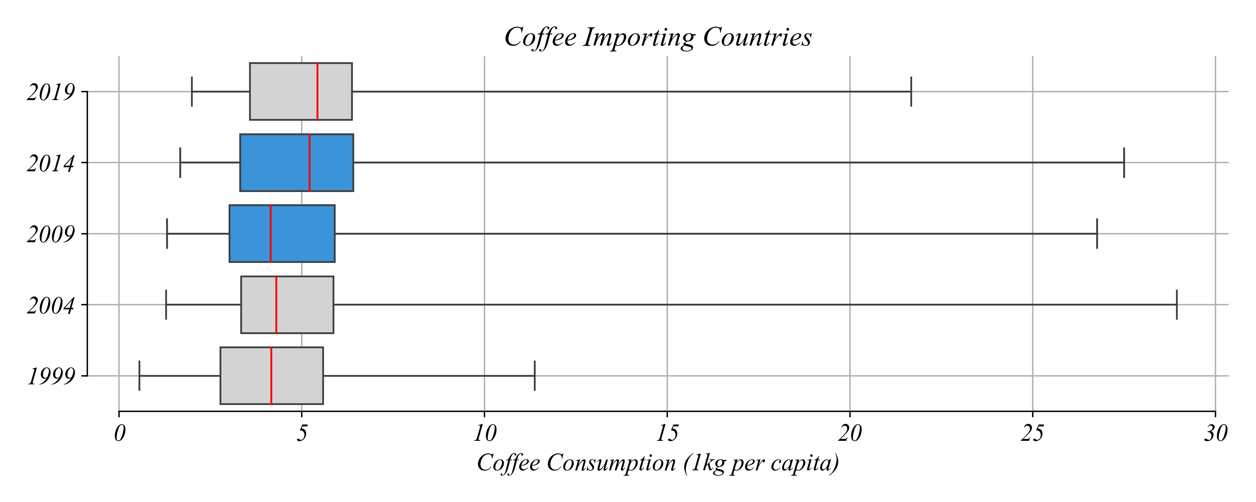
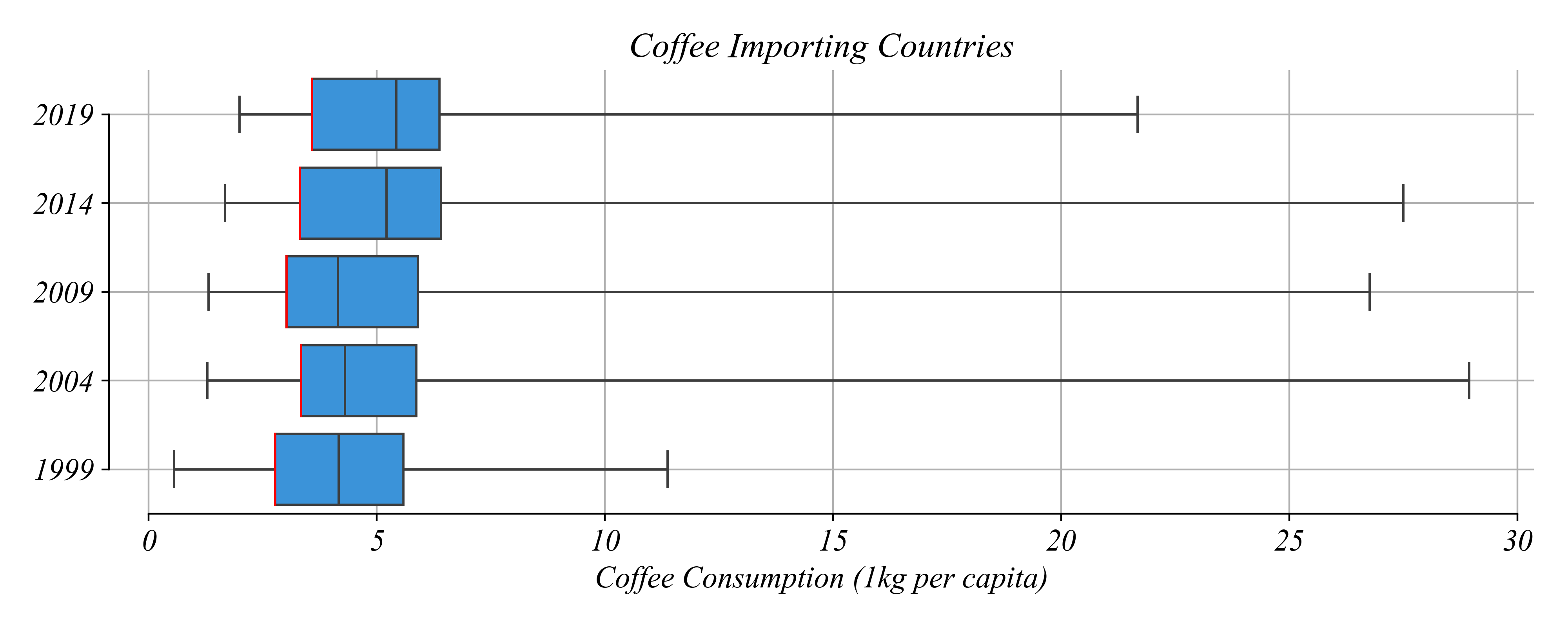
Panel Data: Multi-Boxplots
Is the world drinking more coffee?
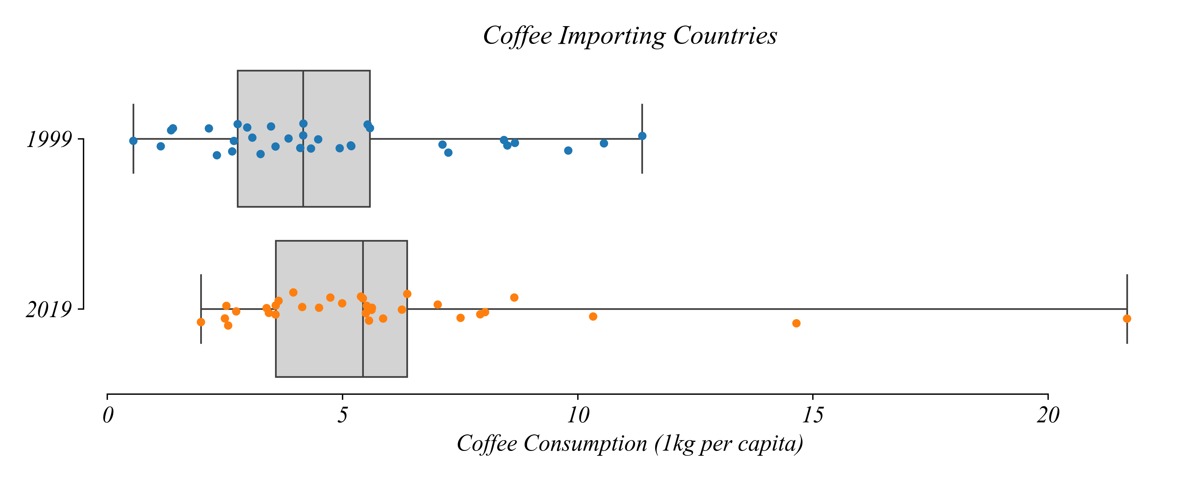
> this is better: it looks like the distribution is shifted higher!
> lets examine the years in between to see how the distribution evolved
Panel Data: Multi-Boxplots
Is the world drinking more coffee?
> lets ask some smaller more focussed questions
Panel Data: Multi-Boxplots
Which years show at least half consuming less than 5 kg per cap?
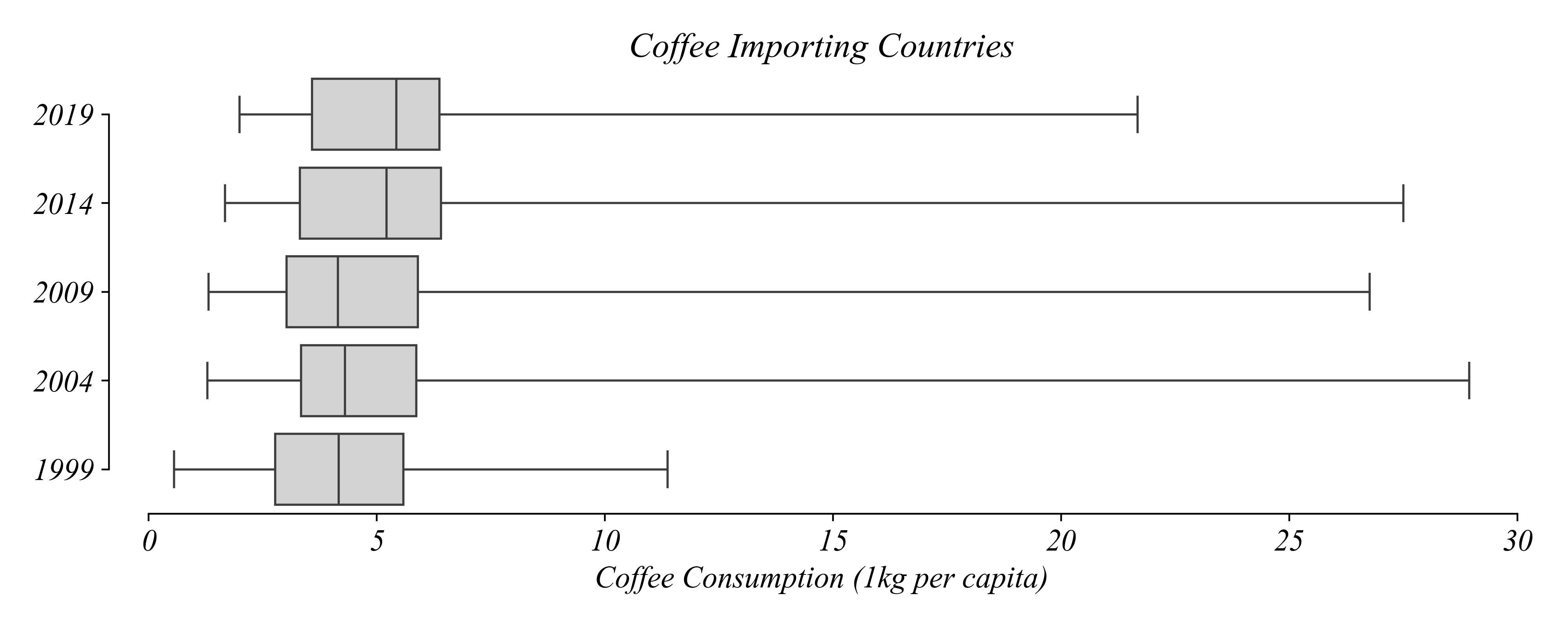
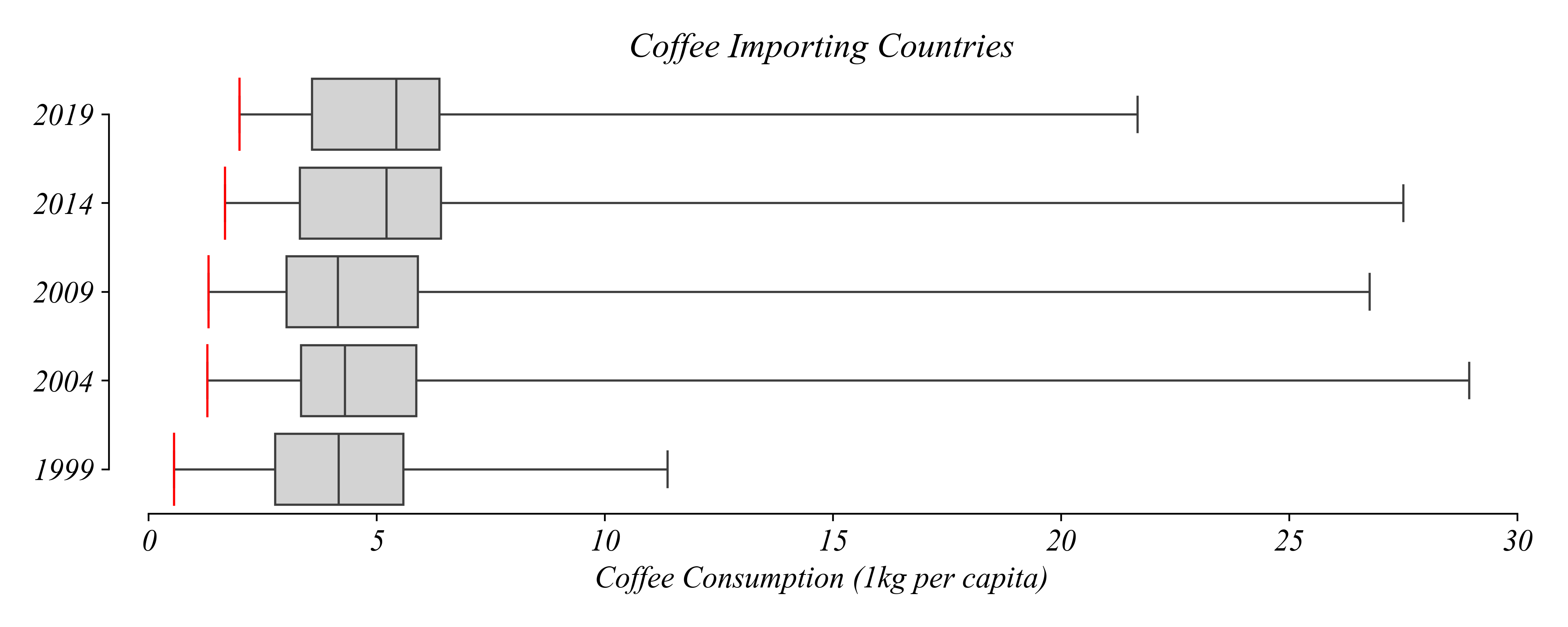
Panel Data: Multi-Boxplots
Which years show at least half consuming less than 5 kg per cap?
> focus on the medians
Panel Data: Multi-Boxplots
Which years show at least half consuming less than 5 kg per cap?
> … when the median is above 5 kg per cap
Panel Data: Multi-Boxplots
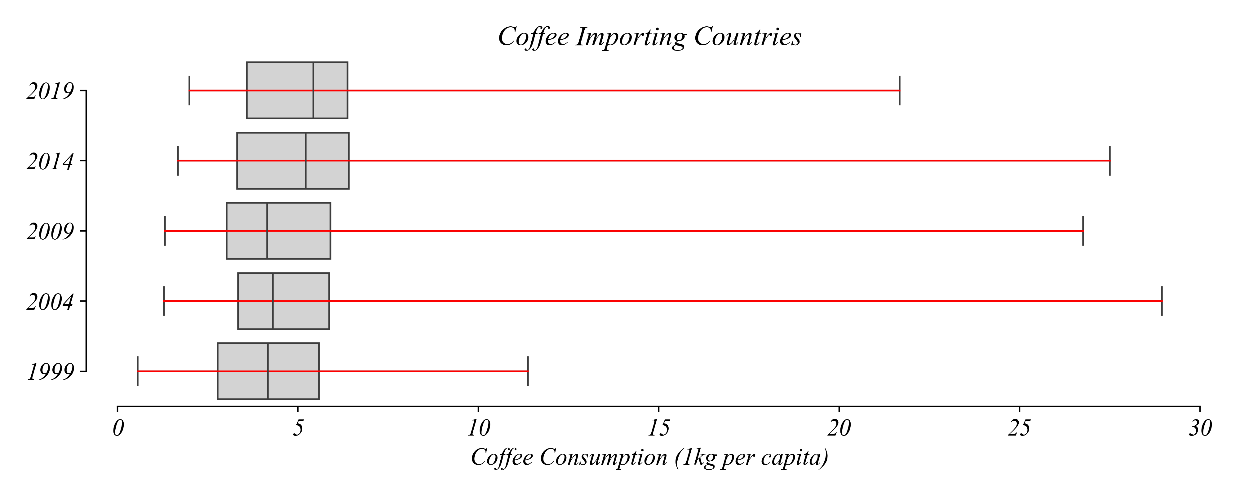
Which years saw the largest jump in the median?
> … a little difficult to see
Panel Data: Multi-Boxplots
Which years saw the largest jump in the median?
> … a little difficult to see
Panel Data: Multi-Boxplots
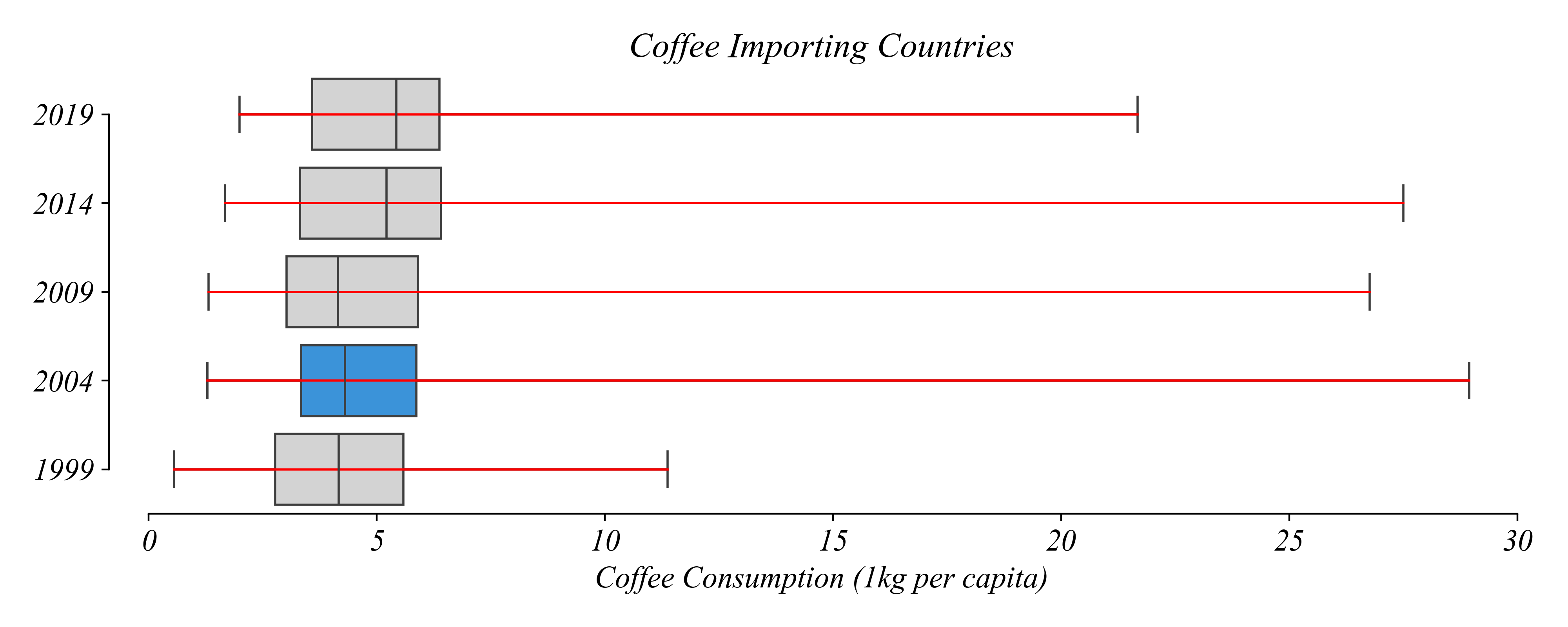
Is the country with the lowest consumption consuming more today?
Panel Data: Multi-Boxplots
Is the country with the lowest consumption consuming more today?
> focus on the minimums
> yes!
Panel Data: Multi-Boxplots
What patterns do we observe about the maximums?
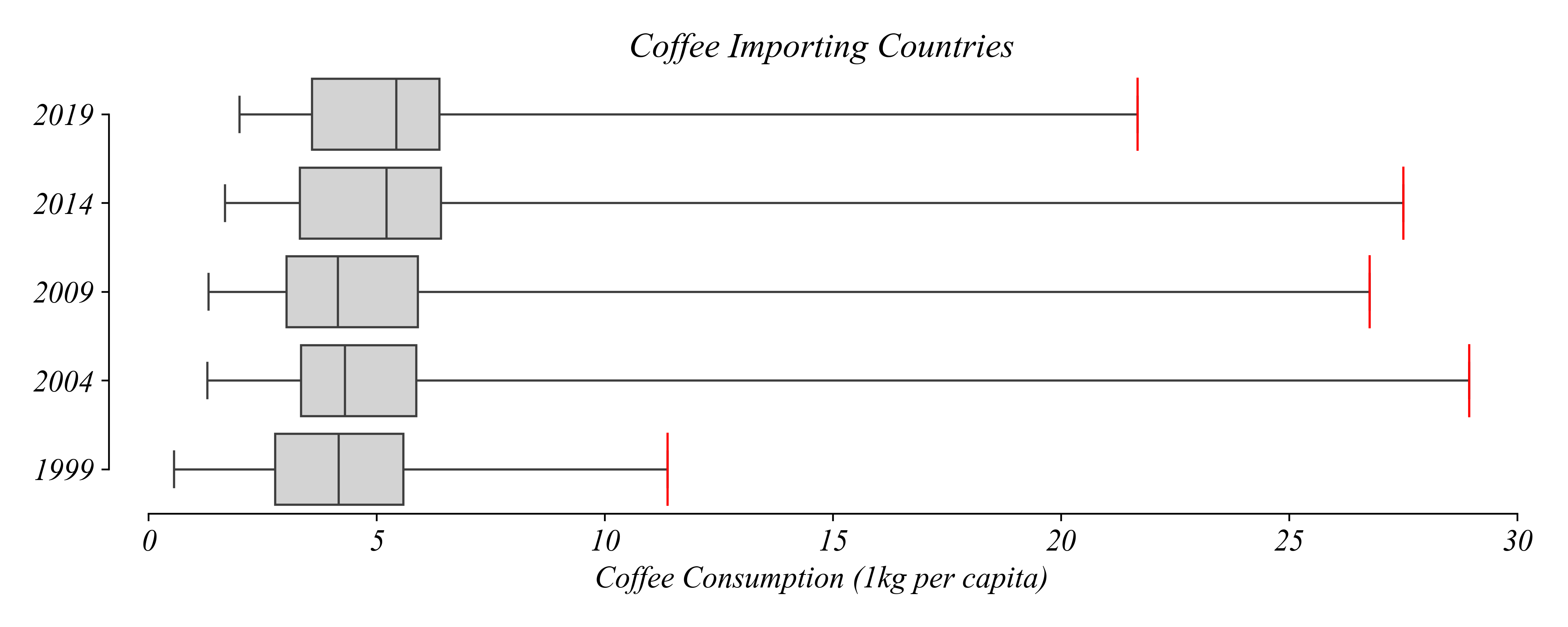
> same with the maximums
Panel Data: Multi-Boxplots
Which years did more than 25% consume less than 5 kg?
Panel Data: Multi-Boxplots
Which years did more than 25% consume less than 5 kg?
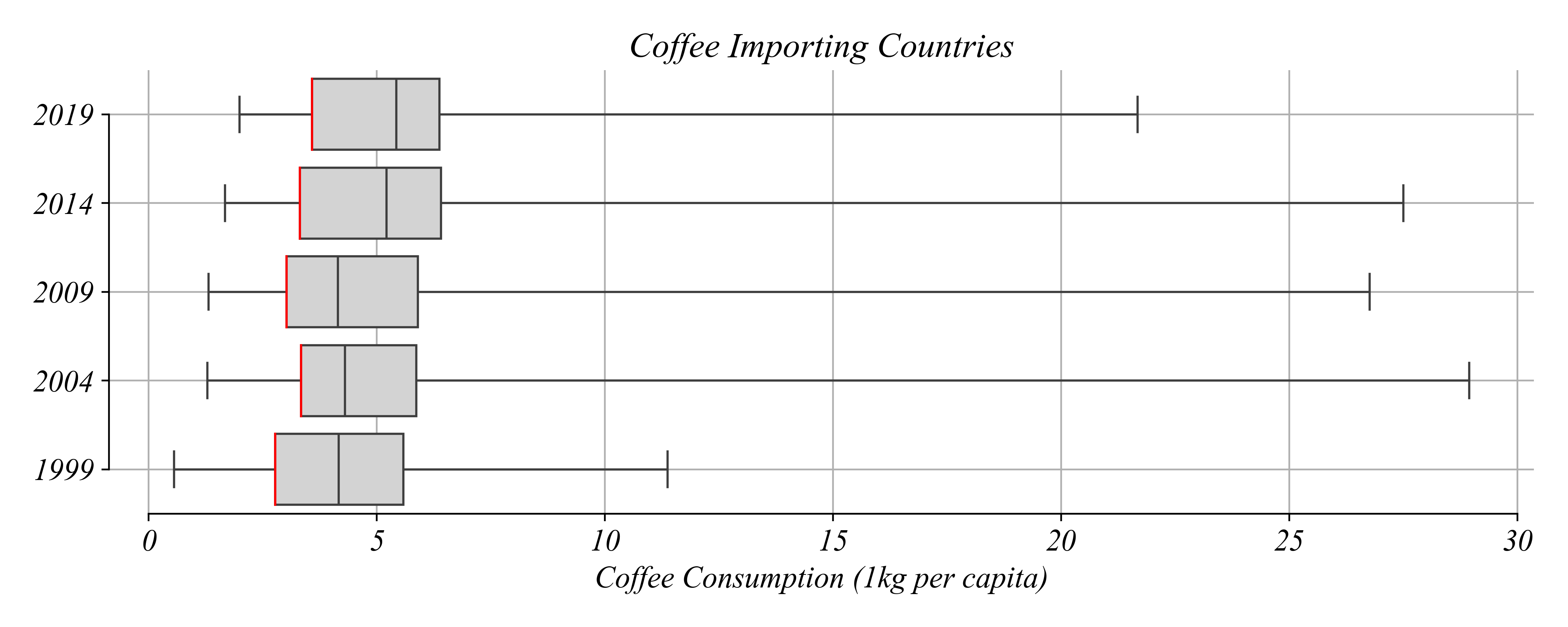
> look at the 25%
Panel Data: Multi-Boxplots
Which years did more than 25% consume less than 5 kg?
> look at the 25% and compare it to 5 kg per cap
Panel Data: Multi-Boxplots
Which years did more than 25% consume less than 5 kg?
> all of them
Panel Data: Multi-Boxplots
Which year saw the greatest difference between any two countries?
> look at the range
Panel Data: Multi-Boxplots
Which year saw the greatest difference between any two countries?
> look at the range
Panel Data: Multi-Boxplots
Which year saw the greatest difference between any two countries?
> look at the range and select the largest
Panel Data: Multi-Boxplots
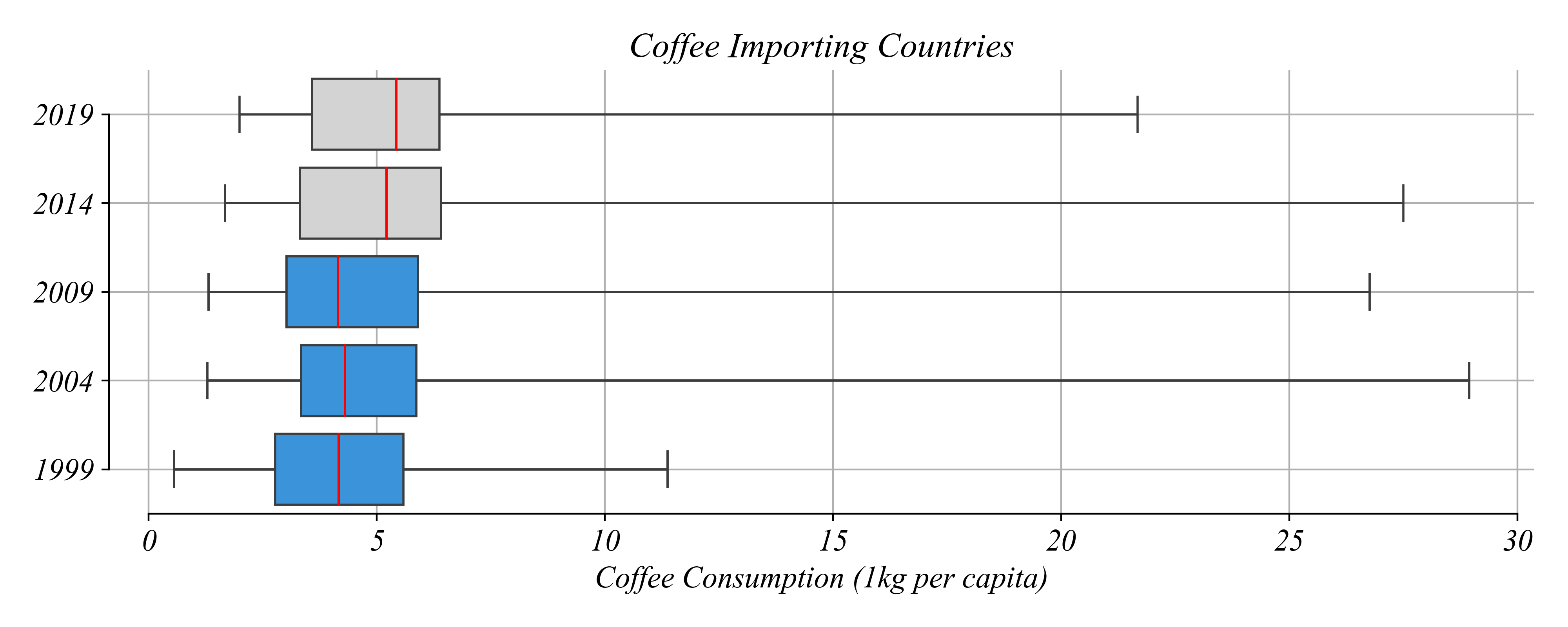
In which year did most countries increase their coffee consumption?
> not visible in the figure!
Panel Data: Relationships Between Years
How many countries increased their coffee consumption between 1999 and 2019?
> also not visible with this figure!
Panel Data: Relationships Between Years
How many countries increased their coffee consumption between 1999 and 2019?
> better, but this figure still doesn’t let us keep track of countries between years…
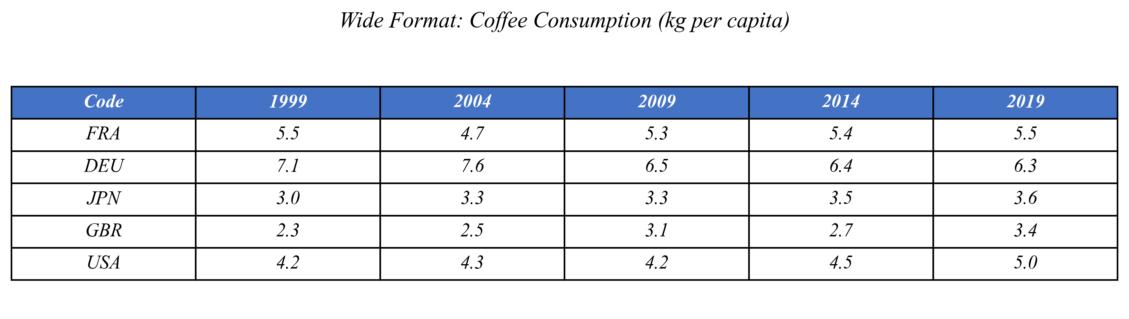
Wide Format
Each year is a column
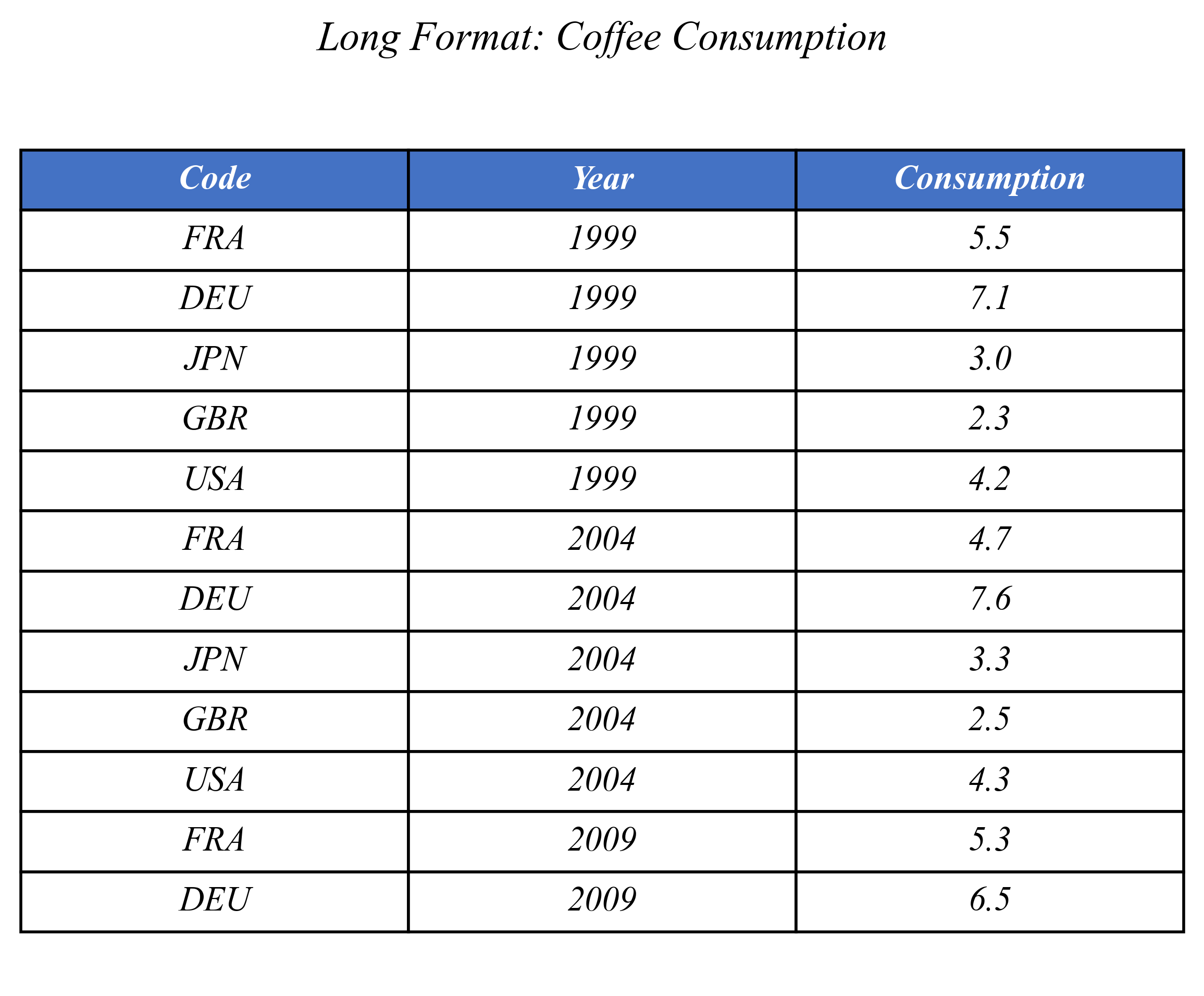
Long Format
Each observation is a row
Panel Data: Relationships Between Years
How many countries increased their coffee consumption between 1999 and 2019?
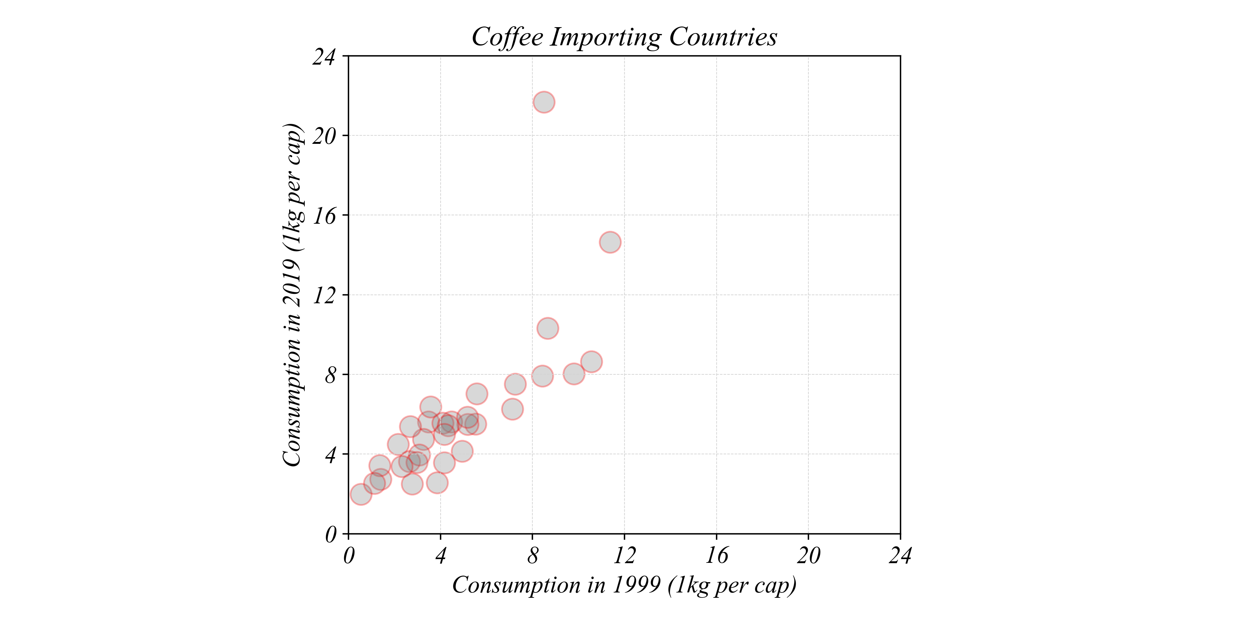
> a scatter plot can visualize changes between two points in time
Panel Data: Relationships Between Years
How many countries increased their coffee consumption between 1999 and 2019?
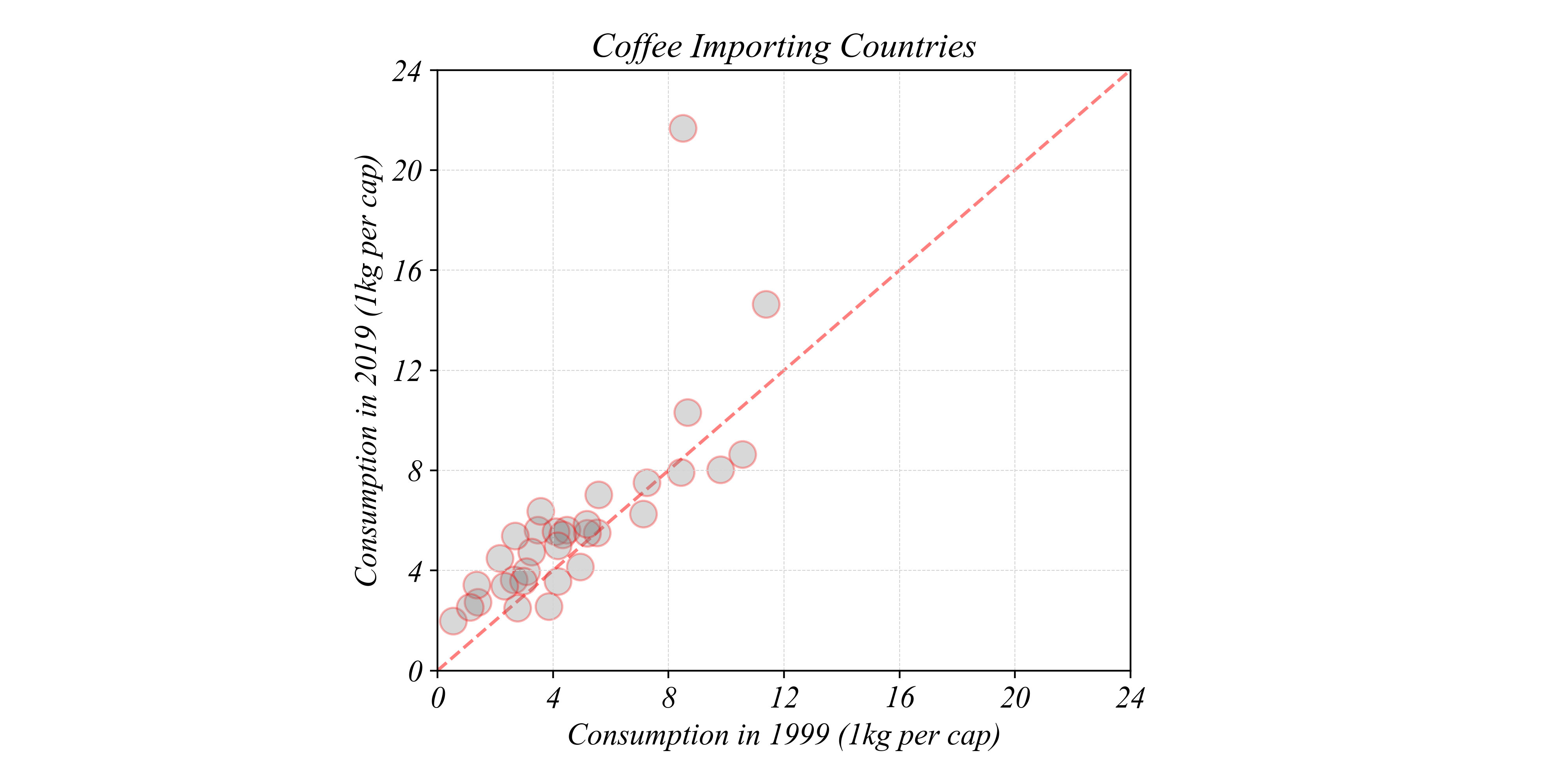
> a 45 degree line shows all the possible points with no change
Panel Data: Relationships Between Years
How many countries increased their coffee consumption between 1999 and 2019?
> points above the line increased
Panel Data: Relationships Between Years
How many countries decreased their coffee consumption between 1999 and 2019?
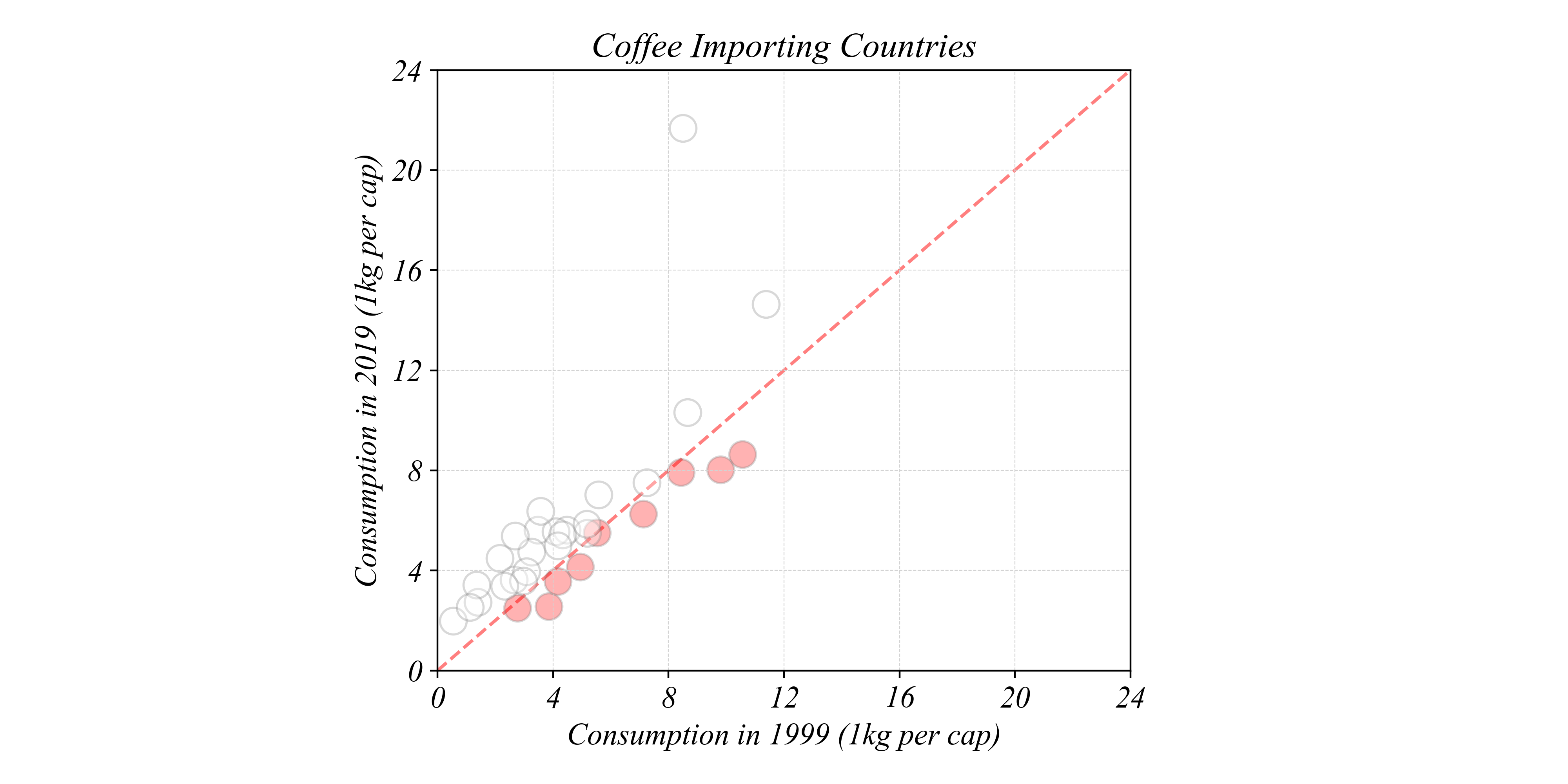
> points below the line decreased
Panel Data: Relationships Between Years
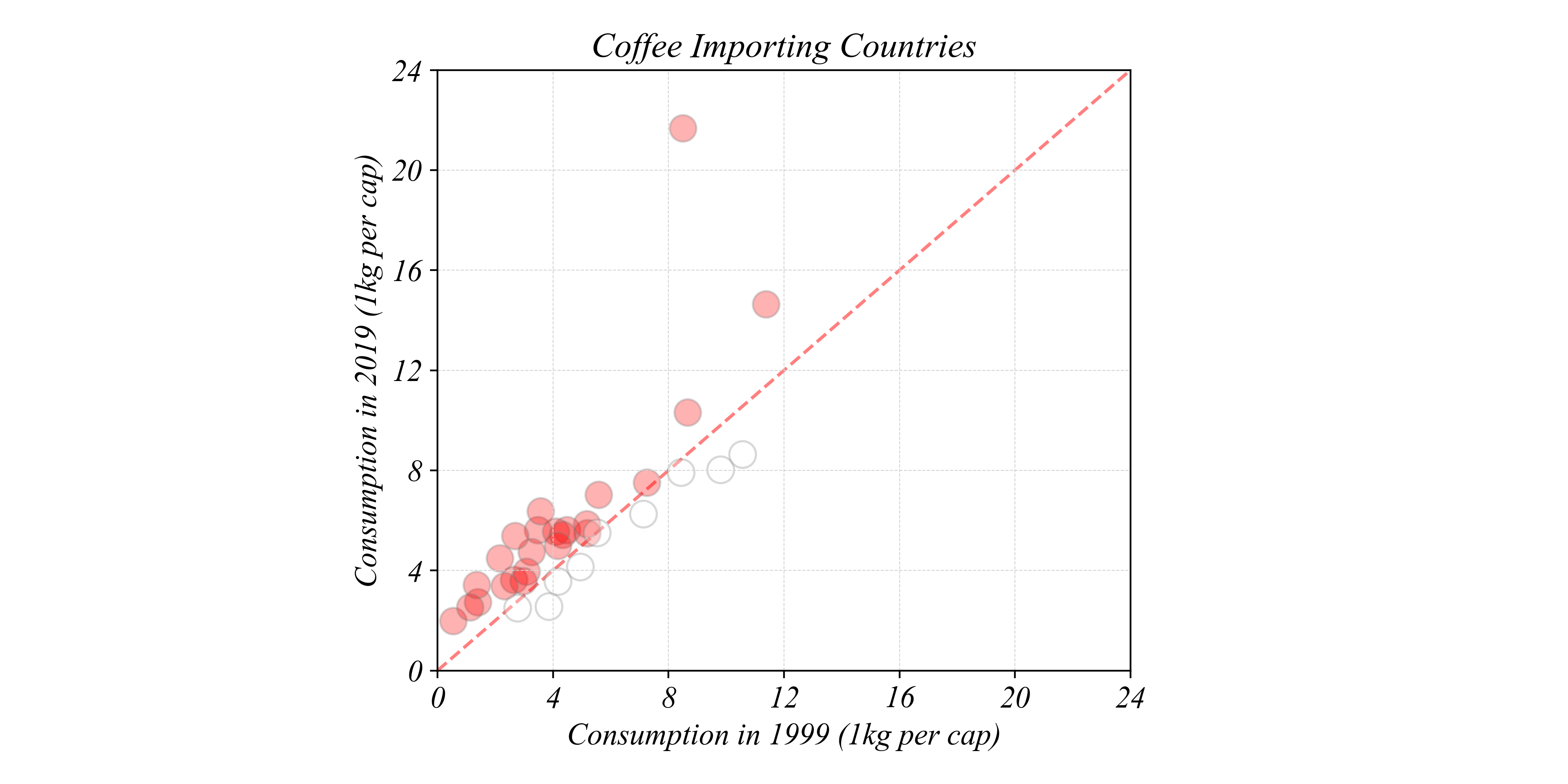
Does the data confirm that the world is drinking more coffee?
> we can use colors to visualize both increases and decreases
Exercise 1.5 | Scatterplots
Is the world drinking more coffee?
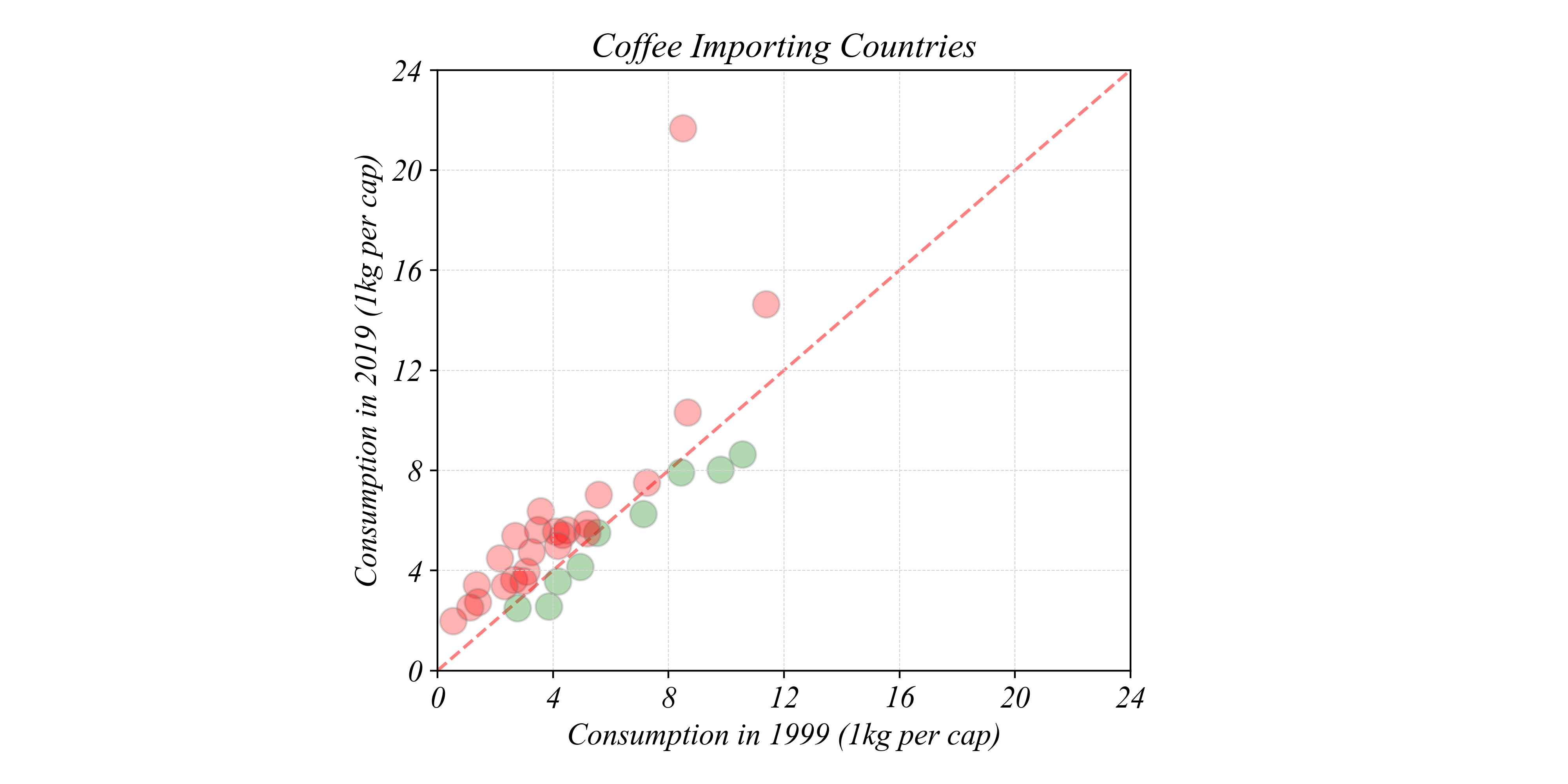
Counting Changes
How many countries increased vs decreased?
> we can see visually that most points are above the 45° line
> but how do we count exactly how many?