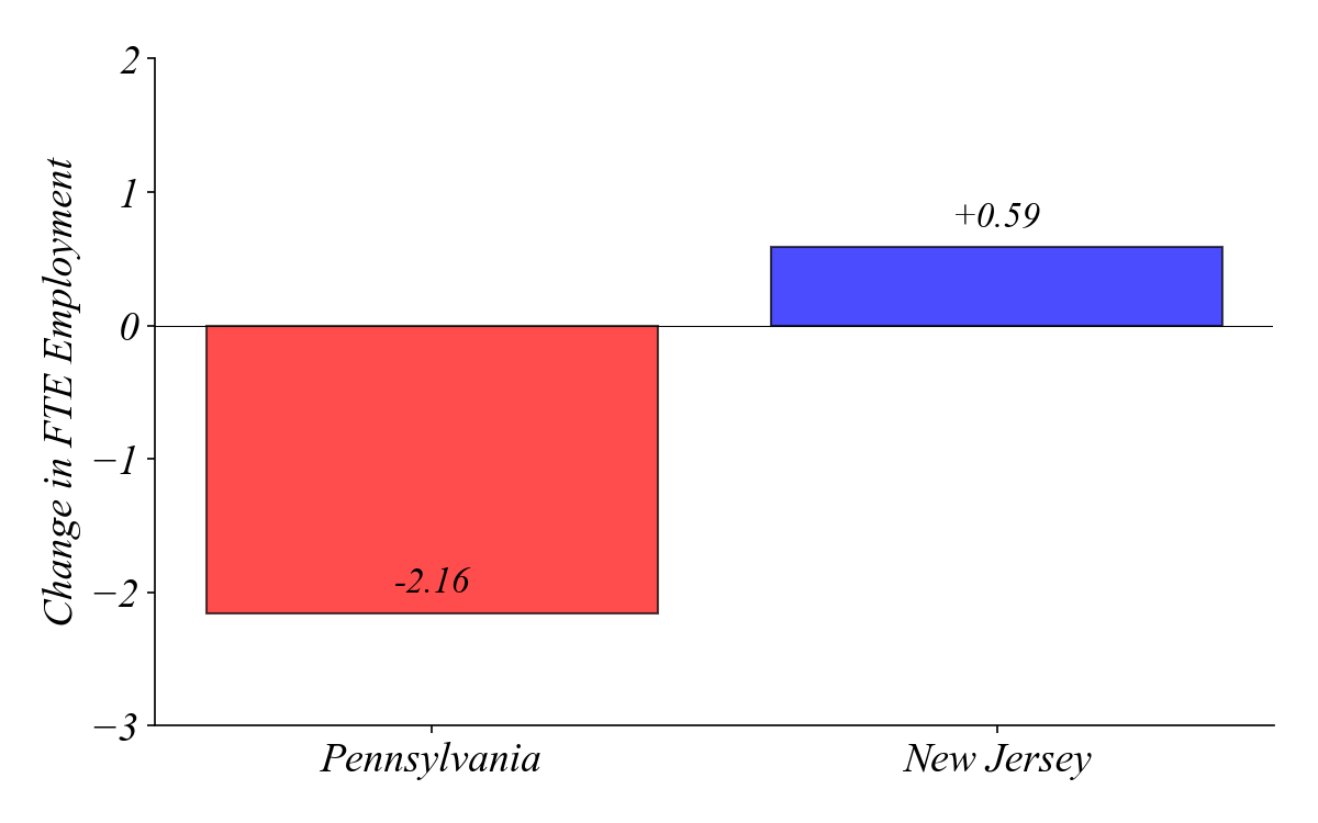
Part 0 | Minimum Wage Study
NJ raised its minimum wage. Employment did not fall.
Hiring a Barista: Bar Graphs Compare Shops
Q. Which coffee shop is the busiest?
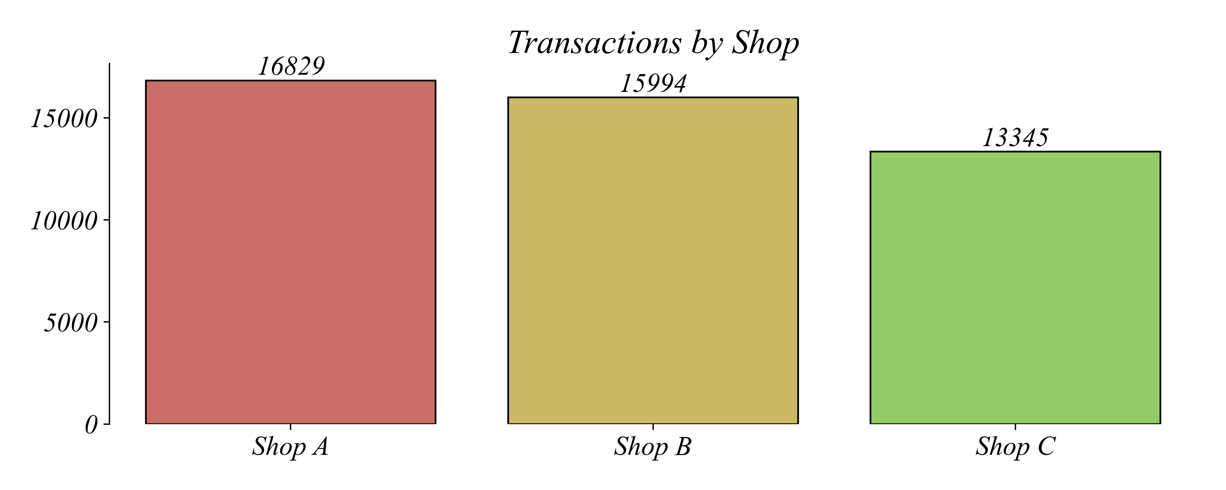
> a bar chart makes it easy to compare shops’ busyness
Hiring a Barista: Histograms Can Compare Times
Q. What time of day is the busiest?
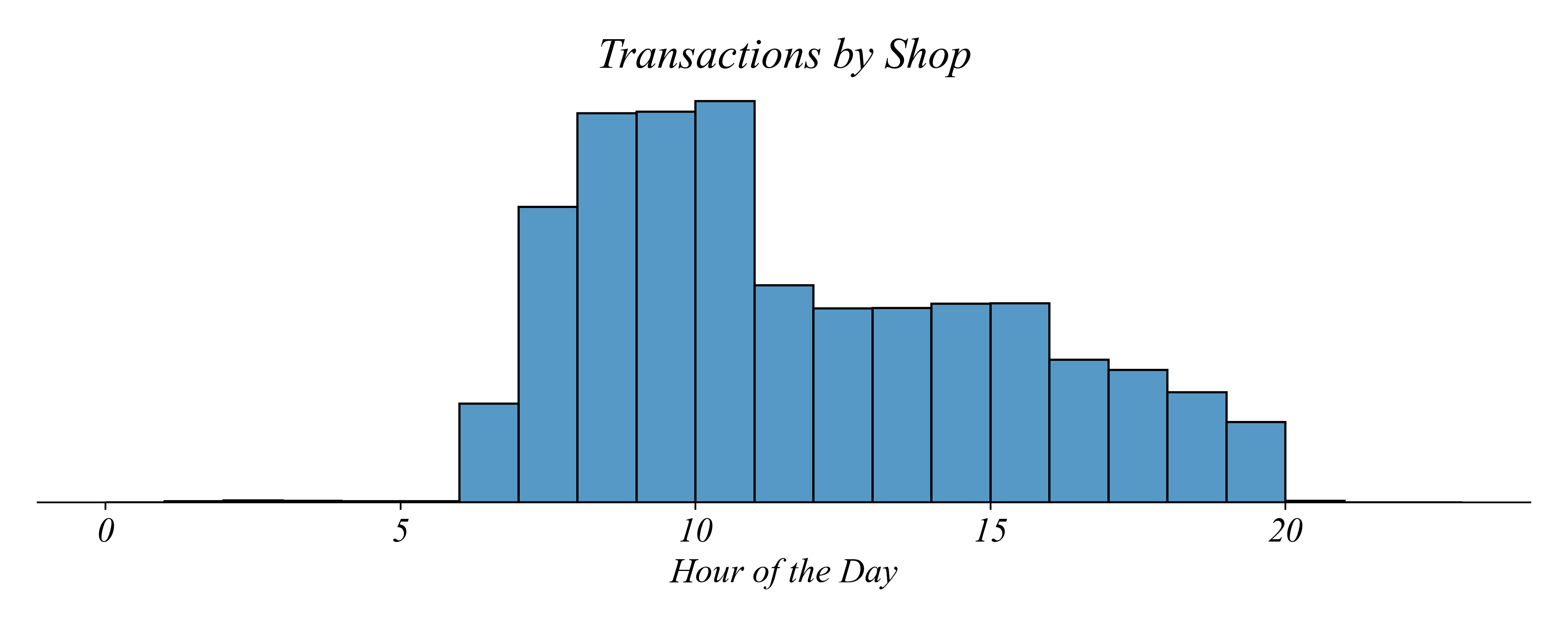
> a histogram makes it easy to compare transactions by time of day
> does this mean the morning shift at Shop A is the busiest?
Hiring a Barista: Transactions by Shop
Q. Which shift is the busiest?

> an overlaid histogram can show all three groups
> does this show the data clearly?
Hiring a Barista: Faceting
Each shop gets its own panel
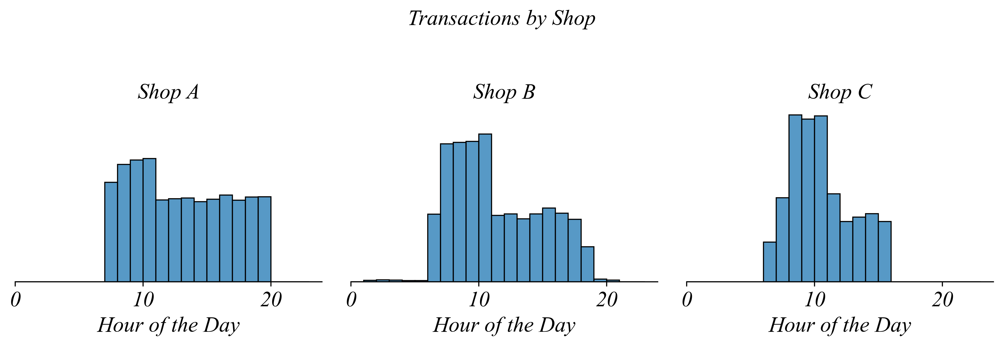
> same data, but now each shop has its own histogram
Hiring a Barista: Faceting
Q. Which shop has the most consistent traffic throughout the day?
> Shop A — the distribution is relatively flat
Hiring a Barista: Faceting
Q. Which shop is busiest during the morning rush?
> Shop C — compare the 8-10am peaks across panels
> but since the histograms are separated it’s not as easy to make the comparison
Hiring a Barista: Line Graphs
Q. Which shop is busiest during the morning rush?
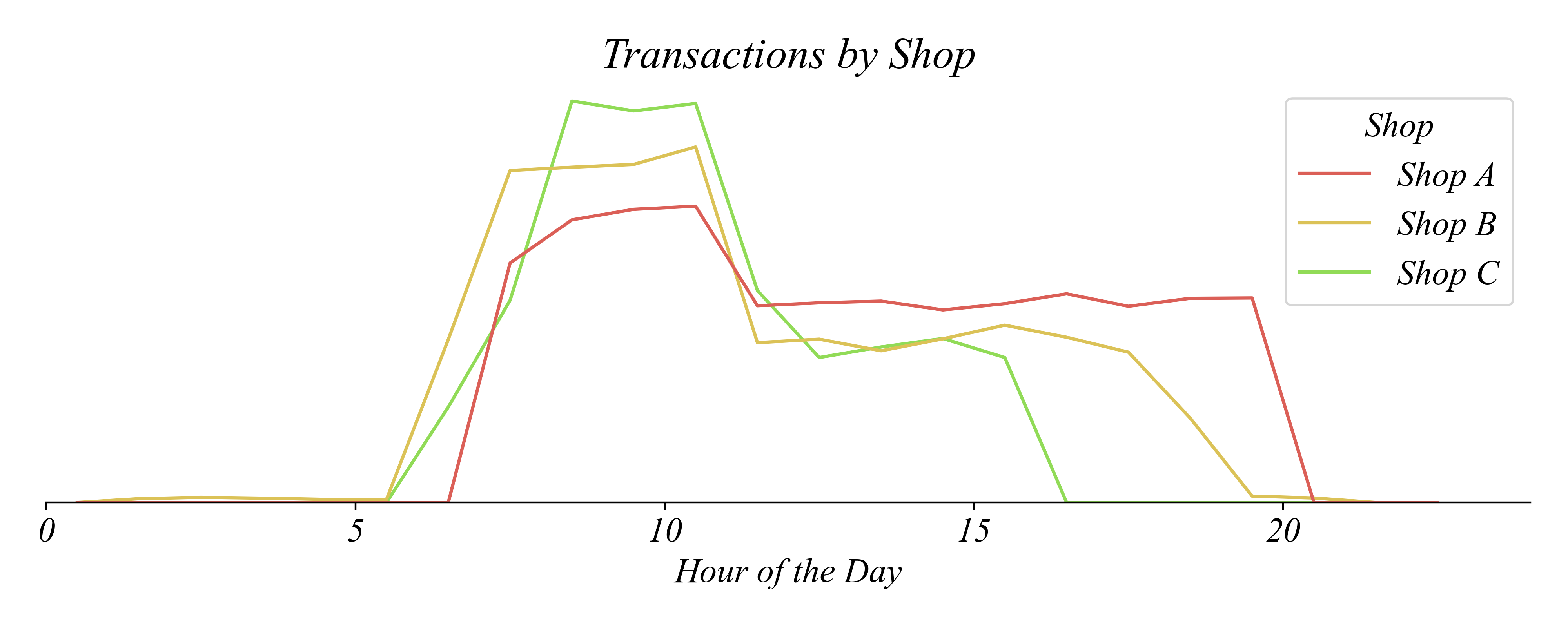
> line graphs can also show comparisons between groups clearly
> Shop C — easier to see the 8-10am peak across shops
Exercise 1.4 | Bar Chart
Use Coffee_Sales_Receips.csv to help inform where to hire a barista.
Exercise 1.4 | Histogram
Use Coffee_Sales_Receips.csv to help inform where to hire a barista.
Exercise 1.4 | Multi-Histogram
Use Coffee_Sales_Receips.csv to help inform where to hire a barista.
Exercise 1.4 | Faceted Histogram
Use faceting to give each shop its own panel.
Exercise 1.4 | Multiple Line Graph
The Groupby Approach: Create a summary table, then plot
Exercise 1.4 | Multiple Line Graph (Shortcut)
The Shortcut: Let histplot do the counting for you
# Multiple-Line Graph using histplot shortcut
sns.histplot(sales, x='Hours', hue='Shop', bins=range(0,24,1), element='poly', fill=False)