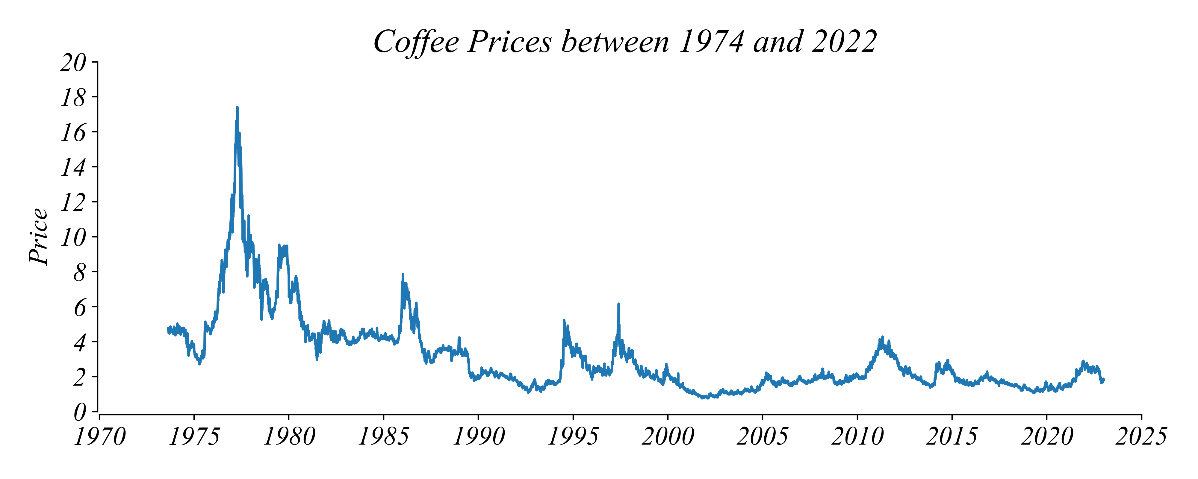
Timeseries: Coffee Prices
What price should we expect in January 2026?
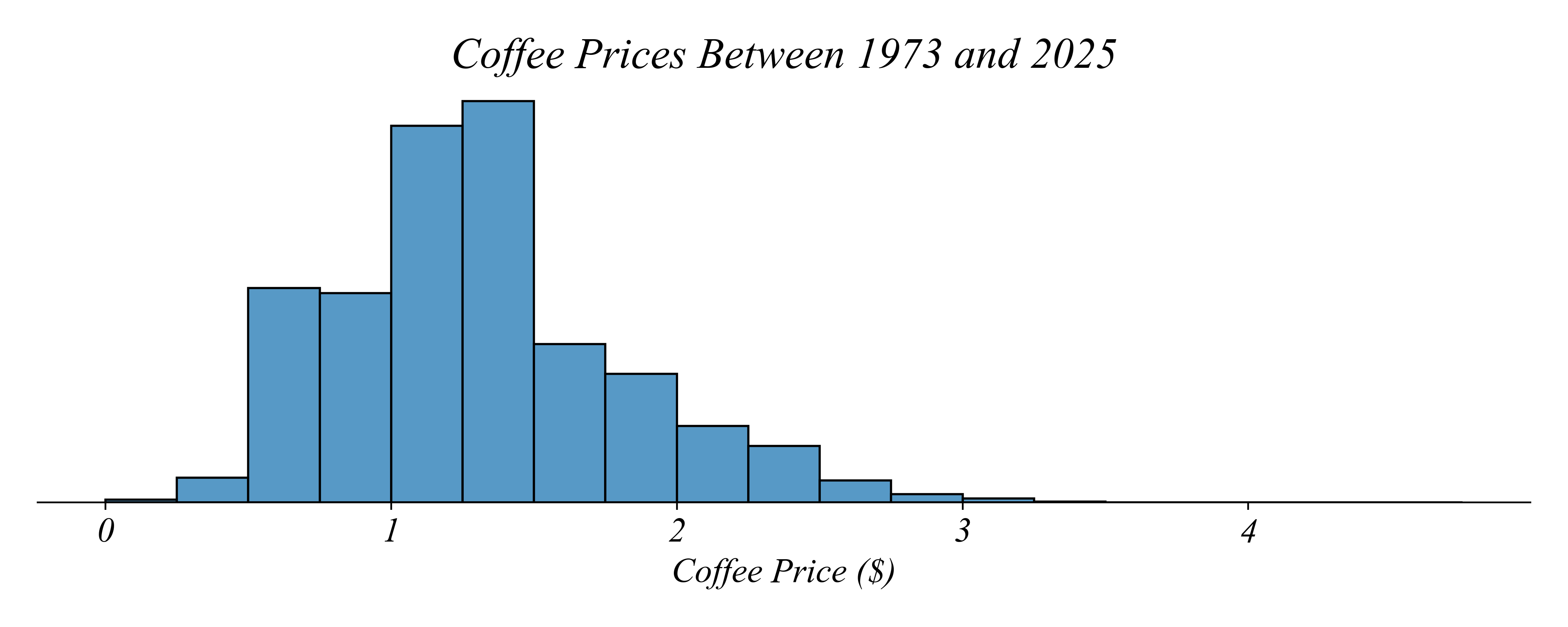
> it’s difficult to know… do we choose the mode?
> lets just organize prices by their ordered index, time
Timeseries: Coffee Prices
What price should we expect in January 2026?
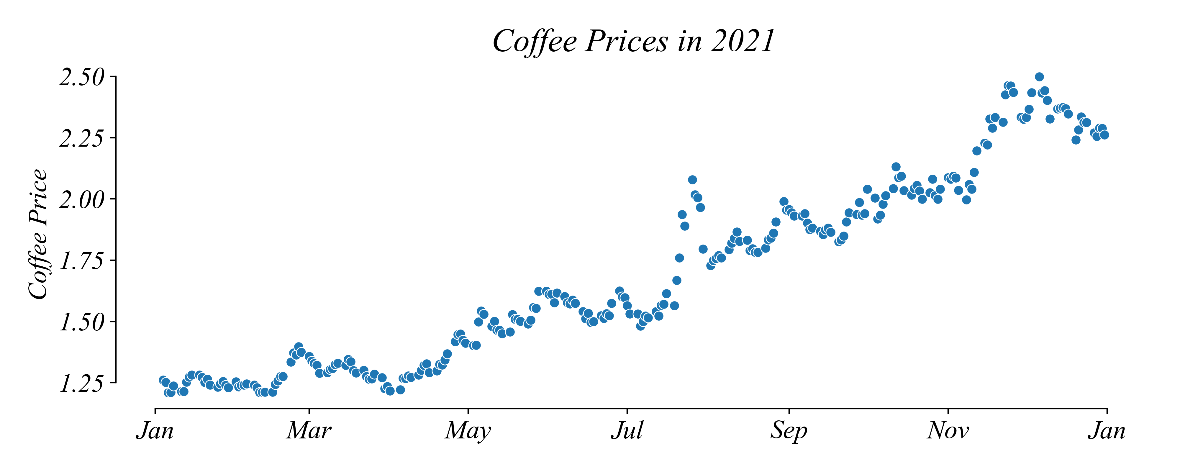
> lets indicate with a line that these points are in squence
Timeseries: Line Graph
What price should we expect in January 2026?
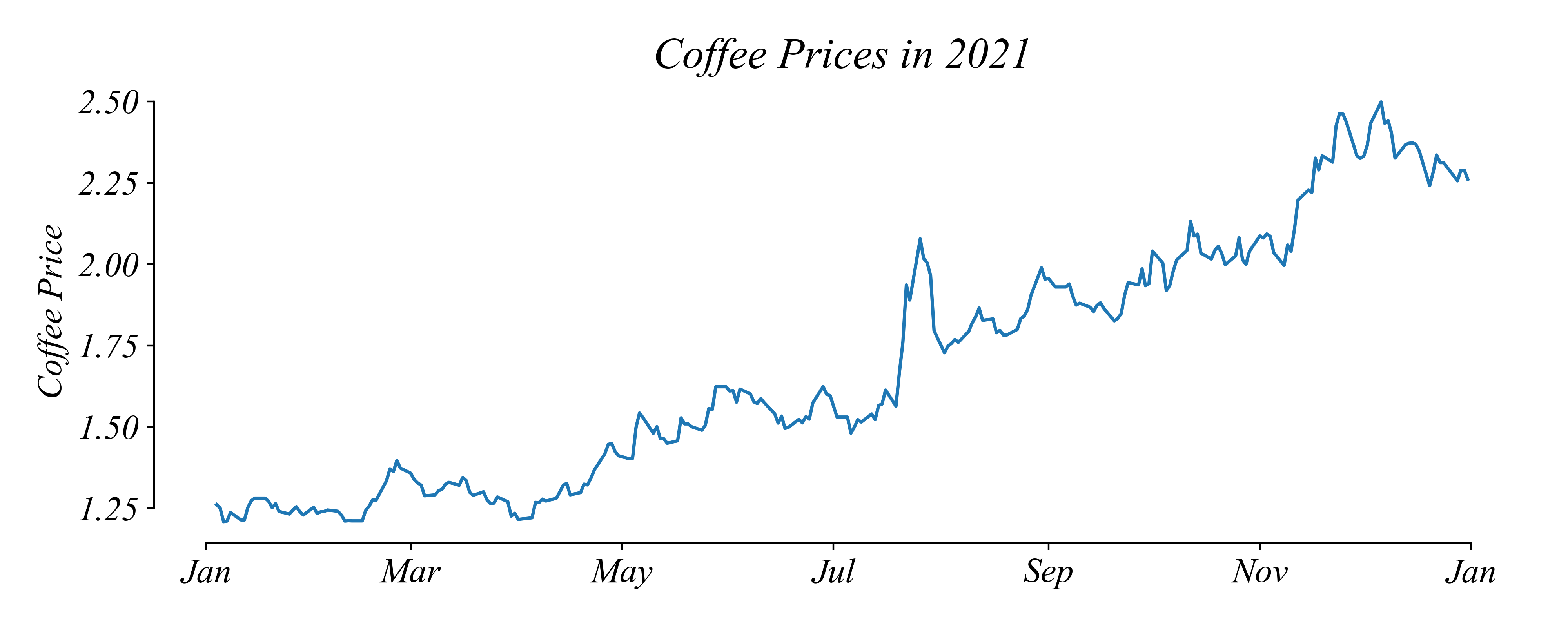
Timeseries: Trends
Do you notice a trend in price?
> there was a positive trend in 2021
> we can zoom out to get a bigger picture
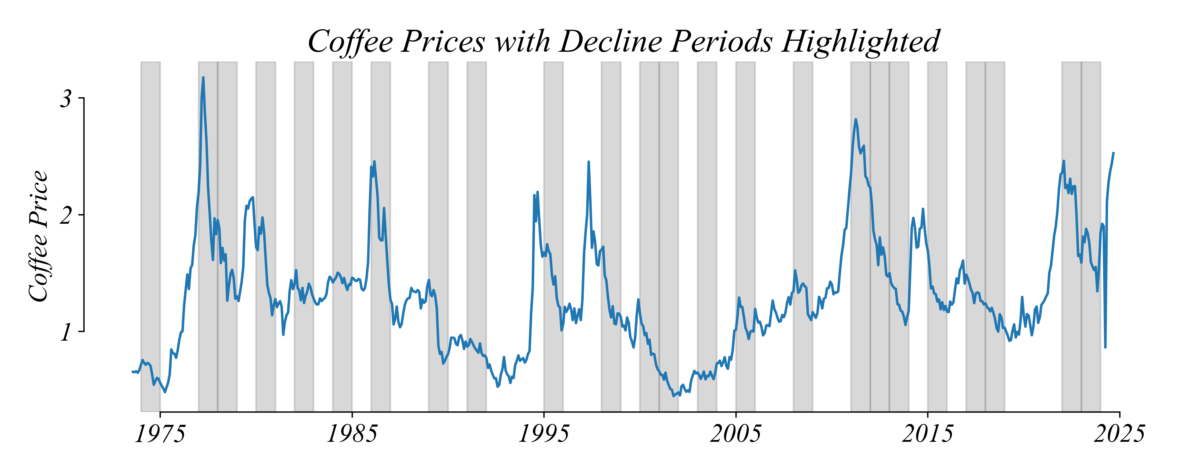
Timeseries: Trends + Subtrends
Do you notice a trend in price?
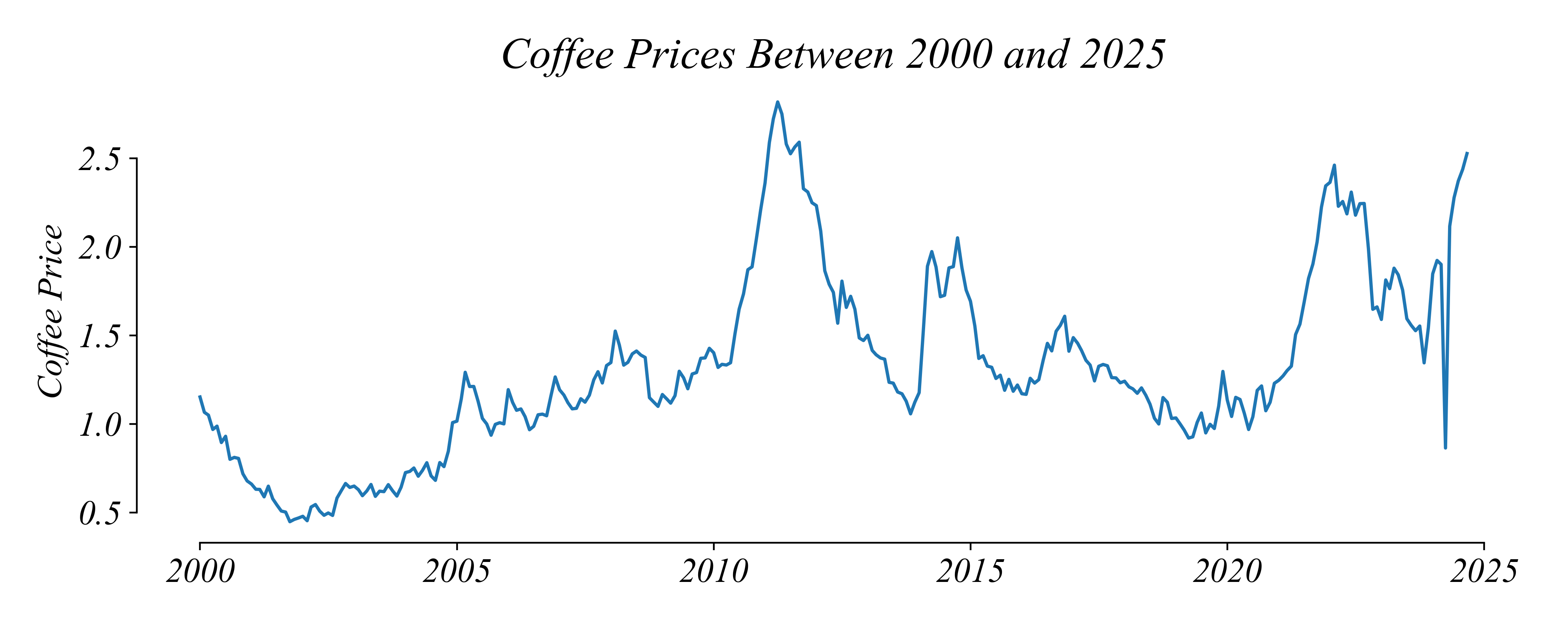
> how have prices changed since 2000?
> prices have increased somewhat, with many periods of decrease
Timeseries: Background Shading
What price should we expect in January 2026?
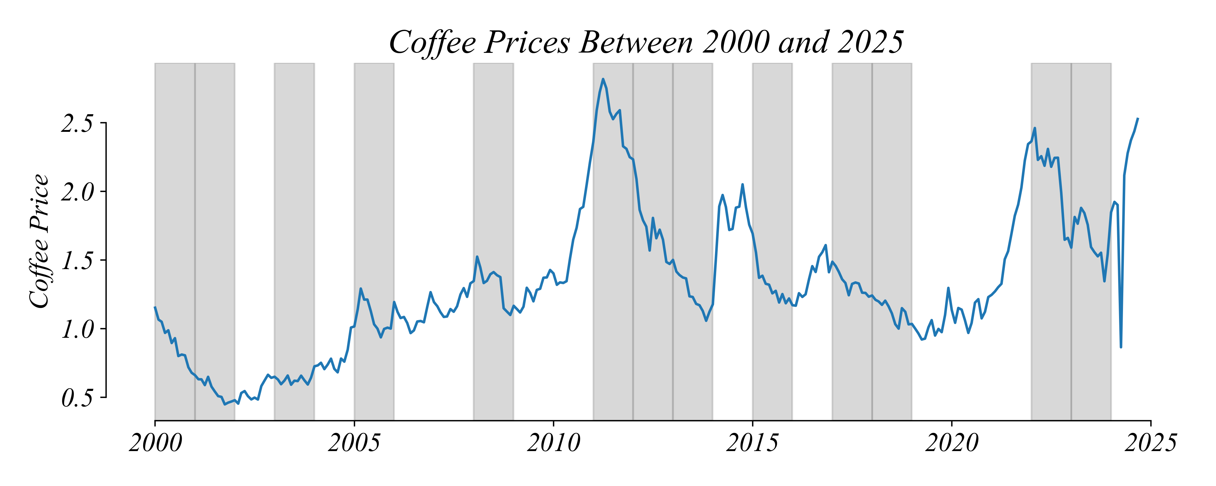
> with background shading its easier to see periods with a negative trend in price
Exercise 1.3 | Timeseries
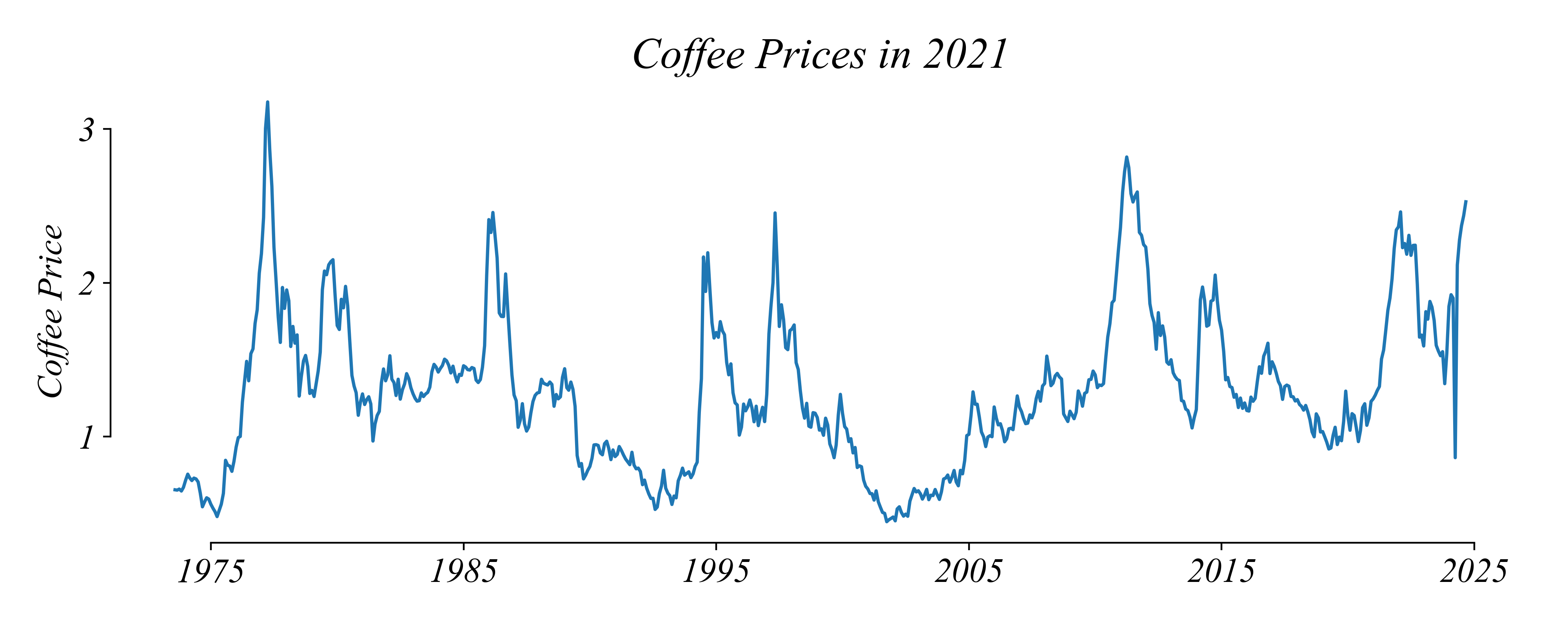
Timeseries: Longer Periods
Are prices over long periods comparable?
> was coffee about as expensive in 1980 as it is today?
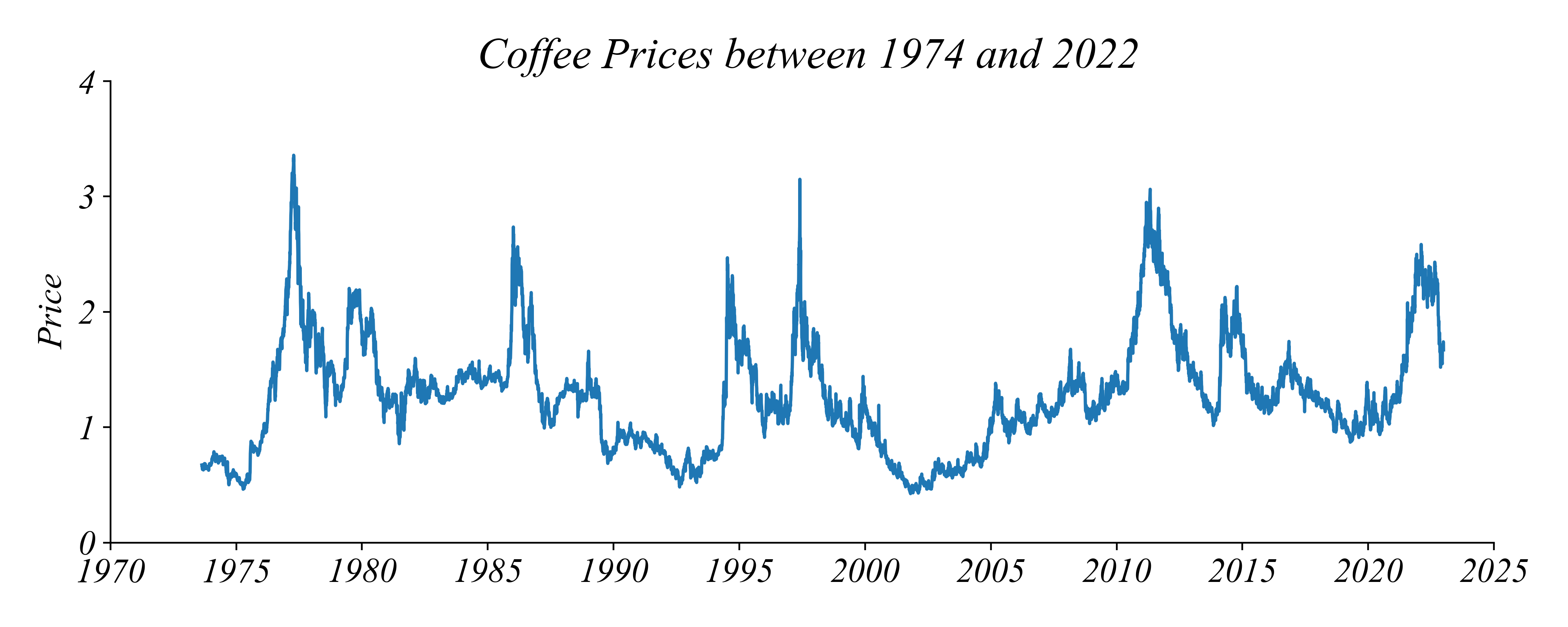
Timeseries: Longer Periods
A dollar in 1980 ≠ a dollar in 2025
> no! a dollar today is worth much less than in 1980
> we need to adjust for inflation to compare across time
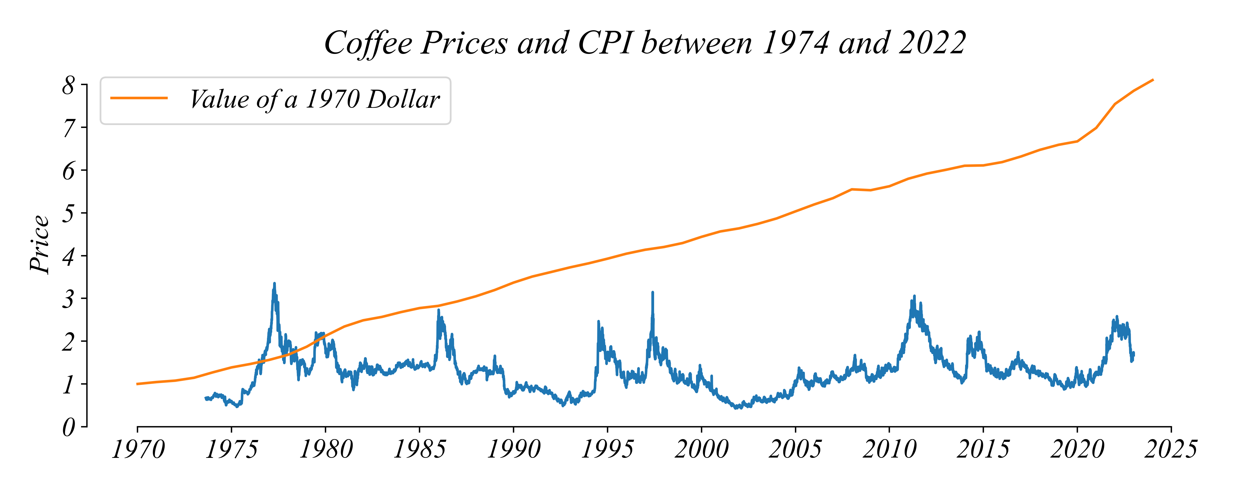
Real Coffee Prices
Adjusting for inflation changes the picture
> prices have actually dropped since 1980 and stabilized since 2000
Exercise 1.3 | Real Price Adjustment
Is there a trend in the real price of coffee?
Timeseries: Original Question
What price should we expect in January 2026?
> timeseries lineplots show us about the trends but is there something specific in January?
Seasonality: January
What price should we expect in January 2026?
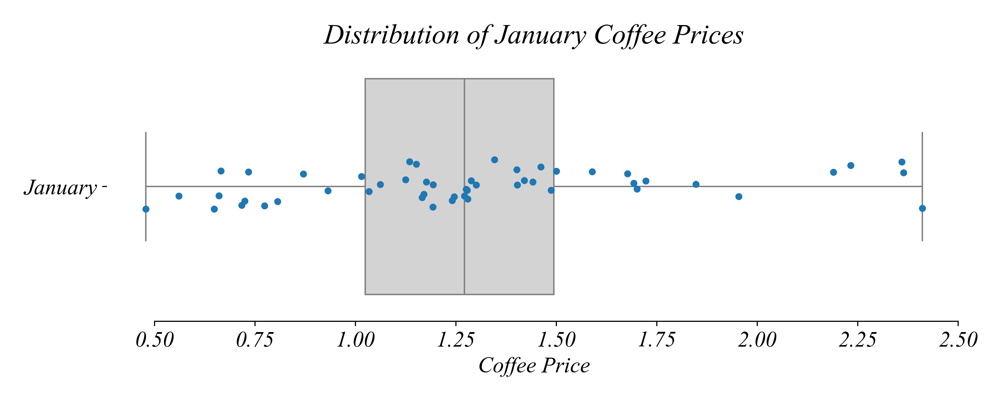
> a boxplot gives us a picture of the prices just in January
> lets compare this to other months
Seasonality: Monthly Boxplots
In addition to the overall trend, are there monthly patterns?
> lets be more specific…
Seasonality: Monthly Boxplots
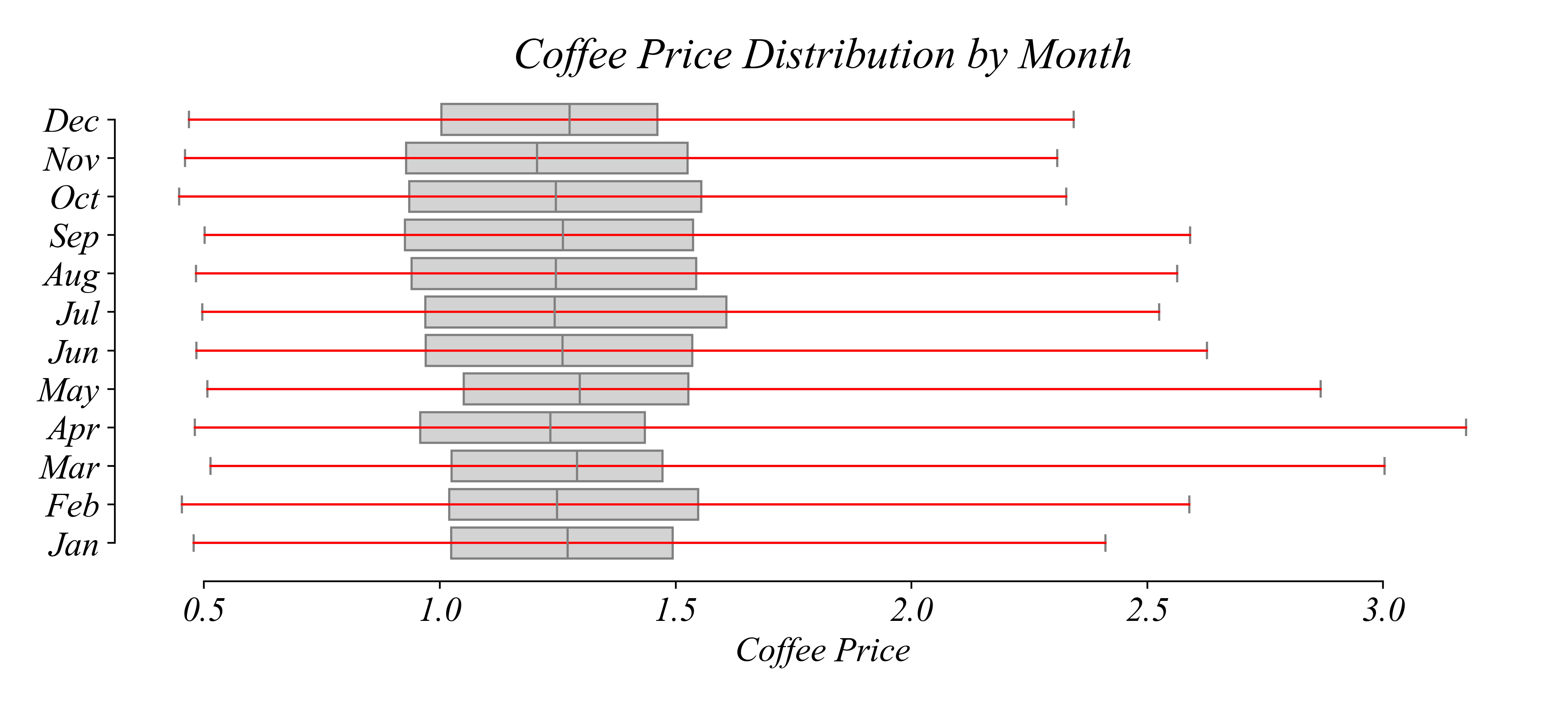
In which month was the record highest price set?
Seasonality: Monthly Boxplots
In which month was the record highest price set?
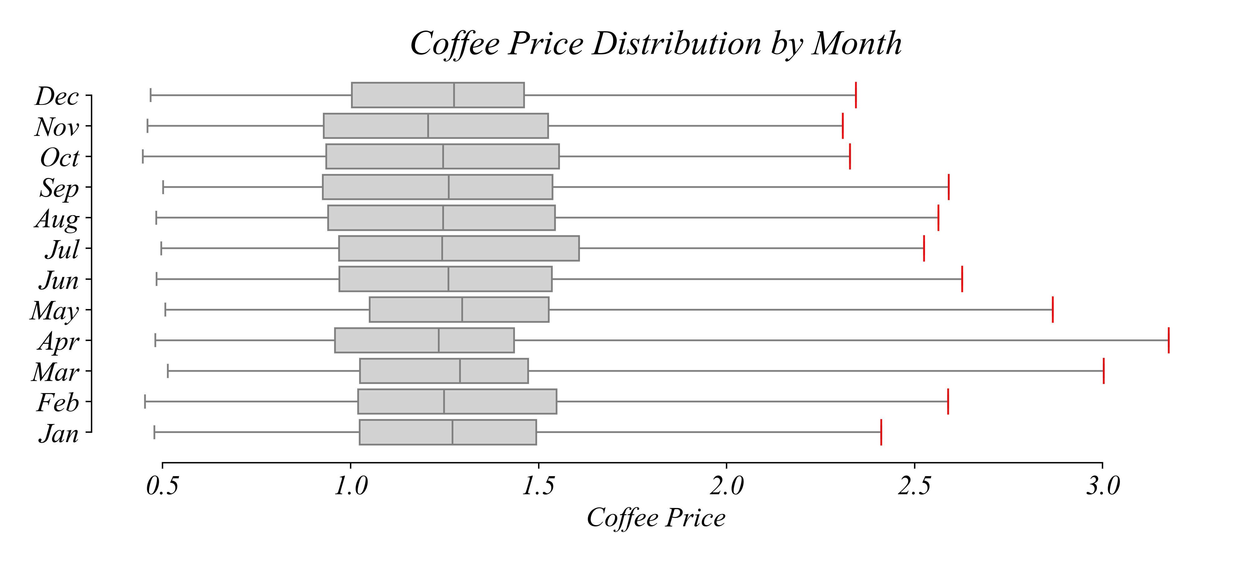
> look at the maximums
Seasonality: Monthly Boxplots
In which month was the record highest price set?
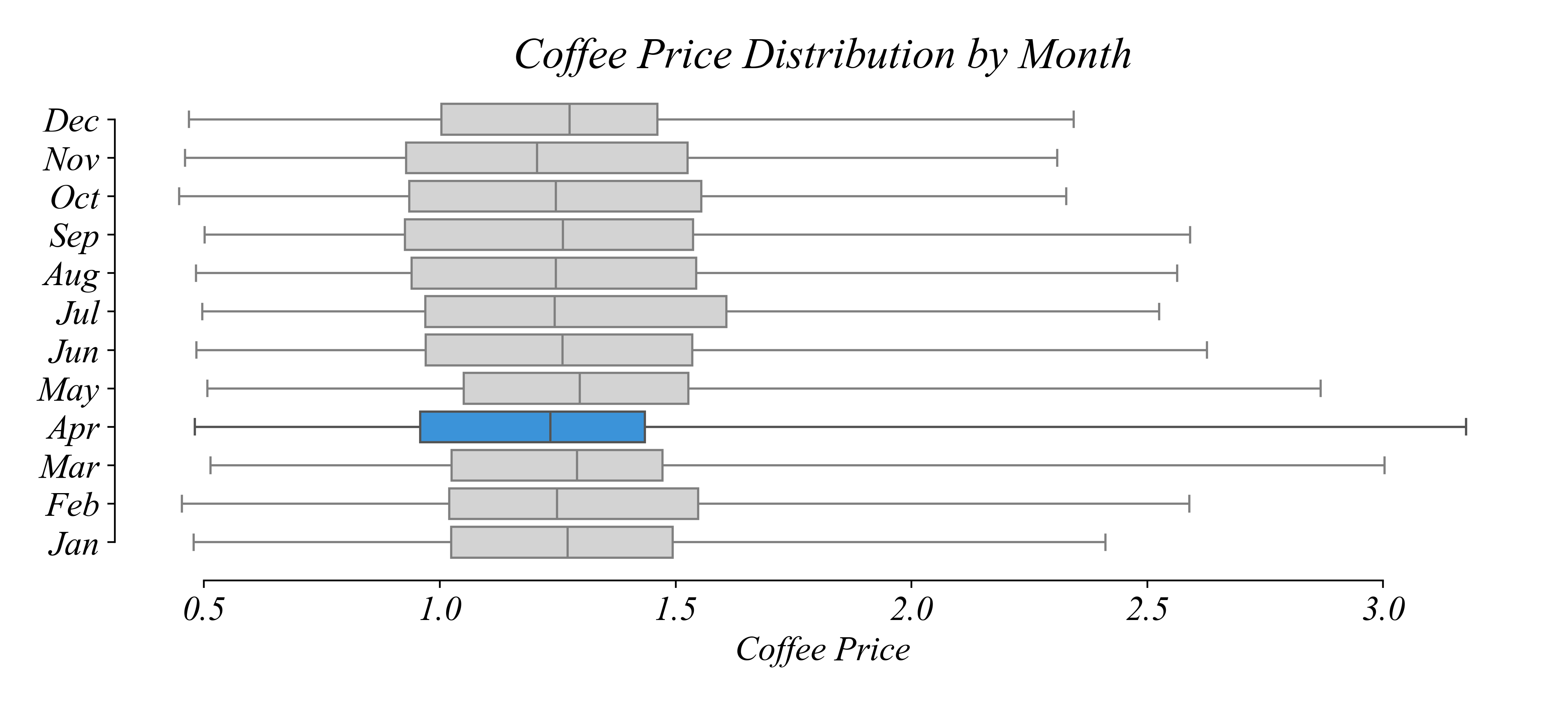
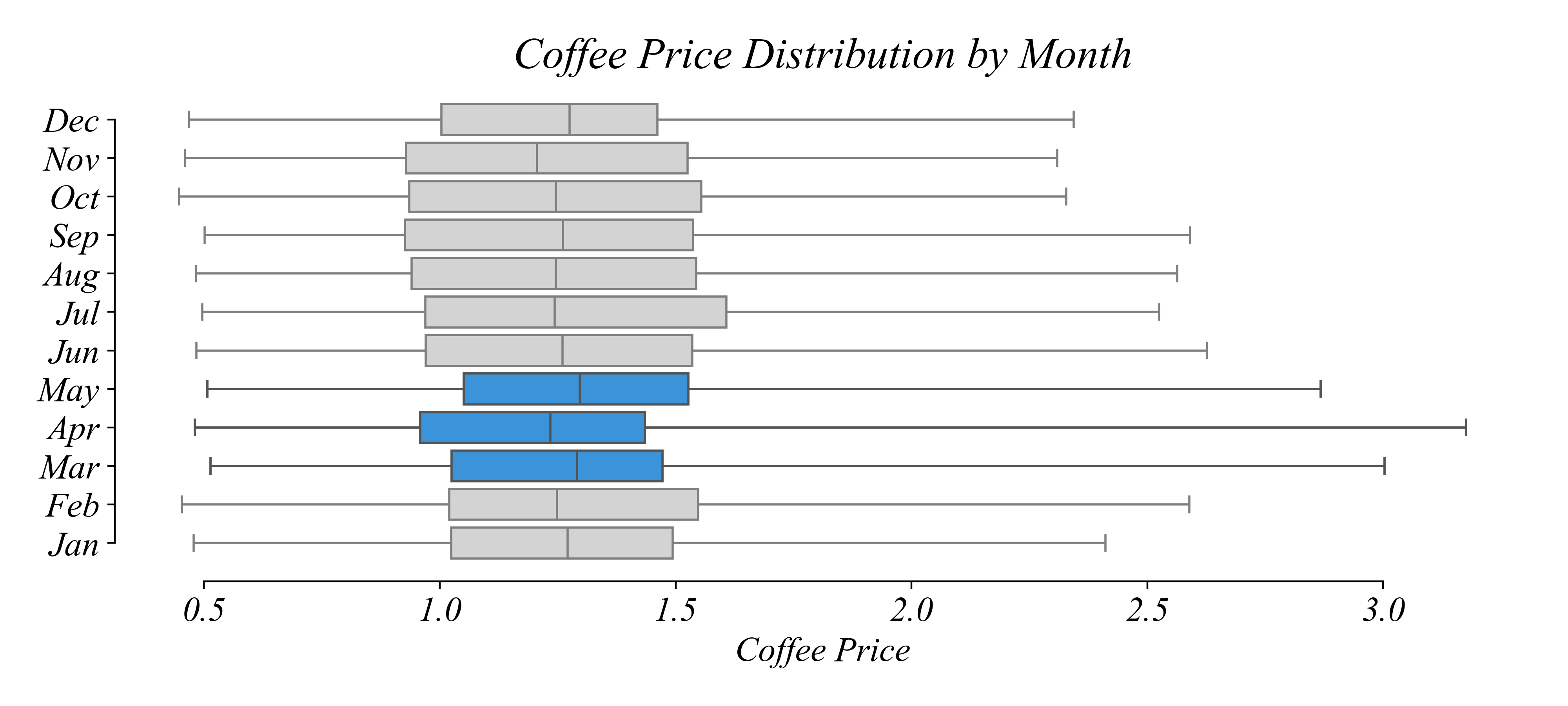
Seasonality: Monthly Boxplots
In which season are prices most spread out?
Seasonality: Monthly Boxplots
In which season are prices most spread out?
> look at the ranges
Seasonality: Monthly Boxplots
In which season are prices most spread out?
Seasonality: Multi-Boxplot
What is the trend in median price?
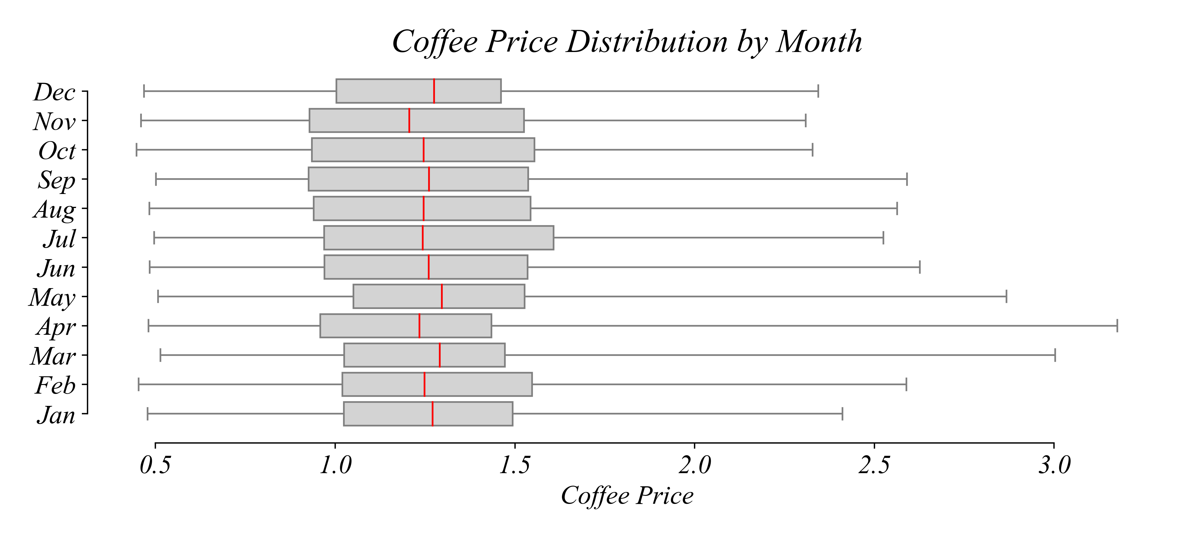
> look at the medians…
Seasonality: Quartile Lineplot
What is the trend in median price?
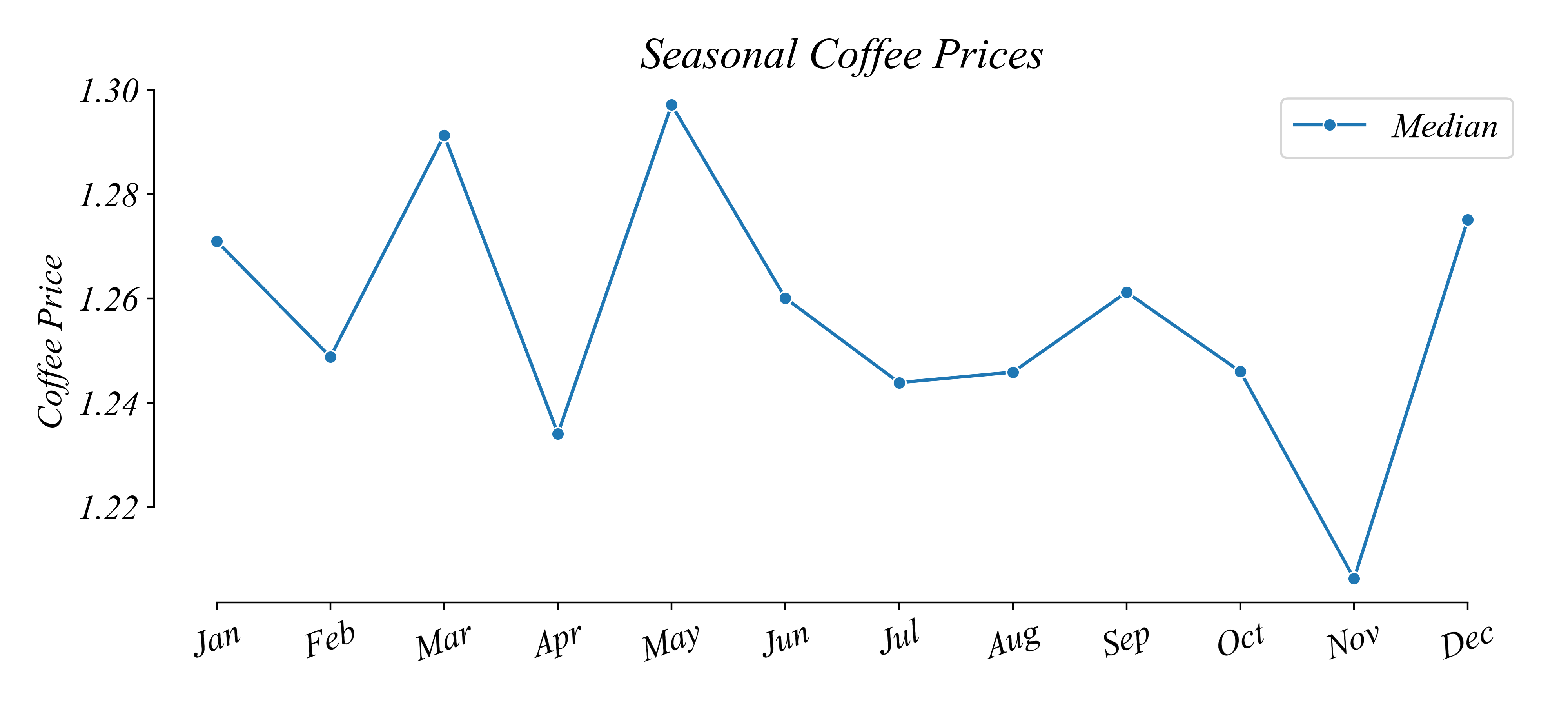
Seasonality: Quartile Lineplot
What is the difference between the largest and the smallest median price per pound?
> something like $1.30 - $1.21 = $0.09
Exercise 1.3 | Seasonality