Histograms
Q. Which age group has the most Starbucks customers?
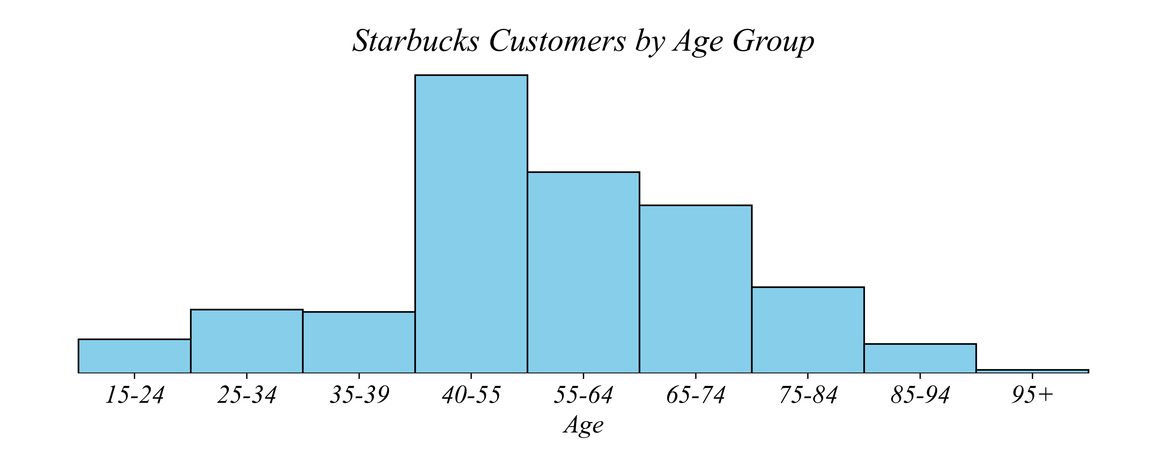
> the bin sizes aren’t even, making it hard to interpret
Numerical Variables: Histograms
Q. Which age group has the most Starbucks customers?
> the bin sizes aren’t even, making it hard to interpret
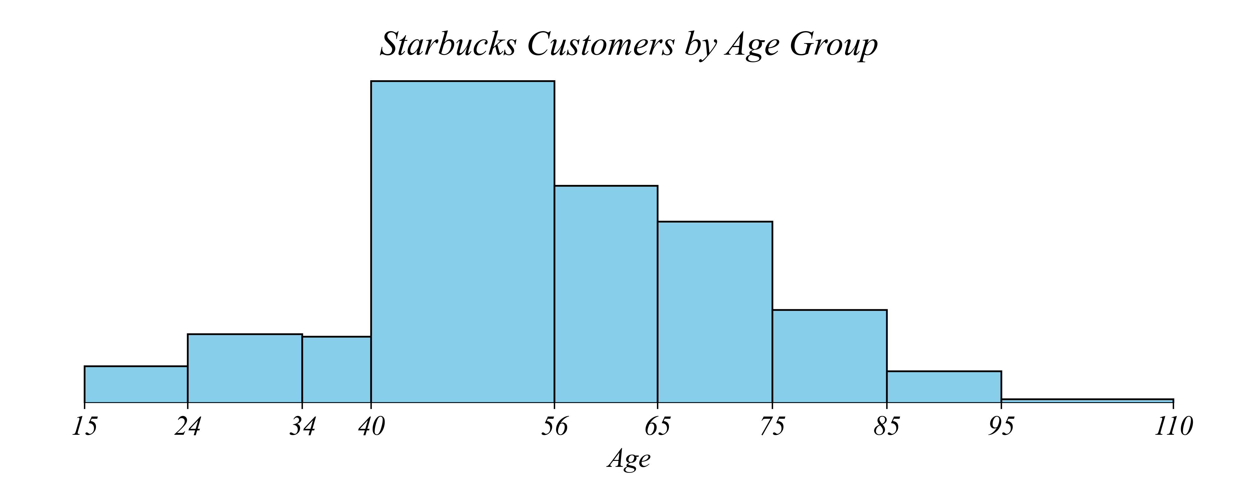
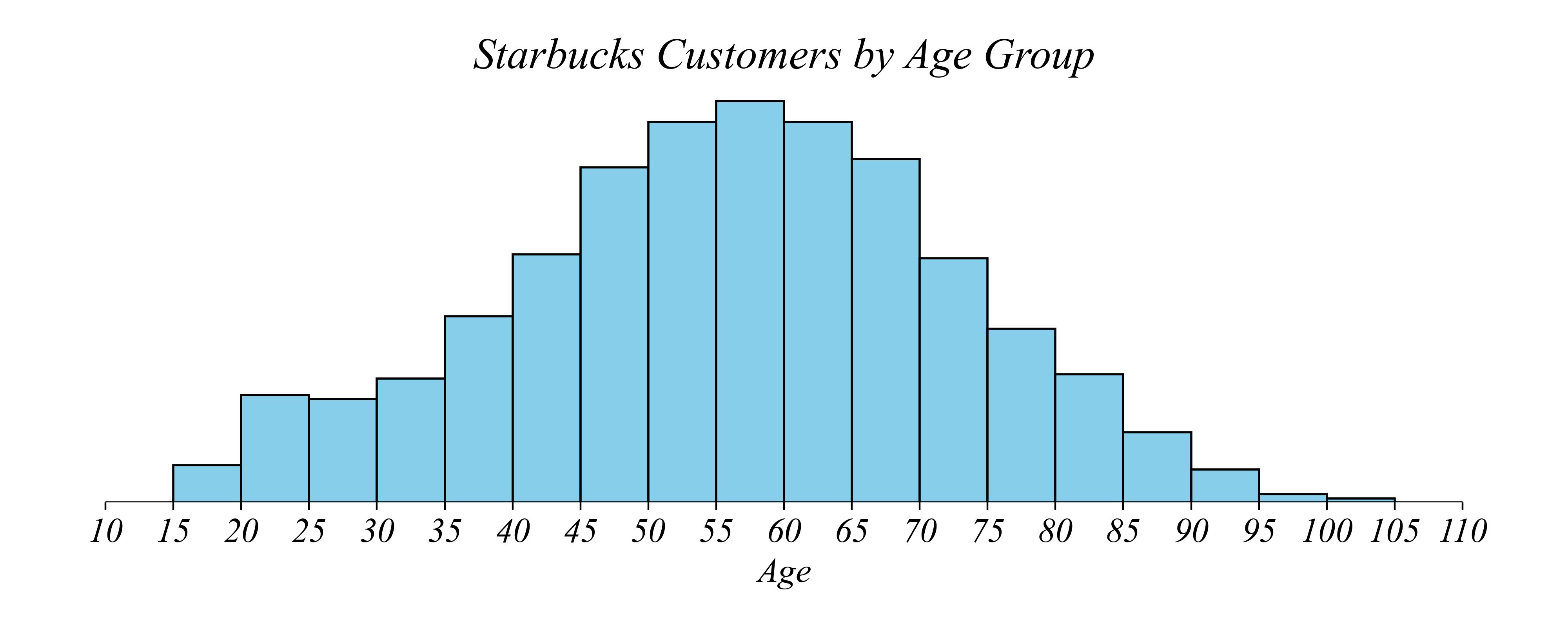
Histograms: Use equal sized bins
Q. Which age group has the most Starbucks customers?
> but what if we want to distinguish between a 55 year old and a 60 year old?
Histograms: Use narrow enough bins
Q. Which age group has the most Starbucks customers?
> what if we take this even further?
> what if we compare 44 year olds to 45 year olds?
Histograms: Avoid visualizing noise
Q. Do 44 or 45 year olds spend more at Starbucks?
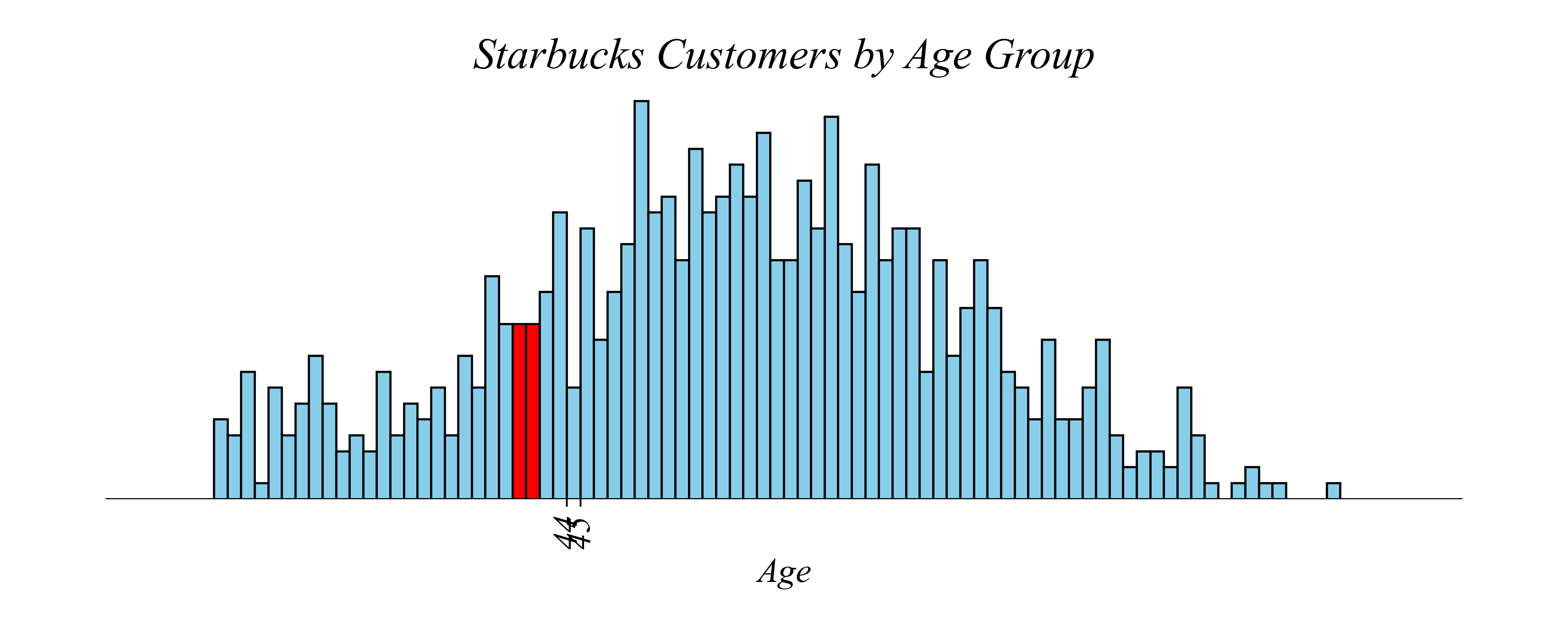
> we can go too far, introducing statistical noise. how do we fix the problem?
> increase the sample size or the bin width!
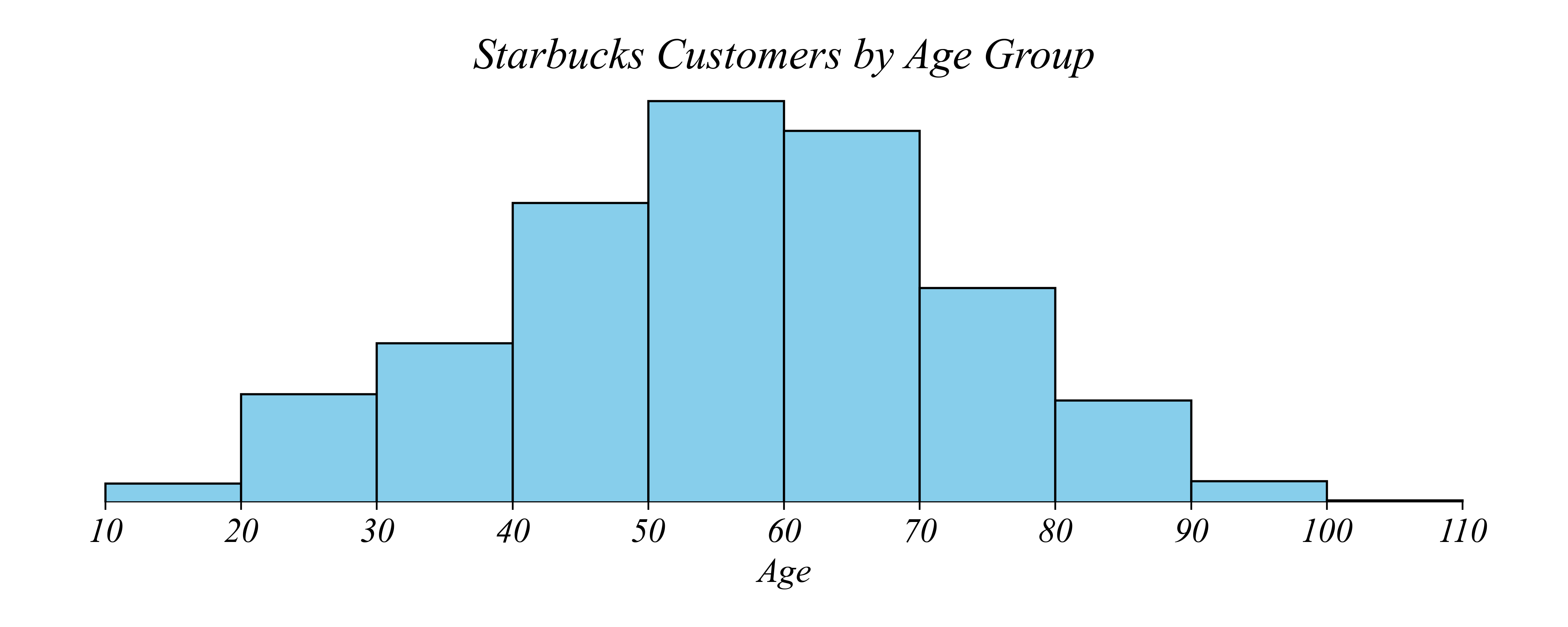
Histograms: Balance resolution vs noise
Q. Which age group has the most Starbucks customers?
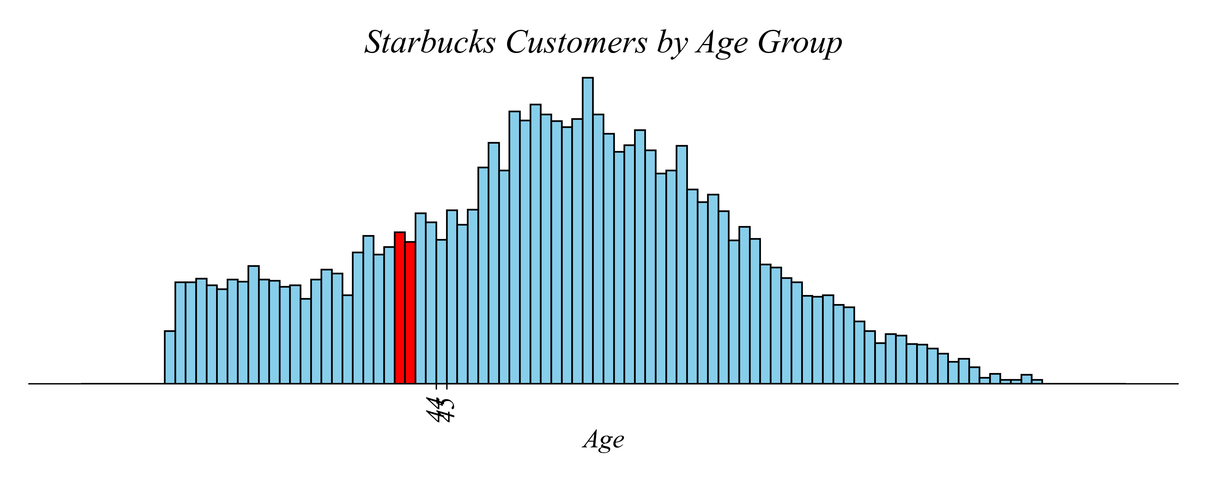
> larger sample has less noise!
Histograms: Balance resolution vs noise
Q. Which age group has the most Starbucks customers?
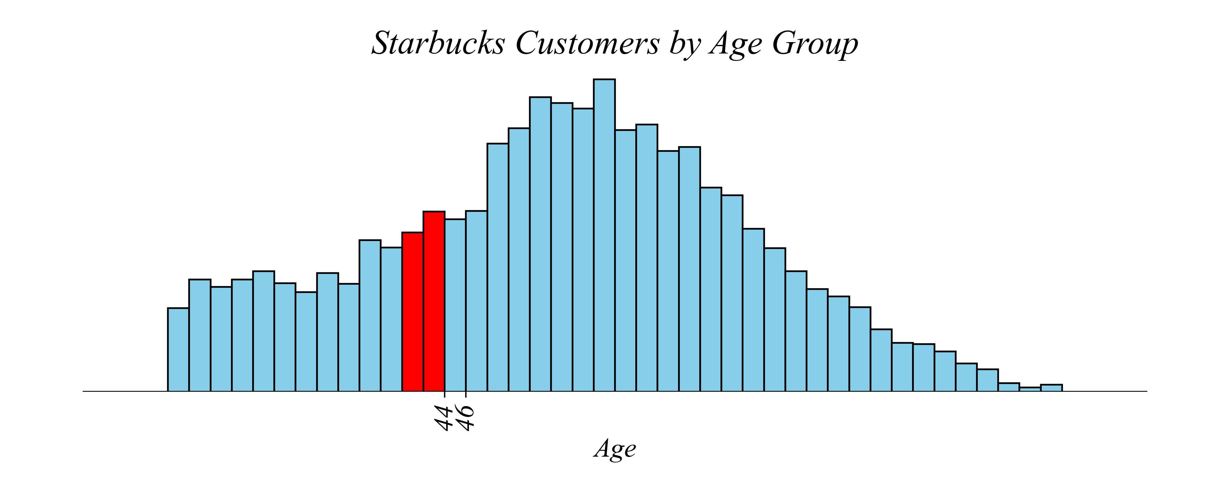
> larger bins also has less noise!
Mean and Standard Deviation
Q. What is the average age of Starbucks customers?
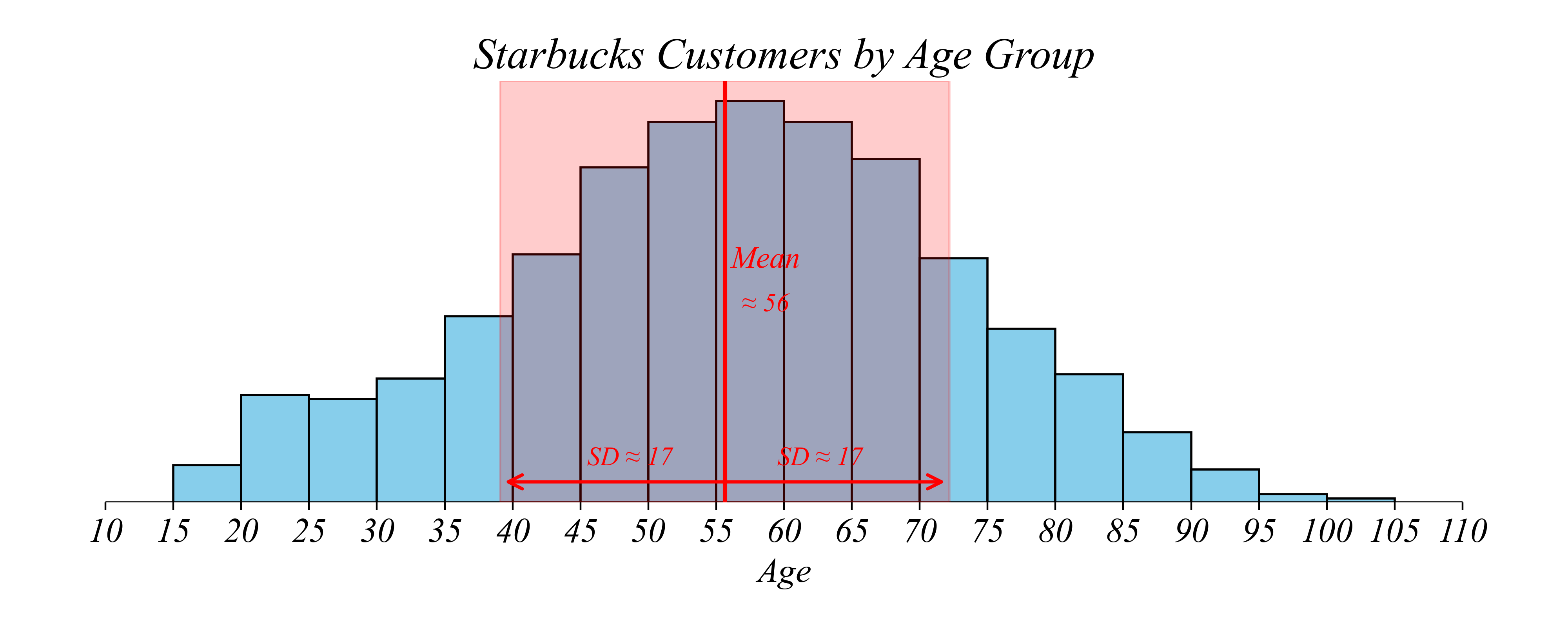
> Mean ≈ 56 years; SD ≈ 17 years
> “The average customer is about 56; ages typically vary by about 17 years from that average”
Exercise 1.2 | Histograms
Q. Which age group among those making $40k or less has the most Starbucks customers?

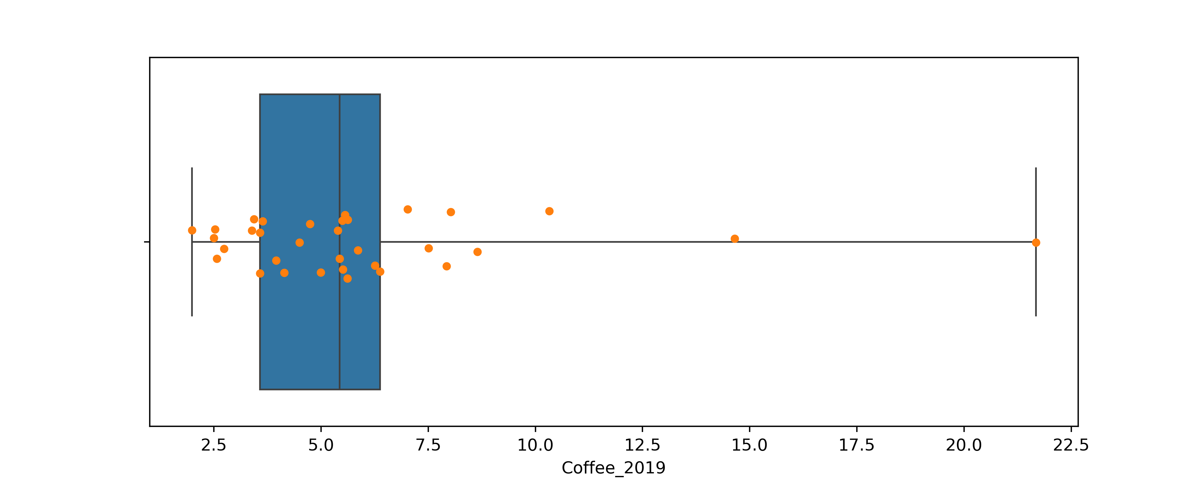
Histograms vs Boxplots
Q. Which countries drank an average amount of coffee?
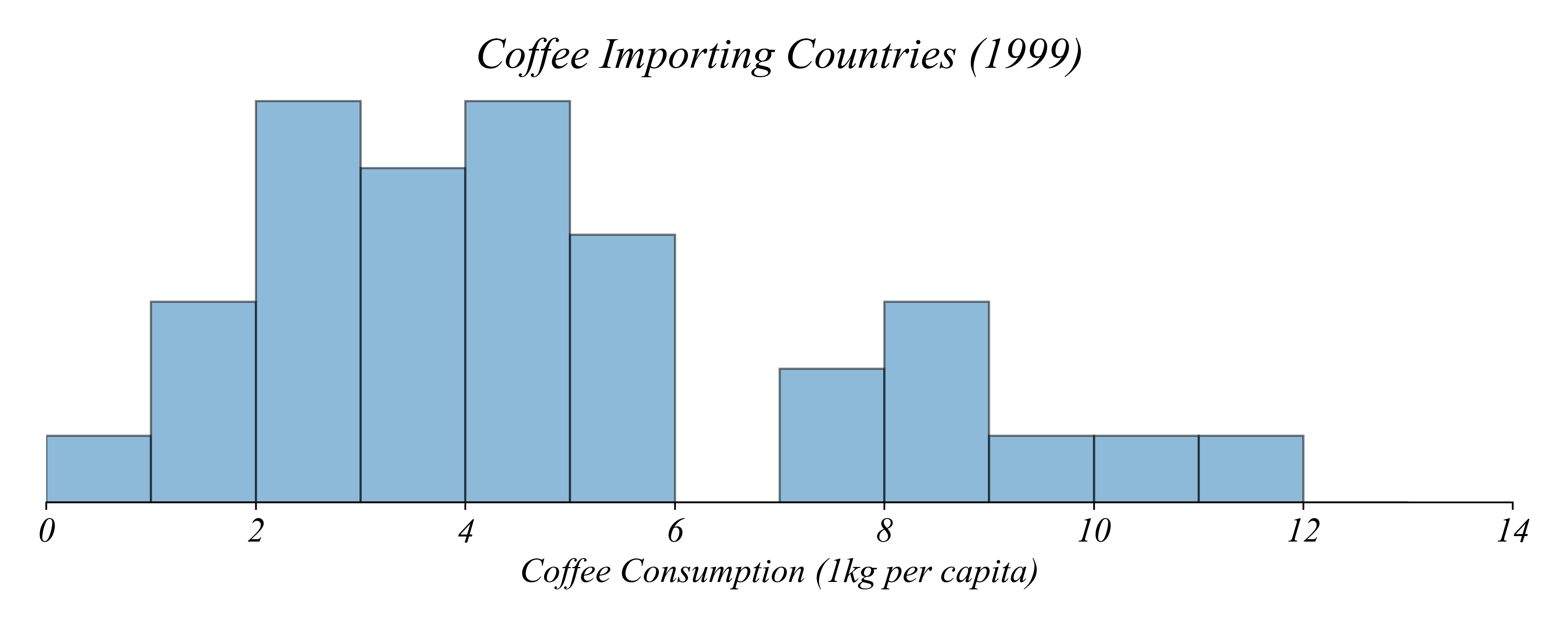
> histogram bins make it impossible to see exact values or quartiles
Boxplots
Q. Which countries drank the most coffee in 1999?
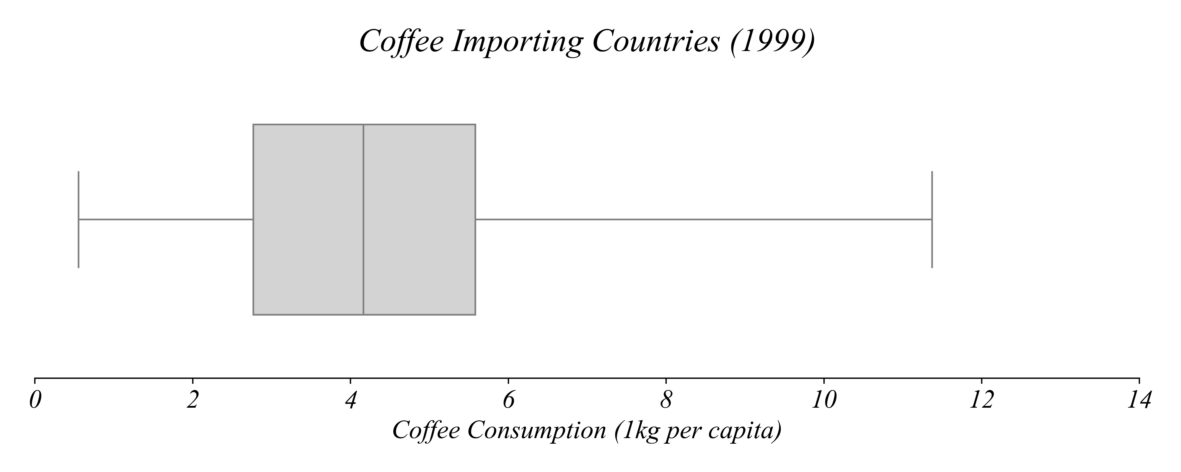
> as we’ll see, boxplots can tell us about quartiles
> but boxplots are still pretty unclear for our question
Boxplots + Stripplots
Q. Which countries drank the most coffee in 1999?
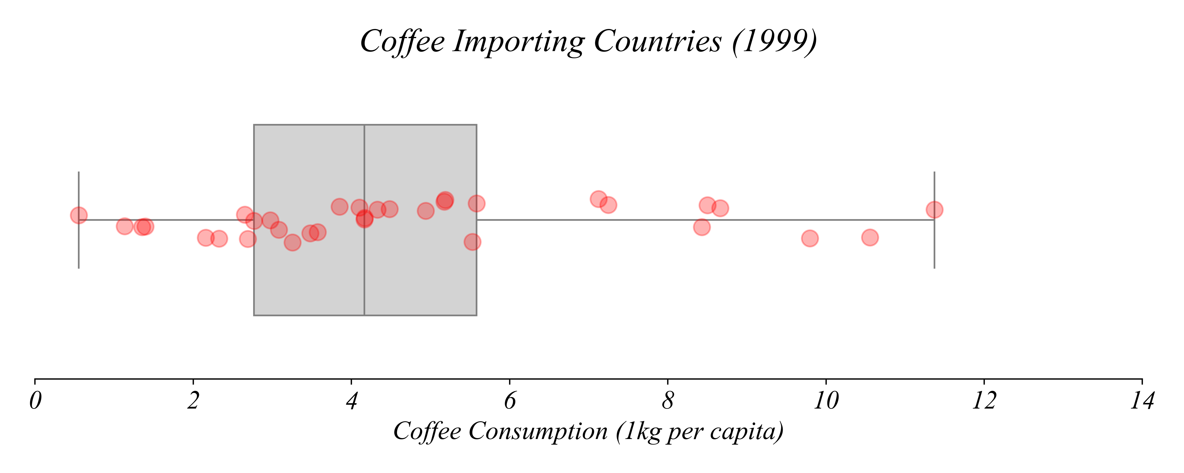
> here we can see the datapoints directly with the boxplot
> each point represents a country’s coffee consumption
Boxplots + Stripplots
Q. Which countries drank the most coffee in 1999?
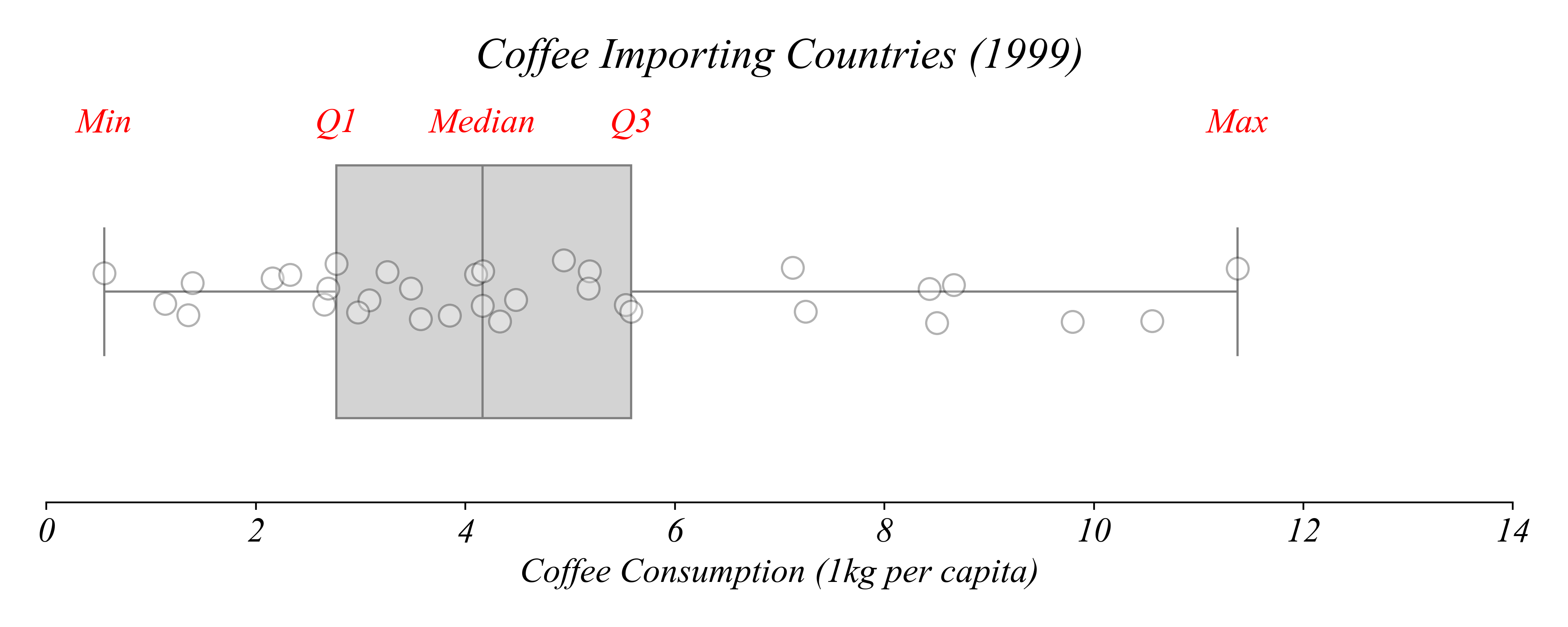
> each element of the boxplot represents one of these five quartiles
Boxplots + Stripplots
Which countries consumed more than 8 kg per capita?
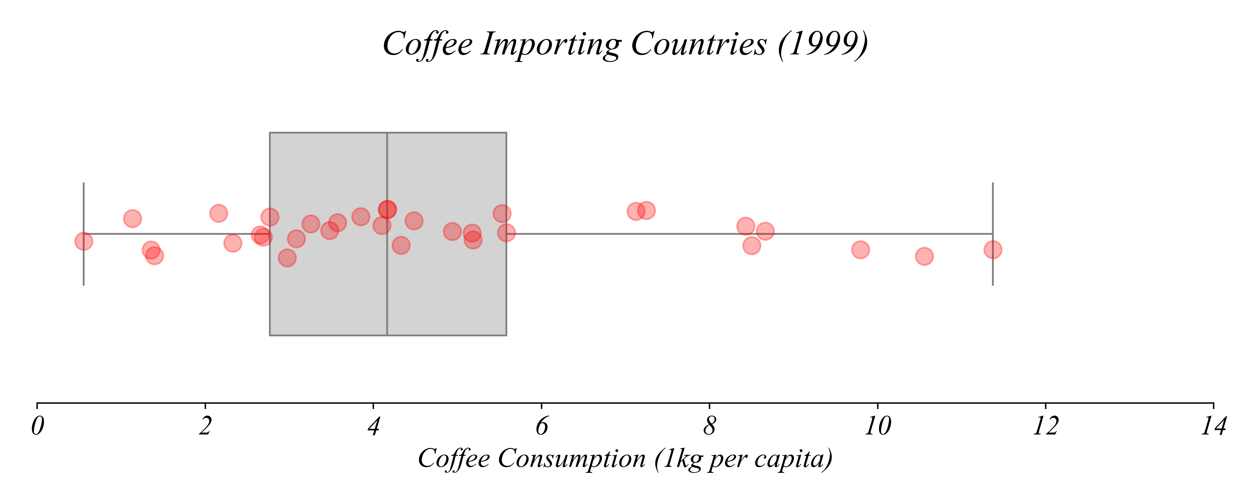
Boxplots + Stripplots
Which countries consumed more than 8 kg per capita?
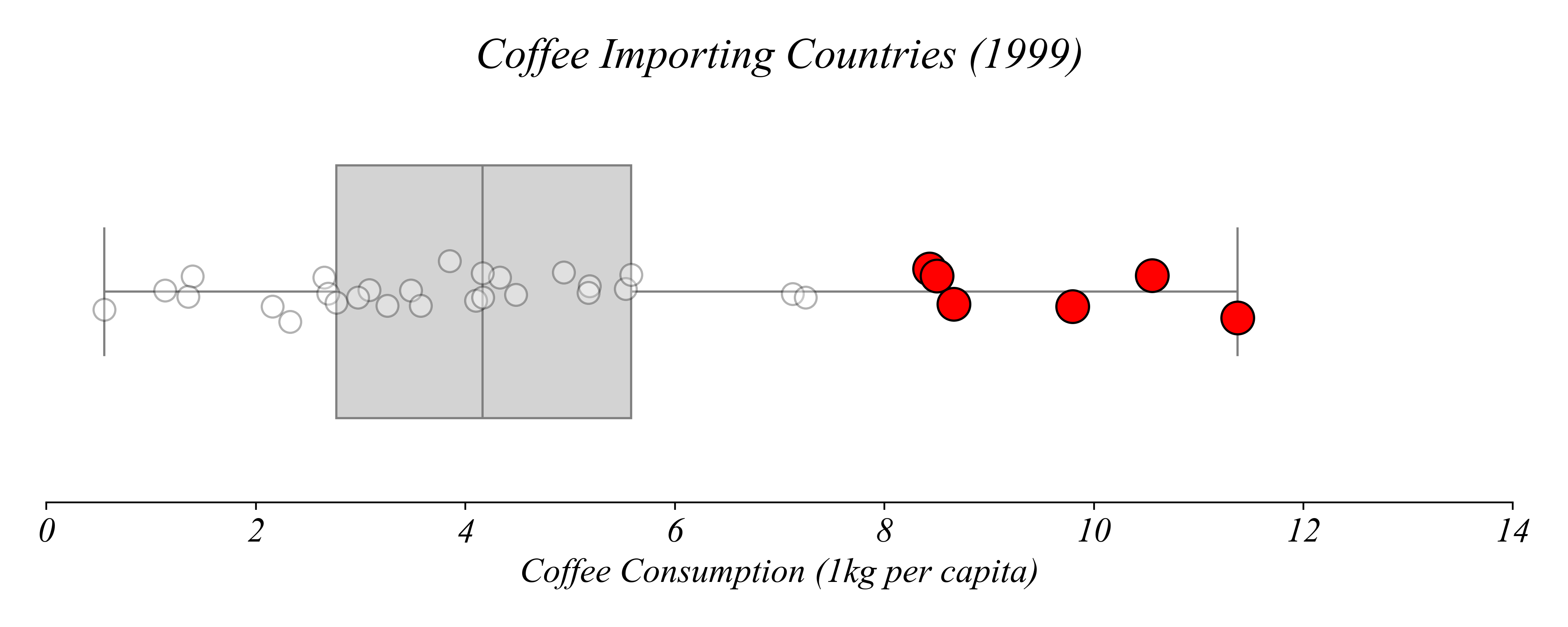
> we can highlight the relevant subsets of the data
Boxplots + Stripplots
Which country consumed the most coffee per capita?

> we can find the exact values according to quartiles
Boxplots + Stripplots
Which country consumed the most coffee per capita?
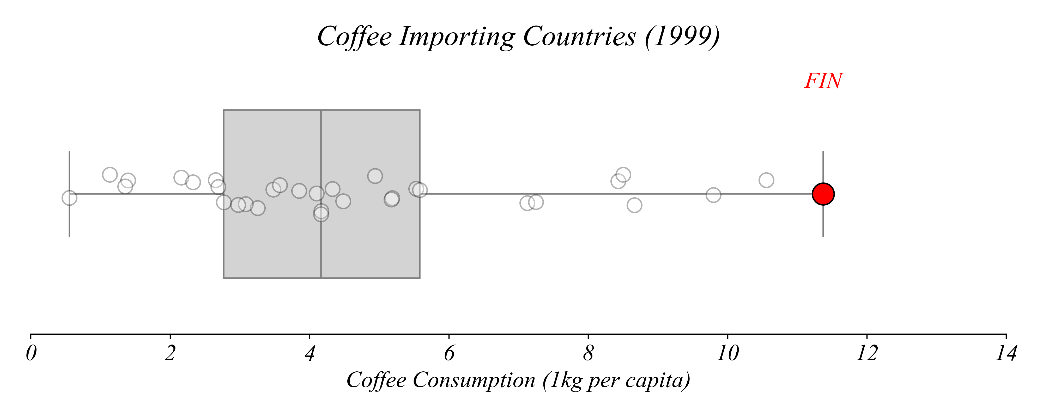
> we can find the exact values according to quartiles
> Finland consumed the most coffee per capita in 1999
Boxplots + Stripplots
Which country consumed the least coffee per capita?
Boxplots + Stripplots
Which country consumed the least coffee per capita?
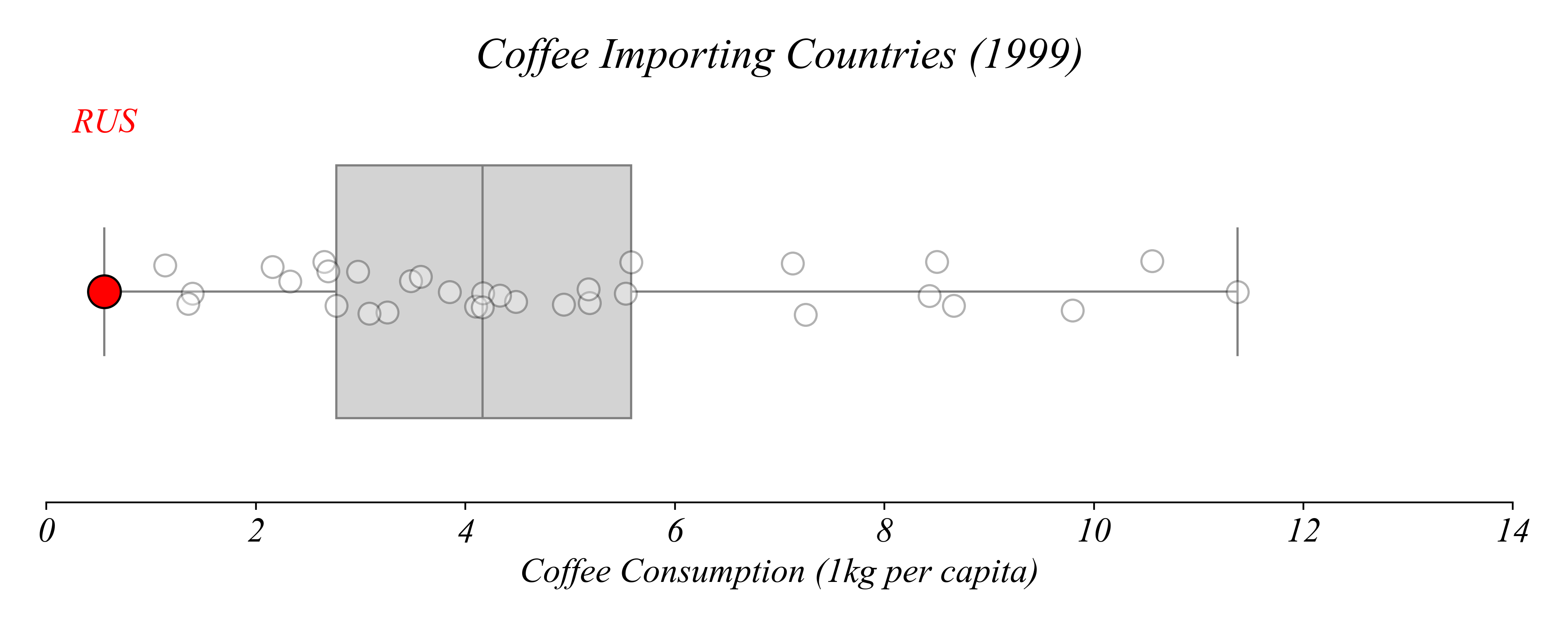
> Russia consumed the least coffee per capita in 1999
Boxplots + Stripplots
How about the median?
Boxplots + Stripplots
How about the median?
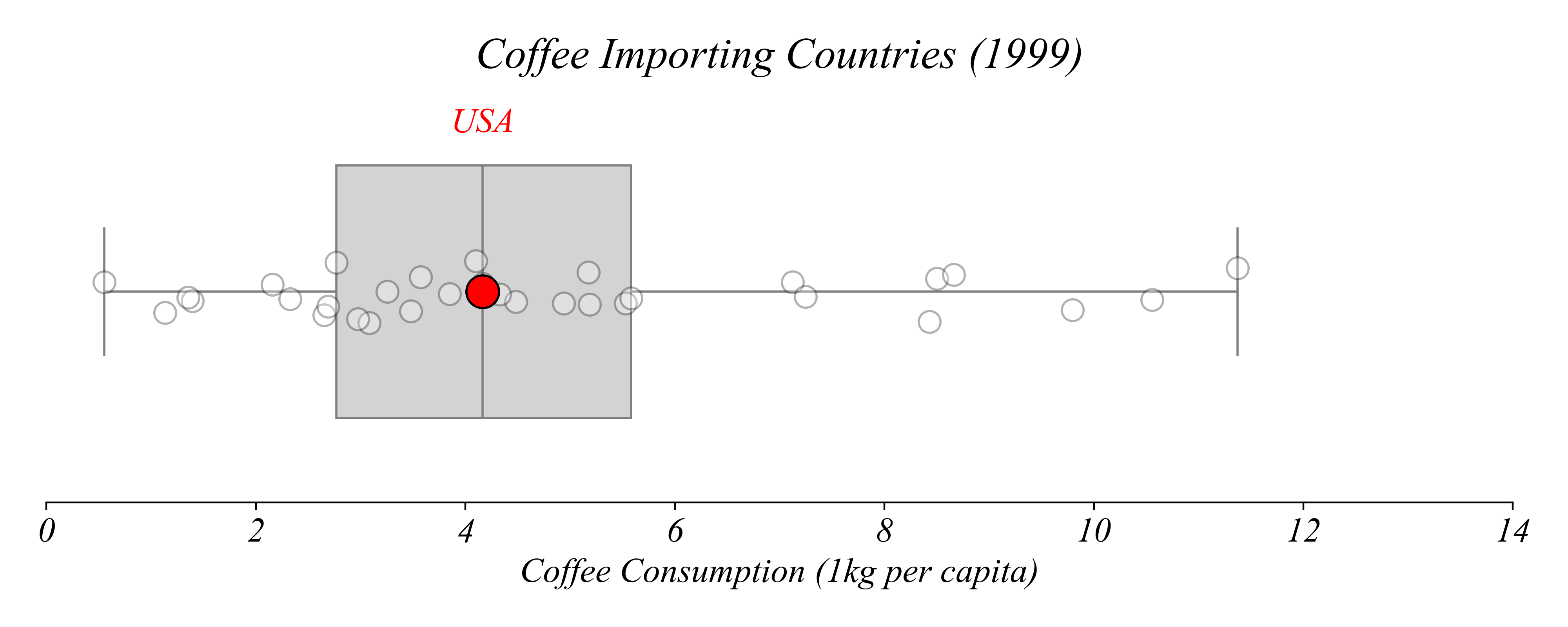
> the US!
Boxplots + Stripplots
Which country consumes more than exactly 25% of countries?
Boxplots + Stripplots
Which country consumes more than exactly 25% of countries?
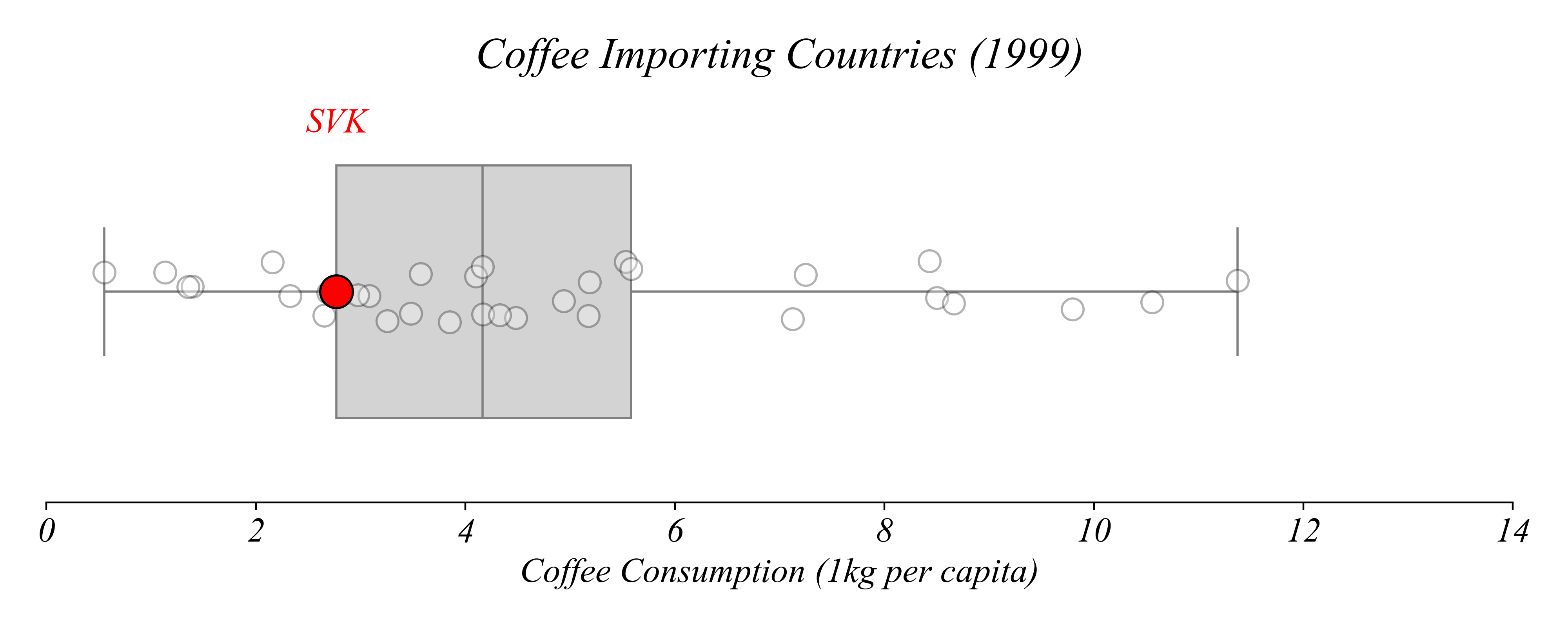
> Slovakia!
Boxplots + Stripplots
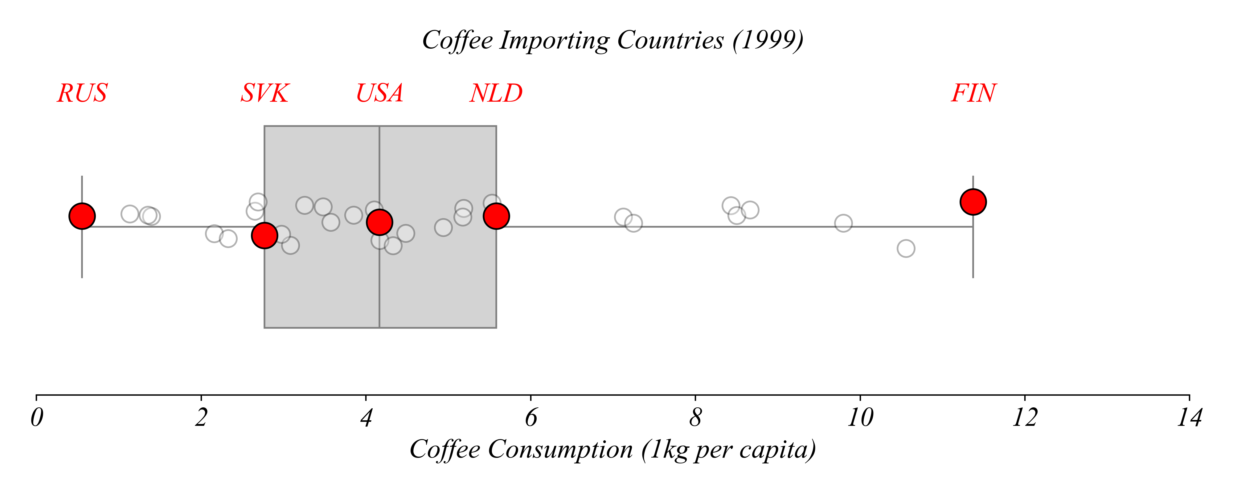
Which country consumes more than exactly 75% of countries?
Boxplots + Stripplots
Which country consumes more than exactly 75% of countries?
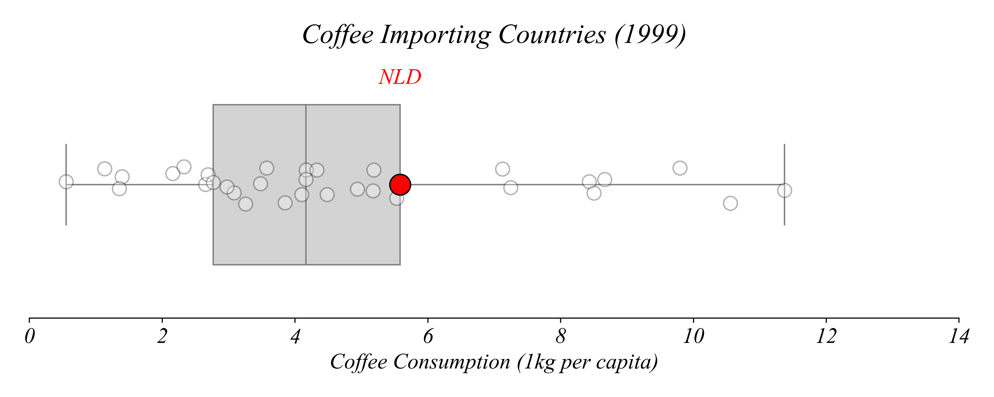
> Netherlands
Boxplots + Stripplots
Boxplots show quartiles; stripplots show the data.
Exercise 1.2 | Boxplots + Stripplots
Show the distribution of coffee consumption per capita in 2019.