| STATE |
|---|
| CA |
| NY |
| TX |
| WA |
| FL |
| ... |
We cannot typically understand our data without summarizing it.

The main differentiator between a good and a bad summarization tool is whether it’s appropriate for the data.
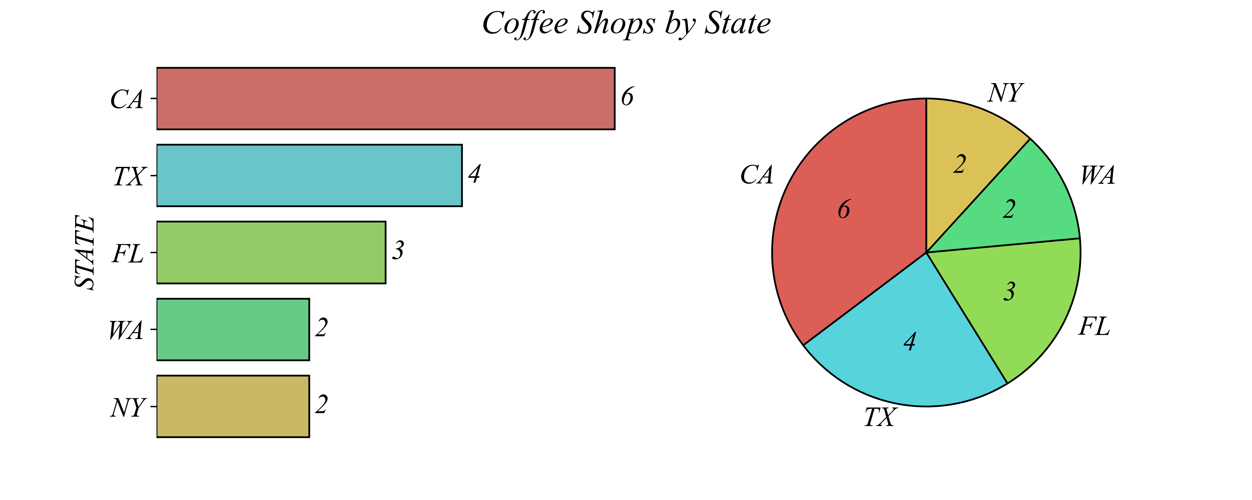
Catagorical Variables: Visualizations
Q. Which state has the most locations?
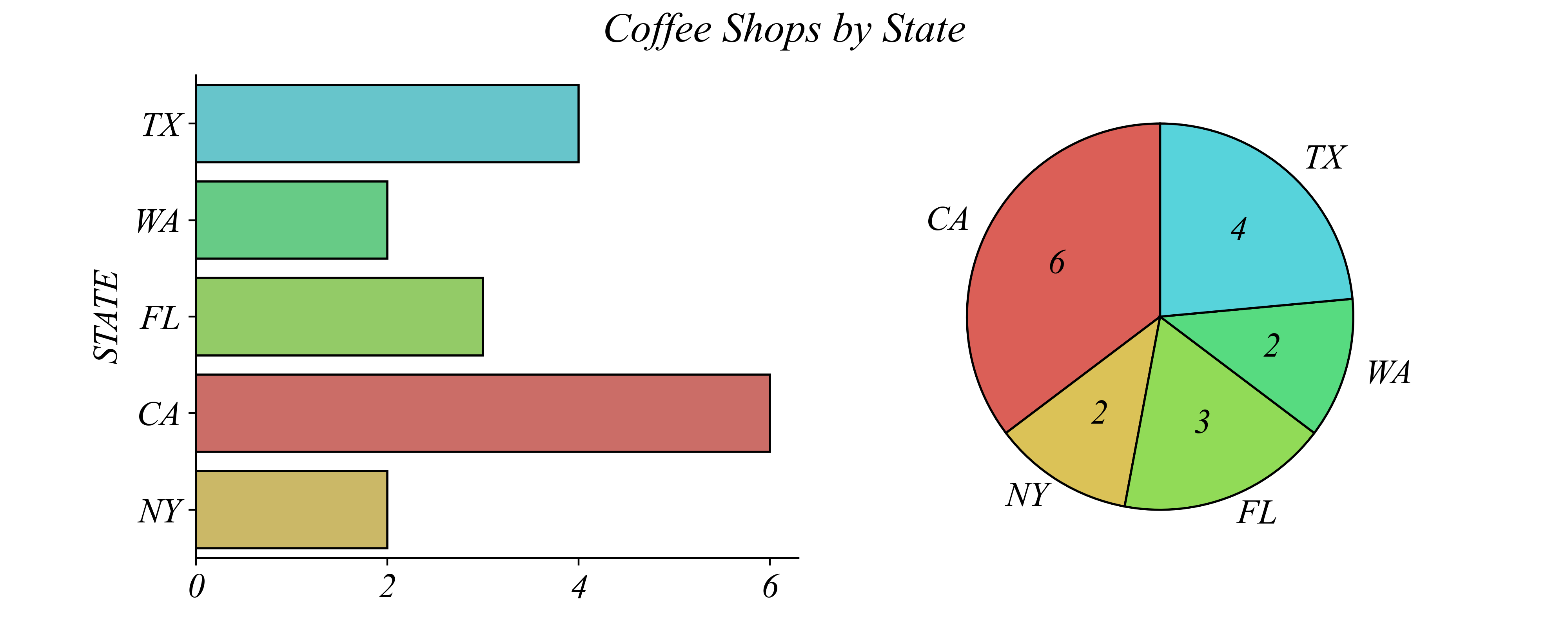
> pay attention to which of these two figures is easier to answer the question
> it’s pretty easy to see that it’s CA from both of these figures
Catagorical Variables: Visualizations
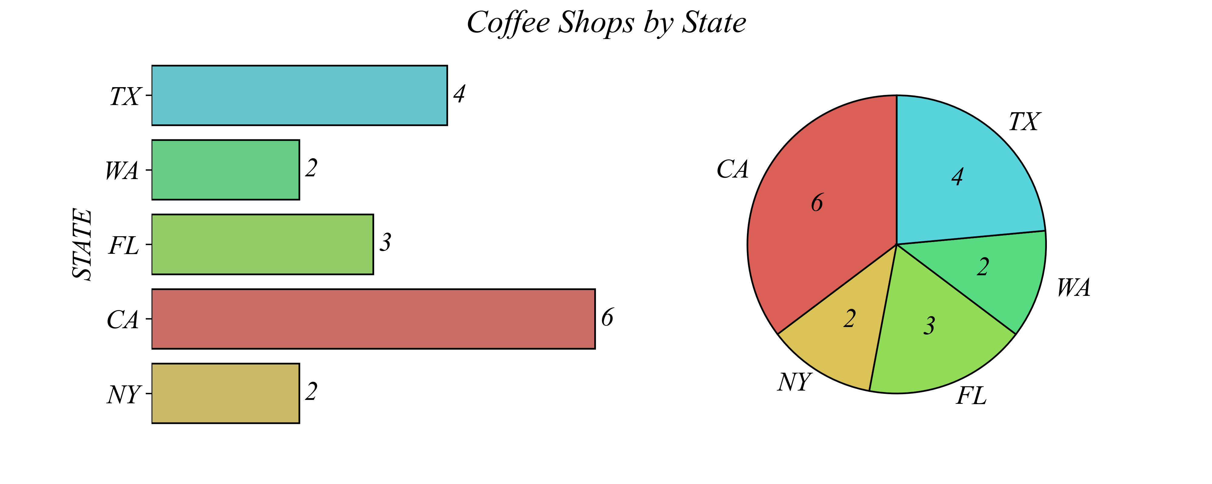
Q. Does FL or WA have more shops?
> pay attention to which of these two figures is easier to answer the question
> a bar graph is much easier to read
Catagorical Variables: Visualizations
Q. How many shops are in FL?
> pay attention to which of these two figures is easier to answer the question
> now it takes a second to read the bar graph…
Catagorical Variables: Bar Plots
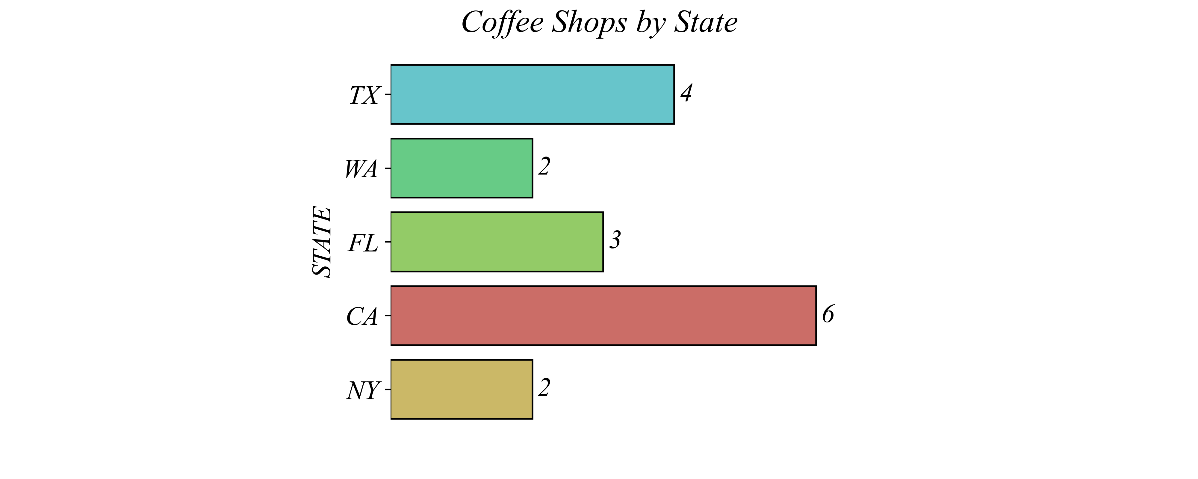
Q. How many shops are in FL?

> pay attention to which of these two figures is easier to answer the question
> we can make the bar graph easier to read by placing the number near the bar
Catagorical Variables: Remove Clutter
Q. How many shops are in the state with the second most locations?
> removing clutter guides your eye to the important information
Catagorical Variables: Remove Clutter
Q. How many shops are in the state with the second most locations?
> removing clutter guides your eye to the important information
Catagorical Variables: Order by Size
Q. How many shops are in the state with the second most locations?
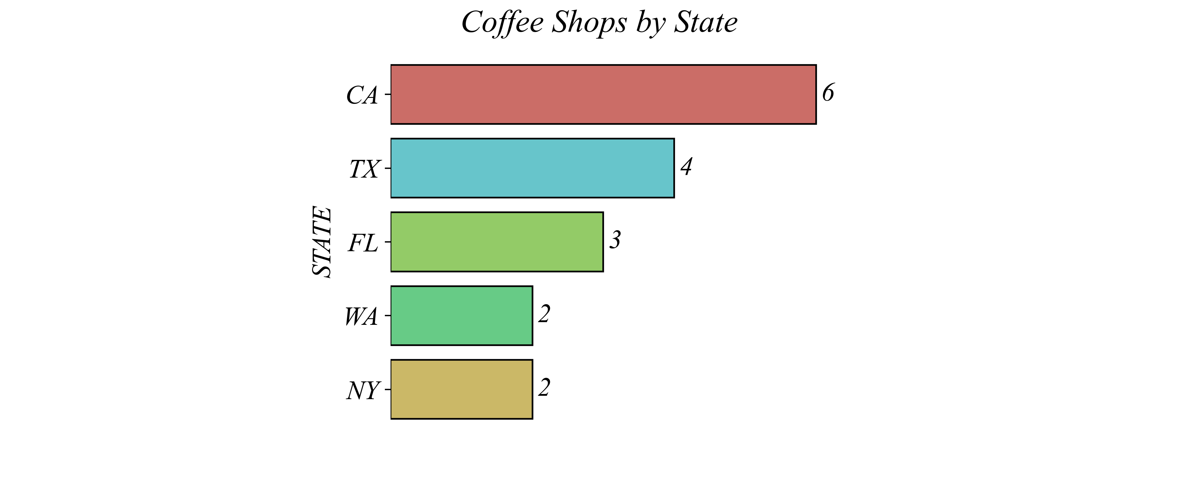
> states have no inherent order, but sorting can make comparisons easier
Binary Categorical Variables: CA vs Other
Q. How does CA compare to the whole?
> instead of a nominal categorical variable, this is binary (CA / Other)
Binary Categorical Variables: Binary Visualization
Q. How does CA compare to the whole?
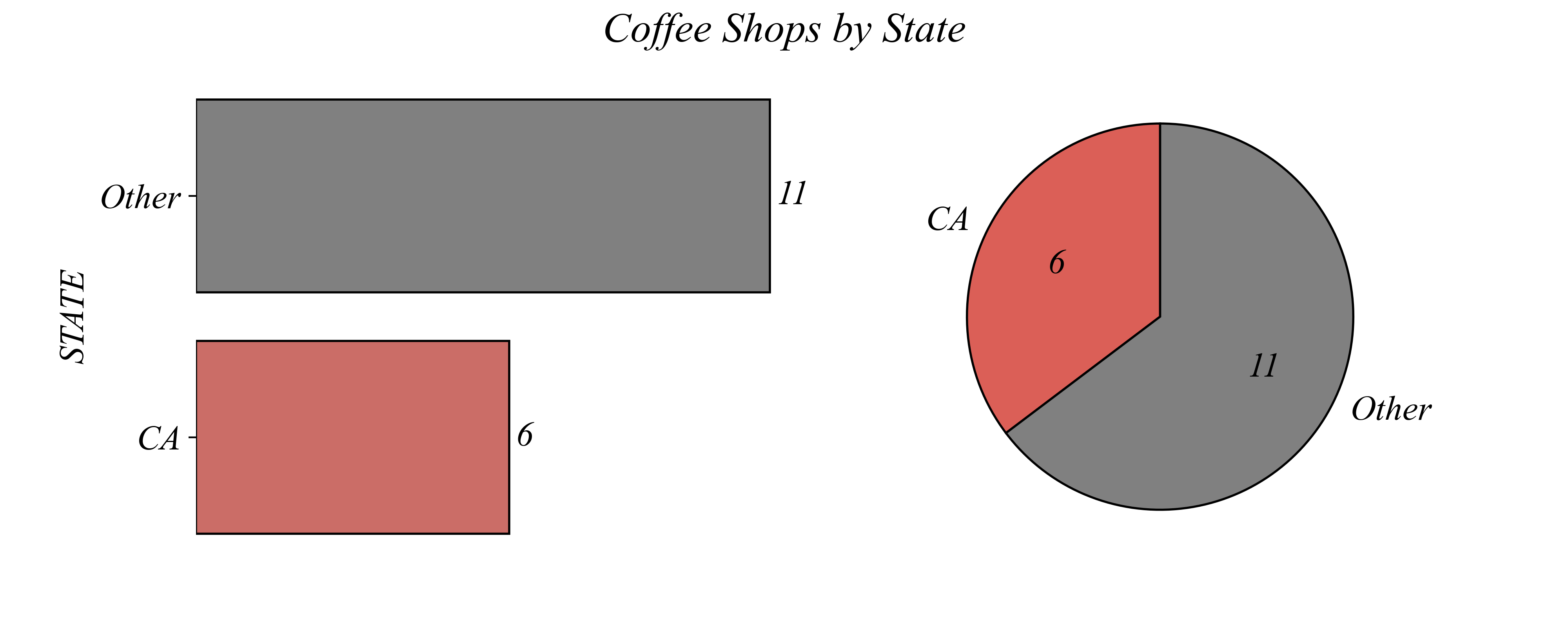
> this question is much easier to see when visualizing the two categories
> here both the pie and the bar communicte the data effectively
Binary Categorical Variables: Percentages
Q. How does CA compare to the whole?
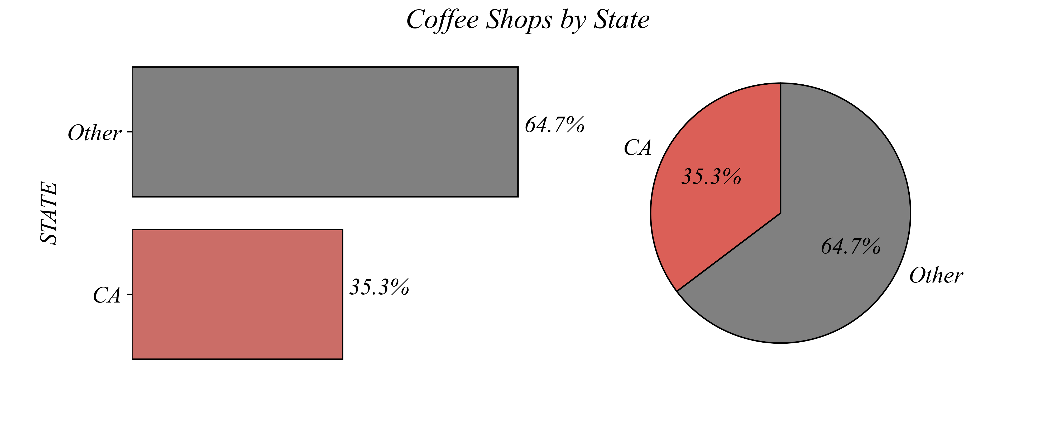
> if the question is about percentages, a pie chart may work best
Exercise 1.1: Dataset 1
Summarize Coffee_Shops.csv as a nominal categorical variable.
Exercise 1.1: Dataset 1
Summarize Coffee_Shops.csv as a binary categorical variable.
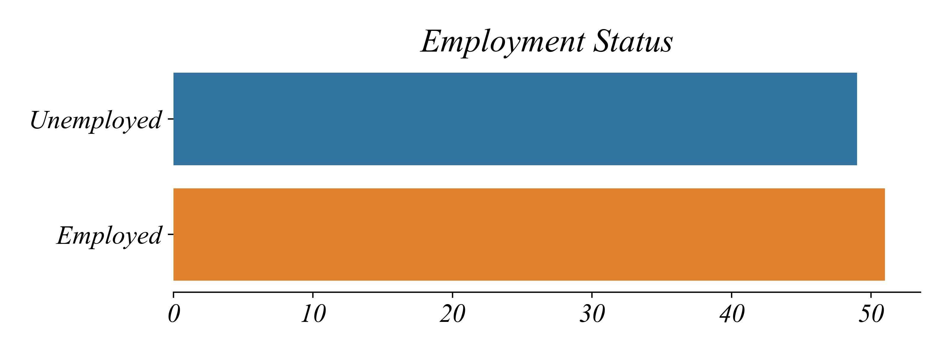
Exercise 1.1: Dataset 2
Summarize employment_status.csv.
Exercise 1.1: Dataset 3
Summarize household_savings.csv.
Exercise 1.1: Dataset 4
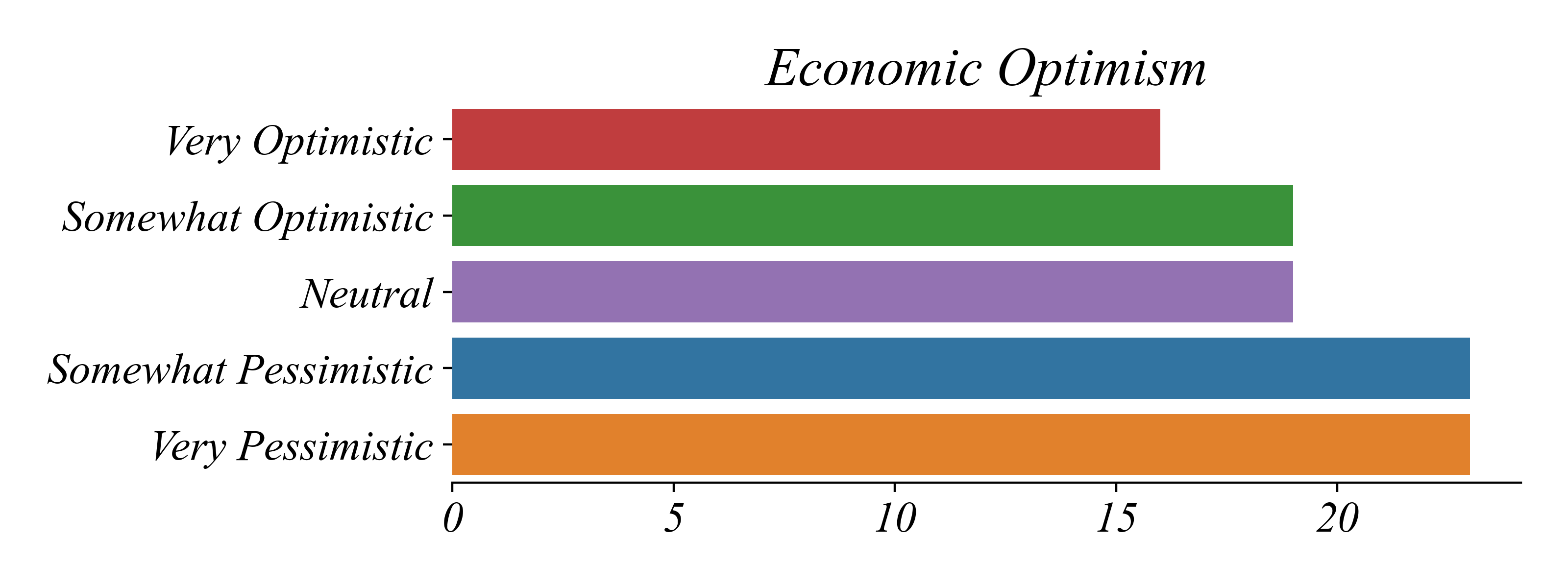
Summarize household_incomes.csv.